Start with a clear focus: hallway manners students can actually see
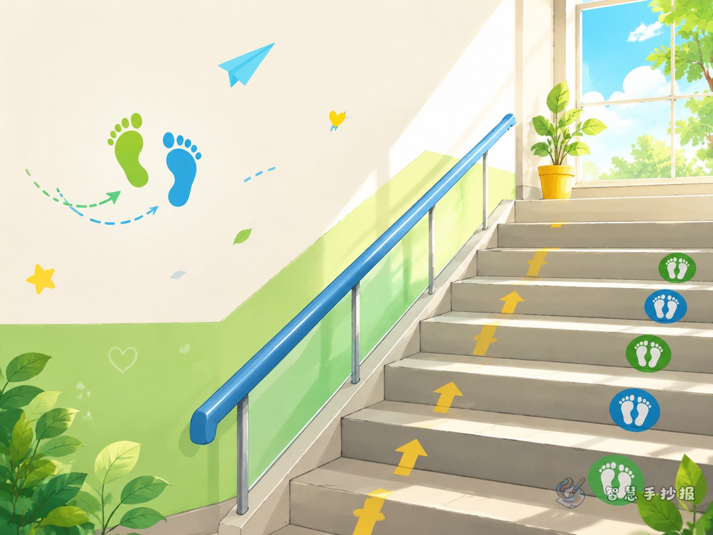
If you want a school etiquette poster that feels specific instead of generic, the theme of walking on the right side of the stairs is a great choice. It connects with daily school life and gives the poster a clear message about order, safety, and courtesy. Readers can understand the topic at a glance.
A strong main title could be “Walk on the Right, Be Polite and Safe”. You can add a short subtitle such as “Slow steps on stairs, kind manners on campus” to make the theme even clearer.
Easy sections for a neat poster layout
This topic works well when divided into four simple parts, so the poster looks organized and easy to read.
- Good manners section: walk on the right, no pushing, slow steps, quiet voices.
- Bad habits to avoid: running, shouting, sliding on railings, rushing in the wrong direction.
- Short slogan box: use brief lines that are easy to copy and decorate.
- My action plan: write in the first person about what the student will do.
If there is more space, add a small safety tip area, such as being extra careful on rainy days or looking before turning at stair corners.
Ready-to-use sentences for the poster
The writing does not need to be long. Clear and practical lines are better. These examples can be used directly:
- Walking on the right side of the stairs is a basic school rule and a polite habit.
- The hallway is not a racetrack. Slow steps show good manners.
- Giving way to teachers and classmates makes school warmer and safer.
- No pushing and no rushing help everyone move safely.
- Look once more at corners and give one more step of space to others.
- Civility begins with our steps, and safety stays by our side.
You can also add a short appeal: Let us start with every step, keep the stairway in order, and become polite students who respect rules.
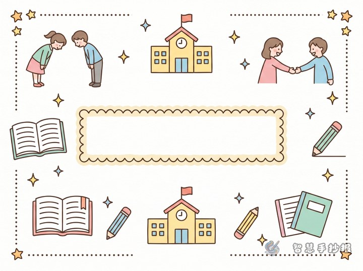
How to make the poster look more polished
A vertical layout or a centered title design works especially well for this theme. Put the main title in the middle, place slogans and behavior comparisons on the sides, and put a short action appeal at the bottom. Simple drawings of stairs, handrails, footprints, signs, and students lining up can make the page feel lively without being crowded.
Blue, green, and orange are good color choices because they look fresh and friendly while also matching a safety theme. Highlight key phrases like “walk on the right,” “no running,” and “give way to others” in bold colors.
How to make the content feel original
Many etiquette posters become ordinary because they only talk about big ideas. A better way is to use real school moments, such as going upstairs in the morning, moving between classes, lining up after school, or walking carefully on rainy days. This makes the poster feel closer to student life.
You can also add a small section called “If I Were a Civility Monitor” and write about reminding classmates gently, helping someone who falls, or keeping the stair area quiet and orderly.
A simple ending that fits the theme
You do not need a long conclusion. A short line works well: civility is not just a slogan, but one calm step on the stairs, one quiet walk in the hallway, and one act of giving way on campus. After finishing the draft, families and teachers can also continue improving the layout, colors, and title ideas in the Zhihui Handwritten Poster WeChat mini program.