Choose a Clear Poster Focus
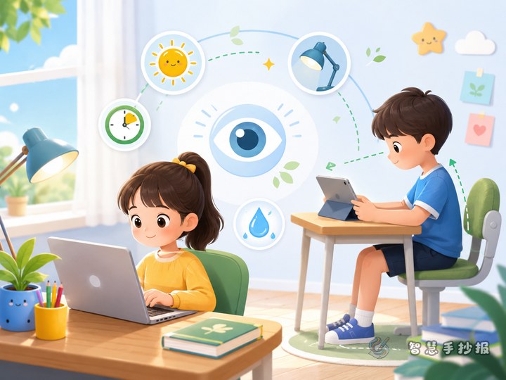
A good poster on eye health should combine proper sitting posture and daily vision habits. Instead of only saying “use screens less,” students can show how posture, reading distance, pencil grip, and rest habits all help protect the eyes.
For the headline, simple phrases such as “Good Posture, Bright Eyes” or “Healthy Eyes Start at the Desk” work well for school poster assignments.
Useful Sections for the Layout
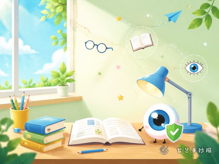
- Eye-care slogan: Add one short line under the title, such as “Sit straight, read right, protect your sight.”
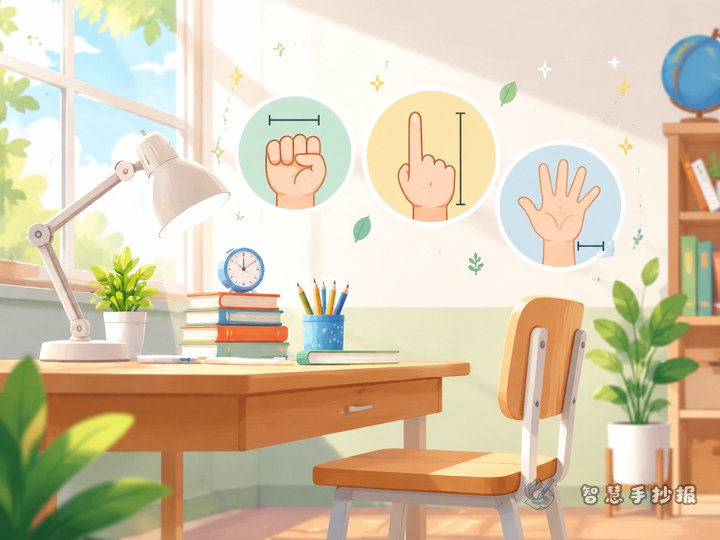
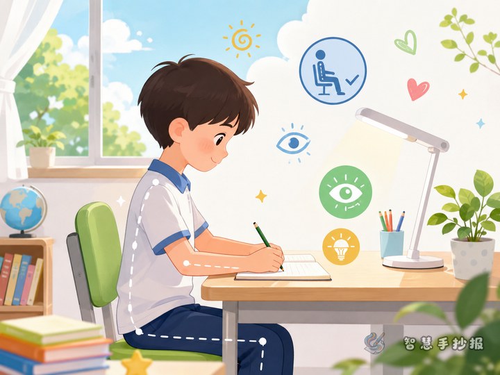
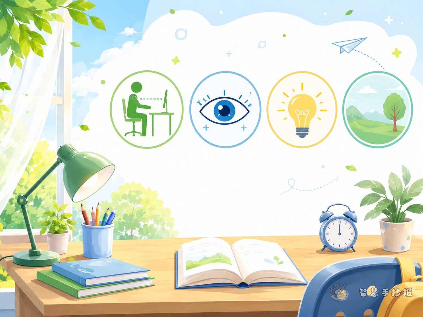
- Four posture rules: Keep the head upright, back straight, chest away from the desk, and eyes at a safe distance from the book.
- Writing habits: Hold the pencil correctly, keep fingers from blocking the line of sight, and avoid bending too close to the page.
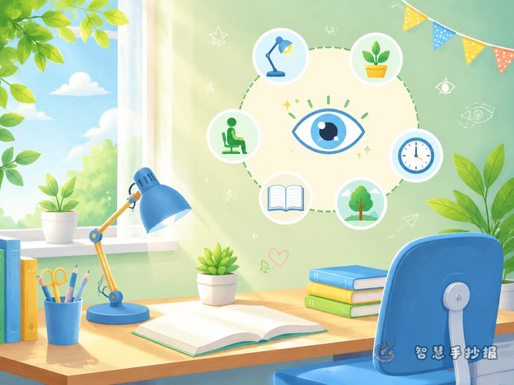
- Break-time actions: Look into the distance, blink often, move the shoulders and neck, and relax the eyes.
- Healthy eye routine: Do not read for too long without a short rest.
If there is extra space, students can add a small checklist called “I can do it” to make the poster more interactive.
Short Text Materials to Copy
Sample paragraph
Our eyes help us learn, read, and discover the world. To protect them, we should not only avoid bad habits like rubbing our eyes or staring at screens for too long, but also keep good posture every day. When we sit properly and rest our eyes in time, reading and writing become more comfortable and healthy.
Simple slogans
- Good posture, clearer vision.
- Read right, write right, protect your sight.
- Healthy habits begin at the desk.
- Look far away and let your eyes relax.
Helpful reminders
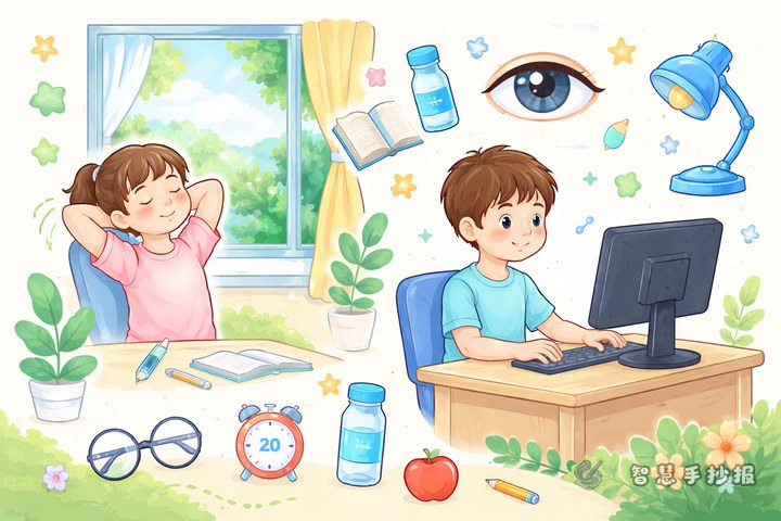
- Do not read while lying down, walking, or riding in a car.
- Do not study for long in light that is too dim or too harsh.
- Take breaks after using digital screens.
- Spend time outdoors and build healthy eye habits every day.
How to Make the Poster Look Better
A practical layout is to place the main title in the center and arrange small content blocks around it. One side can show correct sitting posture, while another side can display books, a desk lamp, or green plants as decorative elements.
Light green, sky blue, and soft yellow are good color choices because they look bright and clean. Important words such as “distance,” “rest,” “blink,” and “sit straight” can be highlighted in colored pens.
Common Mistakes to Avoid
- Do not fill the page with only long explanations.
- Do not focus only on poor eyesight; include posture and habits too.
- Do not overcrowd the page with text. Leave some blank space.
- Younger students can use short phrases, while older students can add a mini checklist or a few extra notes.
If you want to continue improving the layout, trying new titles, or adding more poster sections, you can use the Zhihui Shouchaobao WeChat mini program for more creation ideas.