Why a “Home Earthquake Safety Corner” Makes a Strong Poster Theme
Instead of writing only general earthquake facts, a poster about a home earthquake safety corner feels more practical and easier for children to understand. It connects safety knowledge with real rooms, real furniture, and real family habits. That makes the poster more useful and more memorable.
A clear topic can be phrased as “Where Is the Safest Spot at Home?” or “How to Set Up a Home Earthquake Safety Corner.” Readers can quickly see what the poster is about.
Good Sections to Include
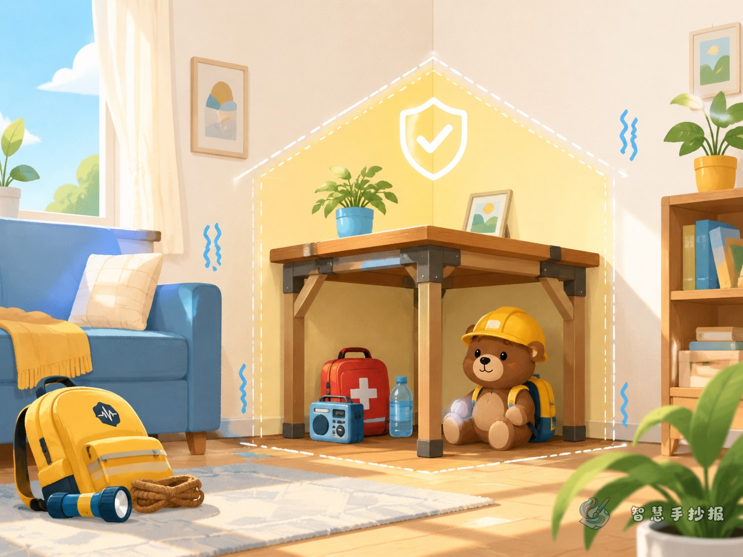
- What is a safety corner? Explain that it is a relatively safer place for temporary protection during shaking.
- Safer places at home: beside a sturdy table, near a load-bearing wall, or next to low and stable furniture.
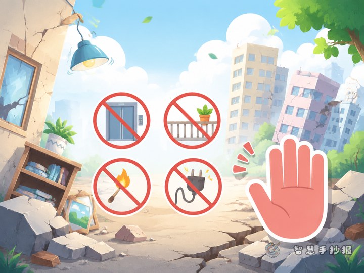
- Places to avoid: near windows, glass cabinets, balconies, hanging lamps, and tall furniture.
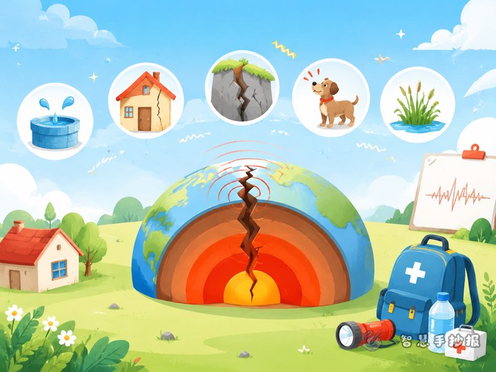
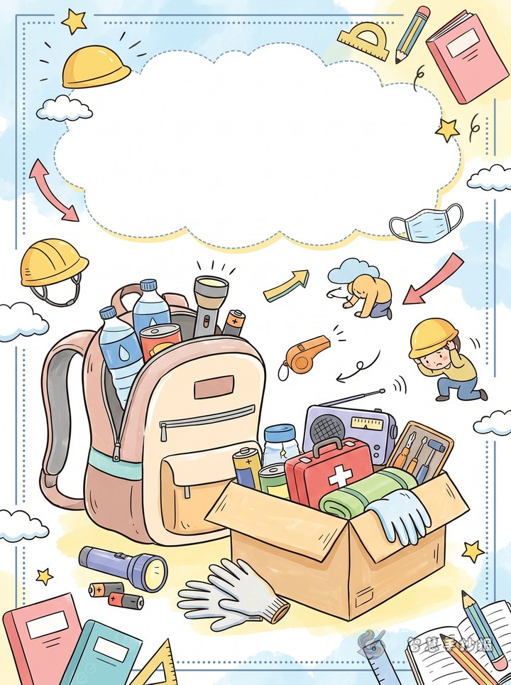
- Emergency supplies: flashlight, drinking water, whistle, simple first-aid items, and towels.
- What to do after the shaking: stay calm, check family members, and evacuate in order if needed.
Four or five sections are enough for a clean layout. Short sentences work best for a handwritten newspaper or classroom poster.
Ready-to-Use Text for the Poster
What a safety corner means
A home earthquake safety corner is a place with fewer falling objects and better protection. During an earthquake, staying calm and taking cover nearby is usually safer than running in panic.
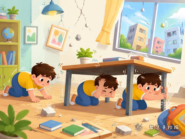
Simple safety motto
Drop, cover, and hold on. Lower your body, protect your head, take cover near a sturdy object, and hold firmly until the shaking becomes weaker.
Family reminder lines
Look around in advance, stay calm during shaking, keep dangerous objects secure, and make a family safety plan together.
Things not to do
- Do not jump from a building.
- Do not rush to stairs during strong shaking.
- Do not stand near glass, mirrors, or hanging objects.
- Do not use an elevator to escape.
Layout Ideas for a Better-Looking Poster
This theme works well with a “room map plus information blocks” design. Put the main title in the center, place “safe places” on one side and “danger areas” on the other, and use the bottom area for an emergency checklist and a short safety slogan.
Blue, green, and orange can create a bright and clear safety-education style. Small decorations such as houses, shields, first-aid kits, or flashlights can make the page more lively. Keep the title readable, and highlight key words like “cover,” “avoid,” and “prepare.”
Small Details That Make the Poster Better
- Use short points instead of long paragraphs.
- Keep the writing connected to real home situations.
- Show both safer places and dangerous areas for comparison.
- Add a personal section such as “My family safety promise” to make the poster feel more original.
If you want a cleaner layout and easier design ideas, you can continue making your poster in the Zhihui Shouchaobao WeChat mini program.