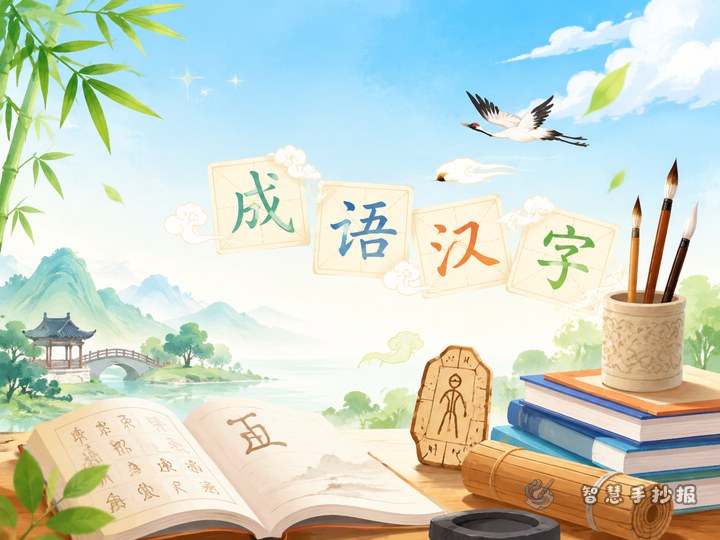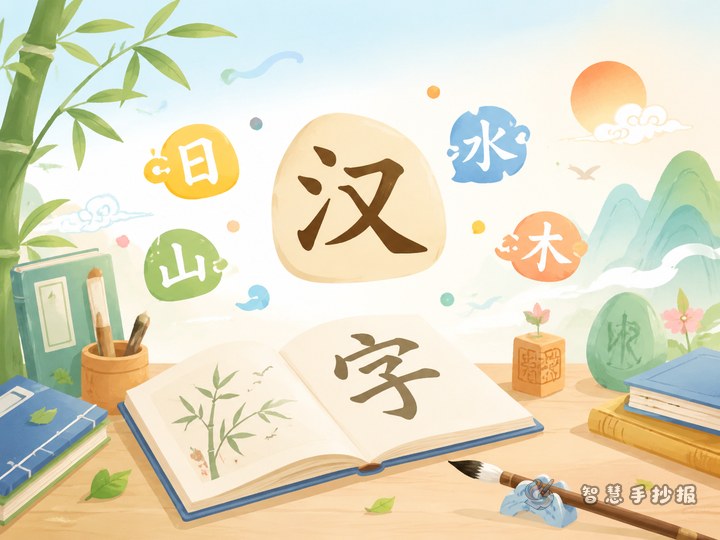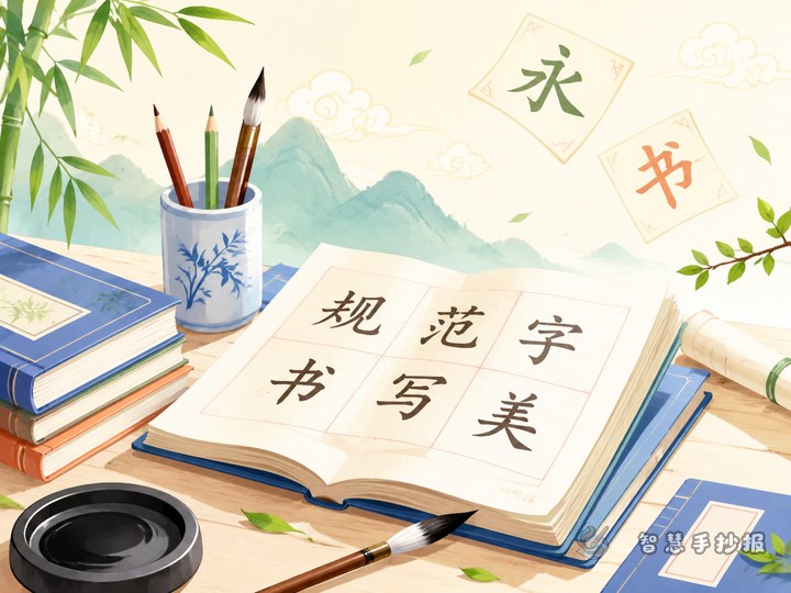
Choose a focused topic: homophones and look-alike characters
If you want a Chinese character culture poster that is both educational and easy to organize, homophones and similar-looking characters are a smart choice. This topic connects closely with everyday language learning and works well in a comparison-based layout.
You can build the poster around ideas such as “same pronunciation, different meanings,” “similar shapes, easy to confuse,” and “one sentence to tell them apart.” That makes the page clear, useful, and student-friendly.
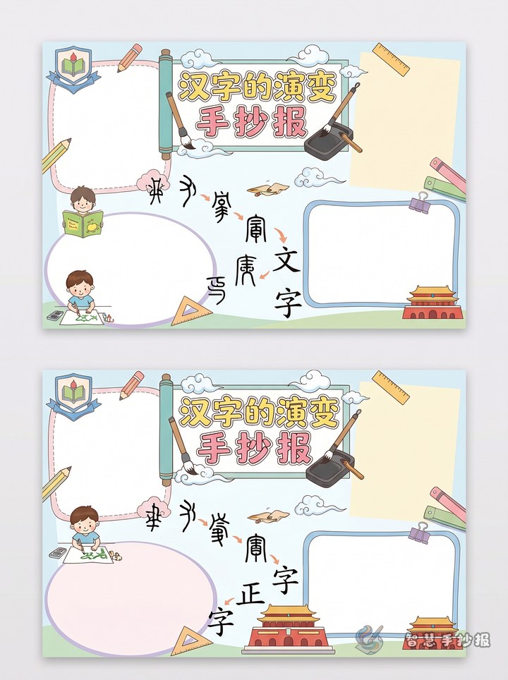
A simple layout that looks neat and complete
Try dividing the page into four sections with a main title in the center. This creates a balanced design and helps readers find the key points quickly.
- Section 1: Homophone corner — show pairs of characters with the same pronunciation but different meanings, along with pinyin and sample sentences.
- Section 2: Similar character finder — compare characters that look alike and explain the small visual difference.
- Section 3: Common writing mistakes — list words students often misspell and write the correct forms.
- Section 4: Mini quiz — add two or three fill-in-the-blank or matching questions for interaction.
Decorations can include grid paper patterns, pencils, brushes, books, or ink-drop shapes to match the Chinese language theme.
Useful content you can write directly
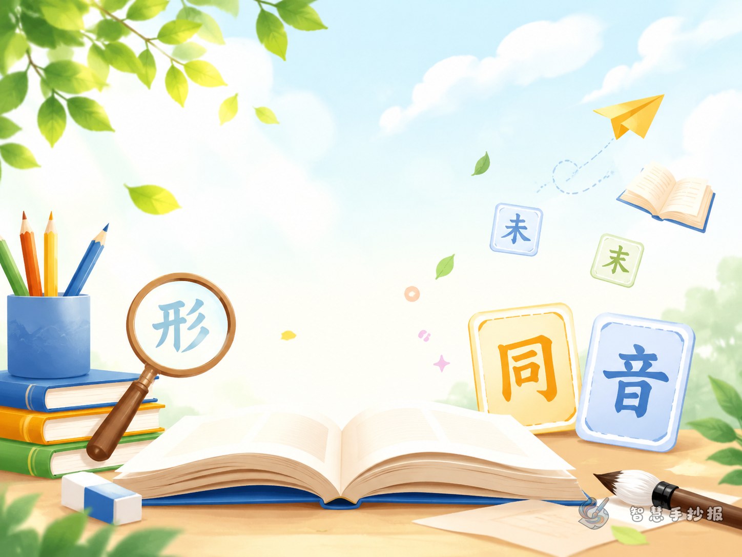
What to include for homophones
Pick several easy examples and explain how the same sound can lead to different meanings. Add a short sentence for each one so the difference is easy to understand.
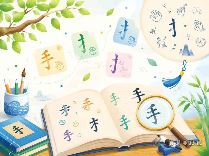
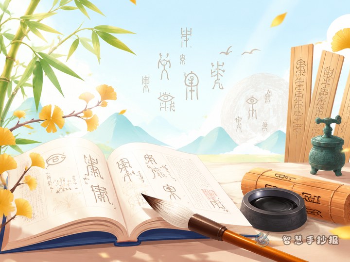
What to include for similar characters
Choose characters with small visual differences and explain a simple memory tip. A “spot the difference” style presentation makes this section more interesting.
Short lines for the title area
- Every character has meaning, and careful writing shows care.
- Learning Chinese starts with understanding each character clearly.
- A tiny difference in form can change the meaning completely.
How to make the poster stand out
Instead of filling the page with long explanations, use side-by-side comparisons. You can show a common mistake first, then write the correct character or word beside it with a short reminder.
Another good idea is to add a small section called “Characters I often mix up”. This gives the poster a personal touch and shows real learning rather than copied content.
Color and writing tips
Use fresh and simple colors such as blue, green, and orange. Keep the body text neat and readable, make the title larger, and highlight only key words instead of coloring everything heavily.
If you want to keep improving the layout, replace sections, or build a cleaner poster more quickly, you can continue creating in the Zhihui Shouchaobao WeChat Mini Program.