Build a clear storyline: how characters changed over time
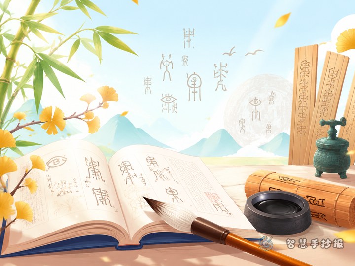
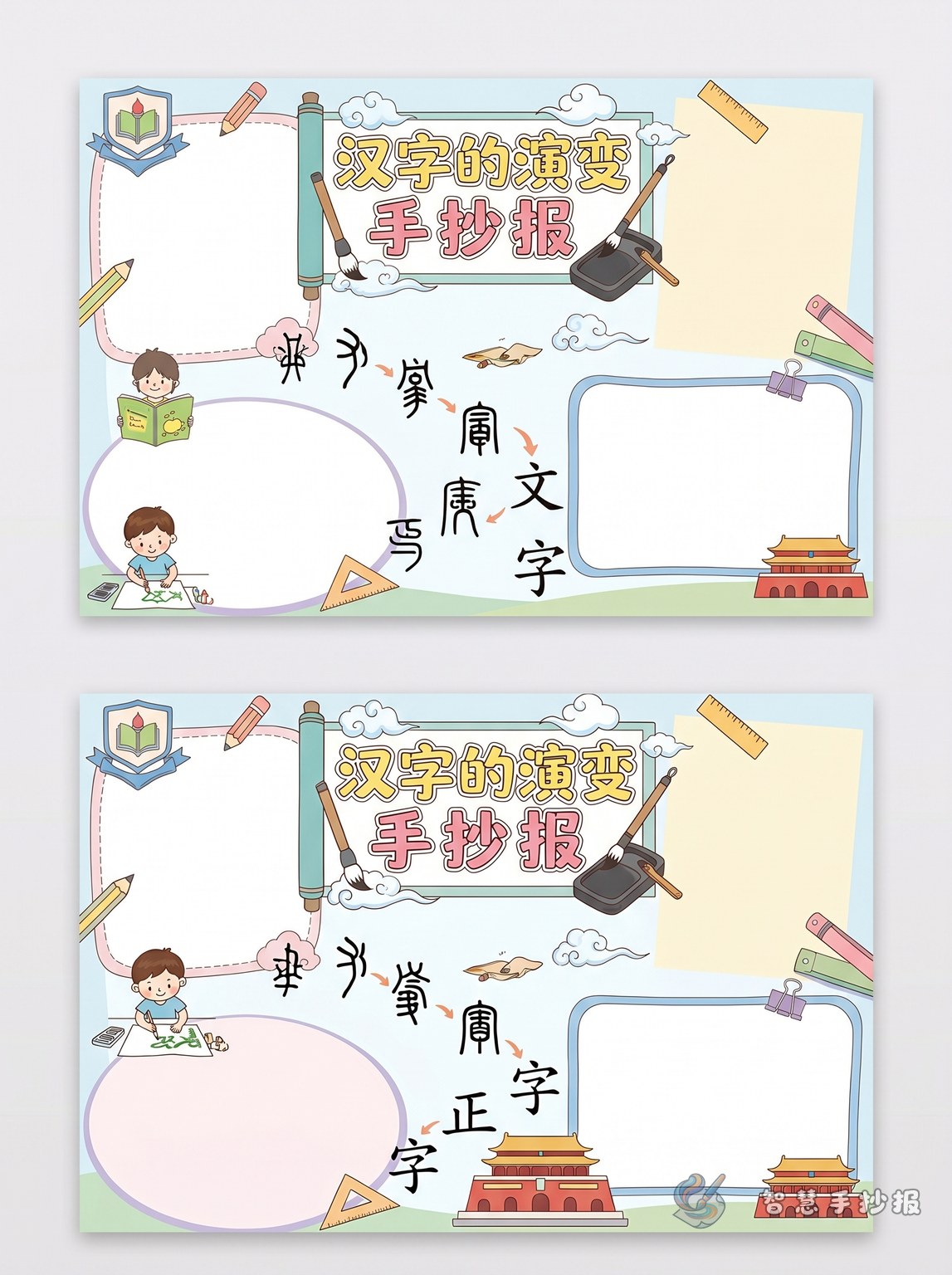
For a handwritten newspaper about the evolution of Chinese characters, do not simply list historical periods. A better approach is to show how characters gradually changed from pictorial forms into standardized writing. Place the main title in the center, then arrange sections for oracle bone script, bronze inscriptions, small seal script, clerical script, and regular script around it.
For elementary students, the content should stay simple. Focus on three points: how the shape changed, what each style looked like, and why this matters in Chinese culture. That balance makes the page both educational and easy to read.
Useful section ideas for the page
- Timeline of change: Show the five major stages in order with one short explanation each.
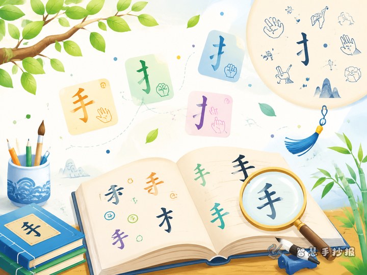
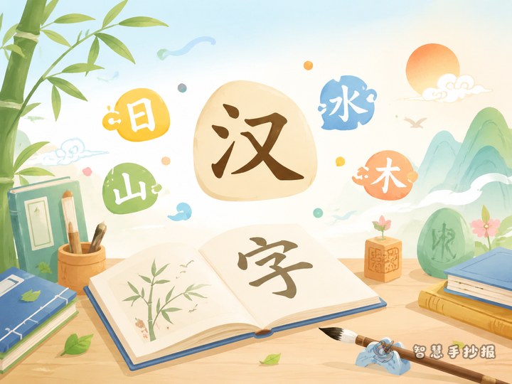
- Character comparison: Use simple examples like sun, moon, mountain, water, and person to compare shapes across time.
- Fun facts about Chinese characters: Briefly explain how characters developed from pictographs into a richer writing system.
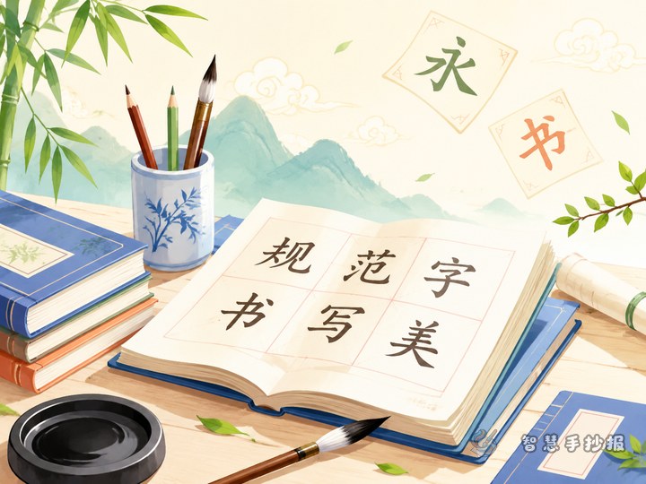
- Calligraphy corner: Introduce visual features such as the balanced form of small seal script or the neat structure of regular script.
- My reflection: Add a short student paragraph about what was learned from studying Chinese characters.
Ready-to-use writing material
Chinese characters are an important carrier of traditional Chinese culture. They have changed over a very long period of time. Oracle bone script was often carved on bones and shells, and many characters looked like pictures. Bronze inscriptions appeared on ritual bronze vessels and became rounder in form. Small seal script was more even and orderly. Clerical script became flatter and more flowing. Regular script gradually developed into the standard writing style still used today.
The evolution of Chinese characters shows not only changes in writing, but also the development of Chinese civilization. Learning this process helps students understand language, history, and culture in a vivid way.
Layout ideas that look better on paper
This topic works well as a scroll-like timeline design. You can draw a horizontal or vertical line across the page and connect each script stage to it. Add small illustrations such as bones, bamboo slips, brushes, seals, or bronze patterns to strengthen the traditional feeling.
Good color choices include beige, black, red, and muted green. The title can have a calligraphy-inspired look, but the body text should remain neat and easy to read.
How to make it feel like a real student project
Do not fill every part of the paper with text. Leave some space so the page feels clean and balanced. Keep each section short, and highlight key ideas with bold mini-headings or colored labels. It also helps to sketch the layout first before writing the final version.
If you want to keep improving the layout, title style, or extra sections, you can continue creating your handwritten newspaper in the Smart Handwritten Newspaper WeChat mini program.