Start with a clear angle: turn “eat less sugar” into a visible tooth-care message
This poster topic works well when it focuses on less sugar, healthy eating, and cavity prevention. A good title should clearly show the link between sweets and teeth. Compared with a general brushing topic, this angle gives students more to write about and makes the poster more practical for daily life.
You can also add a short slogan under the title, such as “Less sugar, healthier teeth” or “Good teeth begin with smart eating.” That helps the whole layout stay focused and easy to understand.
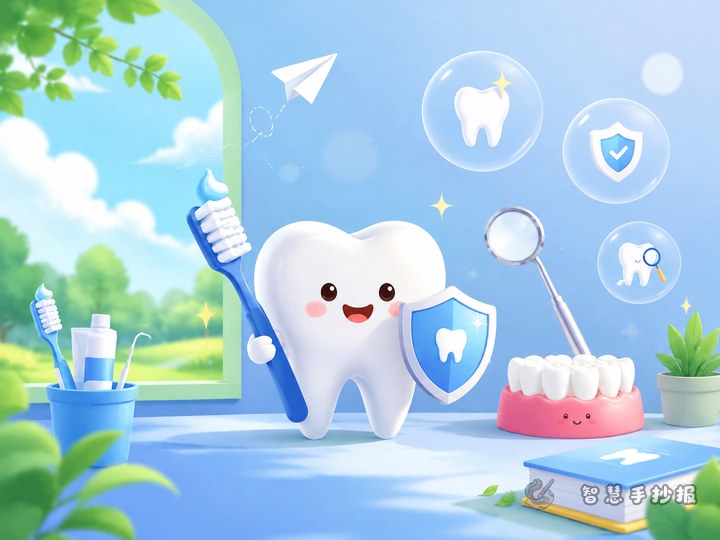
Ready-to-use sections for the poster
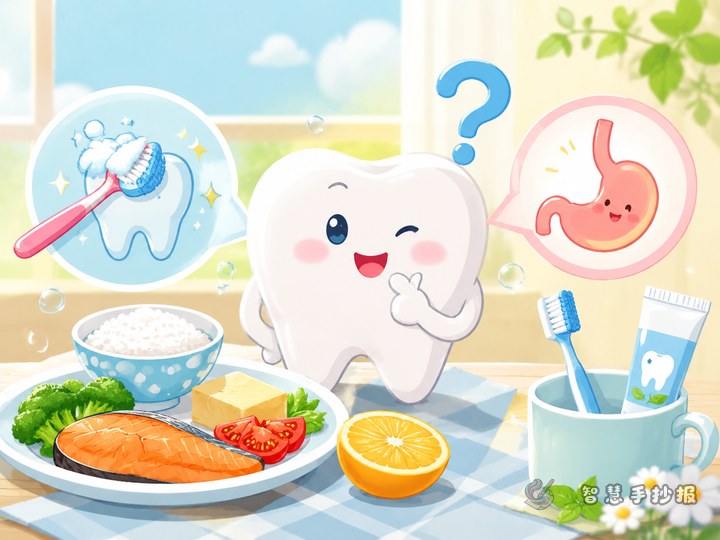
Section 1: Why sweets can harm teeth
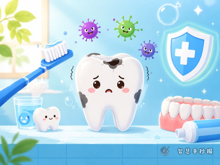
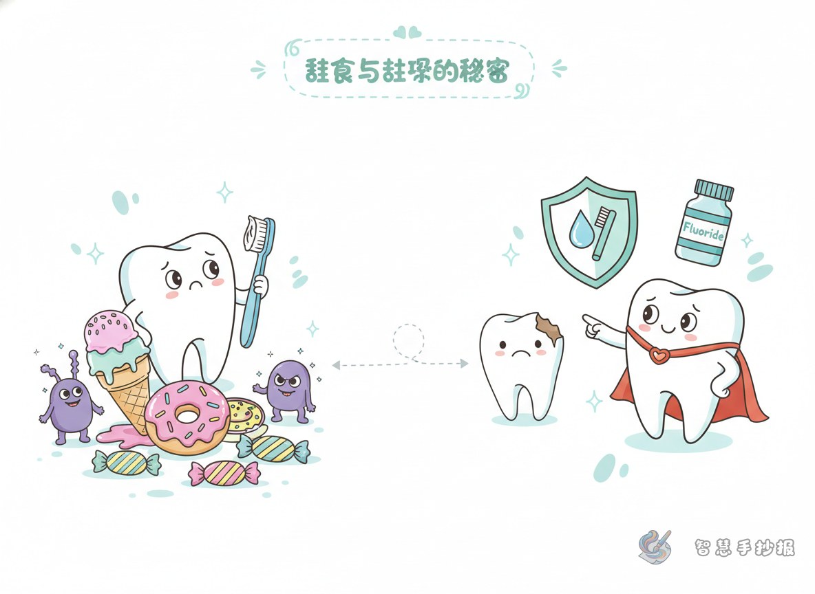
After sugary food enters the mouth, bacteria break down the sugar and produce acid. Over time, that acid can damage the tooth surface and lead to cavities. Sticky candy, chocolate, cake, and sugary drinks are especially common examples. If a child does not rinse or brush after eating them, teeth are more likely to be affected.
Section 2: Eating habits that make teeth work harder
- Keeping candy in the mouth for a long time
- Eating sweets before bed and not brushing afterward
- Drinking sugary beverages instead of water
- Snacking on sweets many times a day
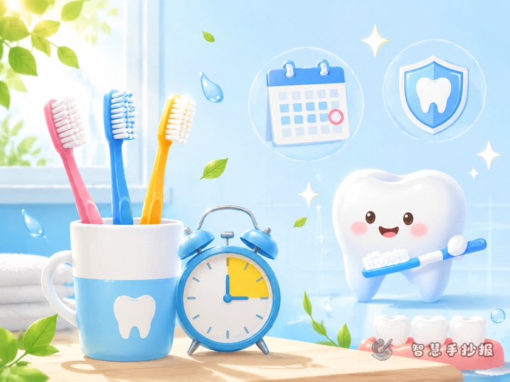
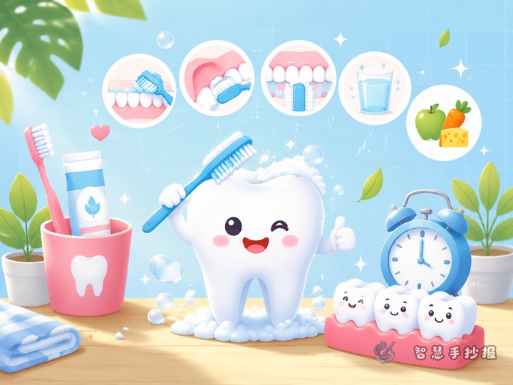
Section 3: Simple eating tips for healthier teeth
- Eat fewer very sweet or sticky snacks
- Rinse your mouth after sweets
- Drink more water and fewer sugary drinks
- Choose fresh fruits, vegetables, and dairy foods
- Keep the habit of brushing in the morning and at night
Short lines students can copy into the poster
- Use your teeth every day, so protect them every day.
- Less sugar, stronger teeth.
- Rinse after meals and keep cavities away.
- Care for your teeth and smile with confidence.
- Drink less soda and enjoy a fresher mouth.
If there is still open space on the page, students can add a short message: Starting today, eat fewer sugary and sticky snacks, build healthier eating habits, and protect your teeth every day.
Layout ideas that make the poster easier to read
A good layout is “big title in the center with sections around it.” Put the main title in the middle, then decorate with small drawings such as teeth, toothbrushes, cups of water, apples, or sugar cubes. One side can explain why sweets hurt teeth, while another side can list tooth-friendly habits and short slogans.
Light blue, white, and light green work well because they feel clean and healthy. You can add a little yellow or pink to represent sweets, but do not overuse them, or the poster may look too playful and weaken the health message.
How to make the finished poster look stronger
Keep the writing short and clear instead of using long paragraphs. Bullet points are easier for children to copy and easier for readers to understand. The goal is not to include difficult science, but to present a clear message: too much sugar can hurt teeth, so healthy habits matter.
If you want to keep improving the layout, decorations, and handwriting style, you can continue creating in the Zhihui Shouchaobao WeChat mini program.