Start with a focused and student-friendly title
A handwritten newspaper about homophones and similar-looking Chinese characters works well because it connects directly to daily language learning. A good title could be How to Tell Apart Homophones and Similar Characters, Characters That Are Easy to Mix Up, or Same Sound, Different Character. This kind of topic is practical, easy to understand, and suitable for a school display.
You can add a short opening line below the main title, such as: Some Chinese characters sound the same or look alike, so careful observation helps us read correctly, write correctly, and use them correctly.
A four-part layout is neat and easy to read
This topic looks best with a central title and four surrounding sections. The page stays organized, and each part has a clear purpose.
- Top left: What are homophones?
- Top right: What are similar-looking characters?
- Bottom left: Common confusing examples
- Bottom right: Memory tips and study advice
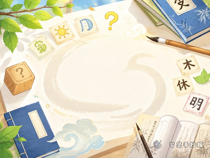
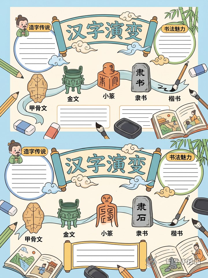
For decorations, you can use brush pens, ink dots, bookmarks, scroll shapes, or grid-paper elements. These details match the theme of Chinese language and calligraphy without making the page too crowded.
Use short text materials that are easy to copy
About homophones
Homophones are characters with the same pronunciation but different forms and meanings. When learning them, students should not rely only on the sound. They should also look at the word and the sentence to understand the correct meaning.
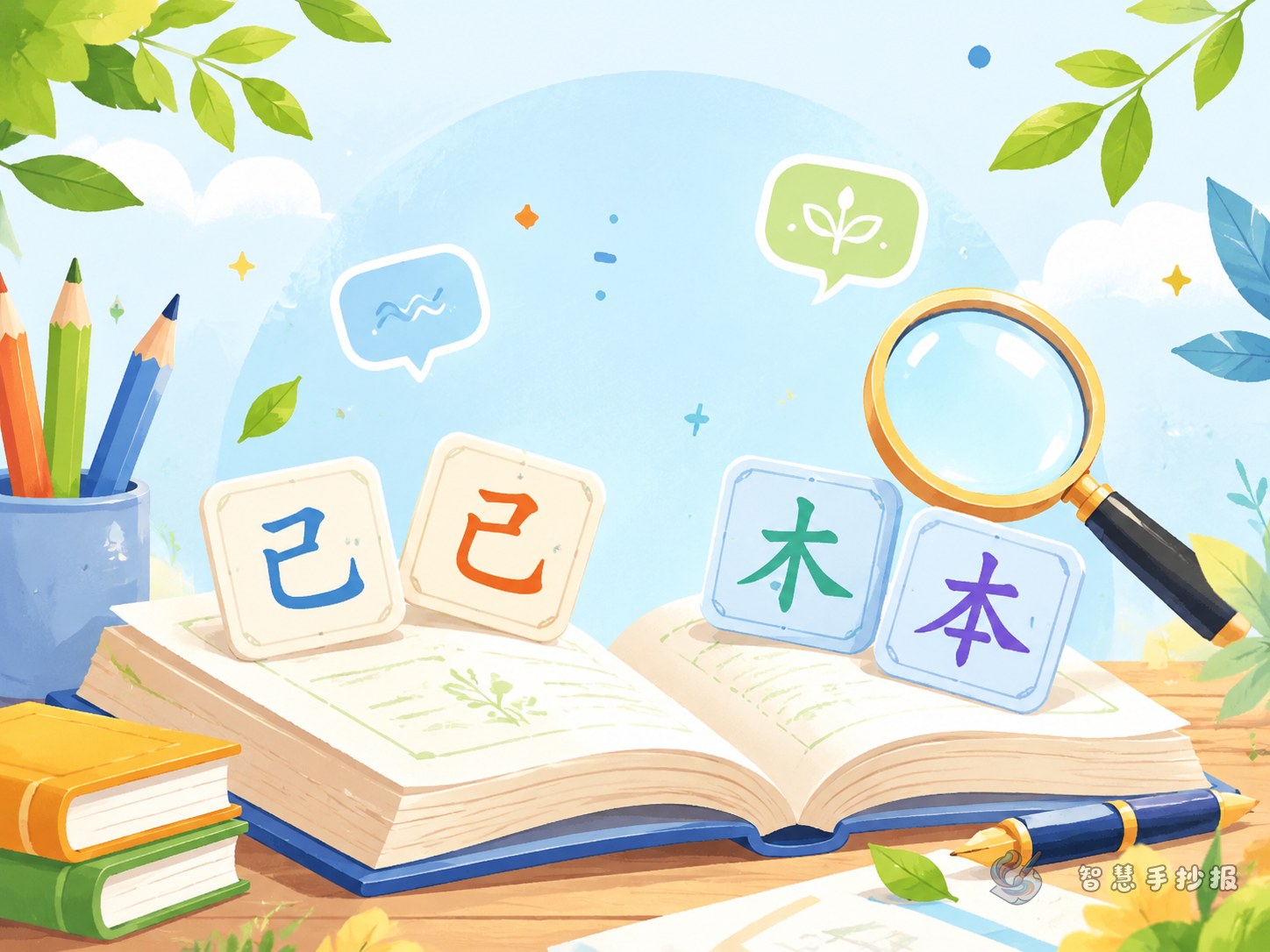
About similar-looking characters
Similar-looking characters are characters whose shapes are close to each other and are easy to confuse in reading or writing. To tell them apart, students can pay attention to radicals, stroke length, and the position of each part.
Suggested examples
- 在 / 再: one is often used for location or current action, and the other means again.
- 做 / 作: one is common in daily actions like doing homework, and the other appears in words like writing or creating.
- 晴 / 睛: one relates to weather, and the other relates to eyes.
- 未 / 末: they look close, but the upper stroke position is different.
You do not need too many examples. Choosing five to eight common pairs is enough for a clear and useful handwritten newspaper.
Add memory tricks to make the page more lively
If the newspaper only gives definitions, it may feel plain. Short memory lines or learning tips make the work more interesting and more personal.
- For homophones: Think about the meaning before choosing the character.
- For similar forms: Look at the radical first, then check the strokes carefully.
- For writing: Write slowly and carefully, one stroke at a time.
You can also include a small section called Characters I Often Write Wrong. This makes the newspaper feel like a real learning record made by the student.
Choose a calm style for the whole page
This theme does not need too many bright decorations. Light blue, pale green, beige, or soft ink colors work well. Make the section titles a little bolder, keep the body text readable, and leave enough blank space. If you want a stronger calligraphy feeling, write the main title larger and add simple border details inspired by brushes, seals, or practice grids.
For younger students, use short sentences and simple word cards. For older students, add more explanation about meaning, radicals, and common mistakes.
End with a short and useful conclusion
A simple ending can say: Characters may sound the same but mean different things, and characters that look alike are not always the same. Careful observation, repeated practice, and learning through words and sentences help us use Chinese characters accurately and beautifully.
If you want to improve the page layout, add more sections, or continue polishing the design, you can explore ideas in the Zhihui Shouchaobao WeChat mini program and keep building your handwritten newspaper there.