Choose one clear focus before you start
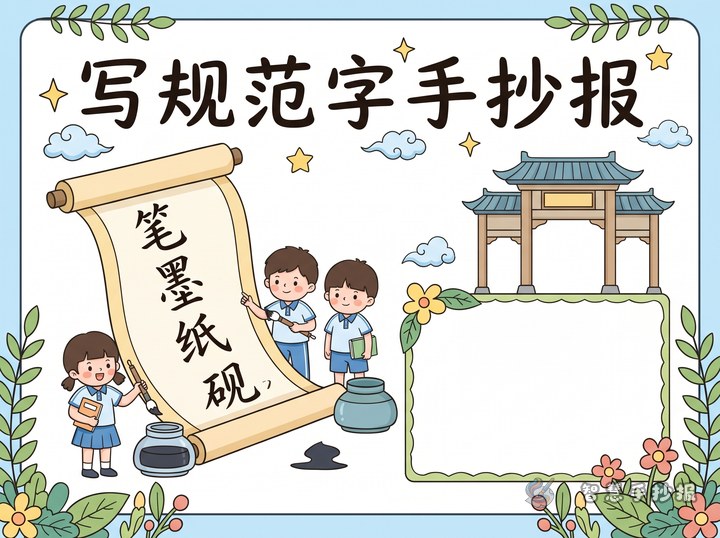
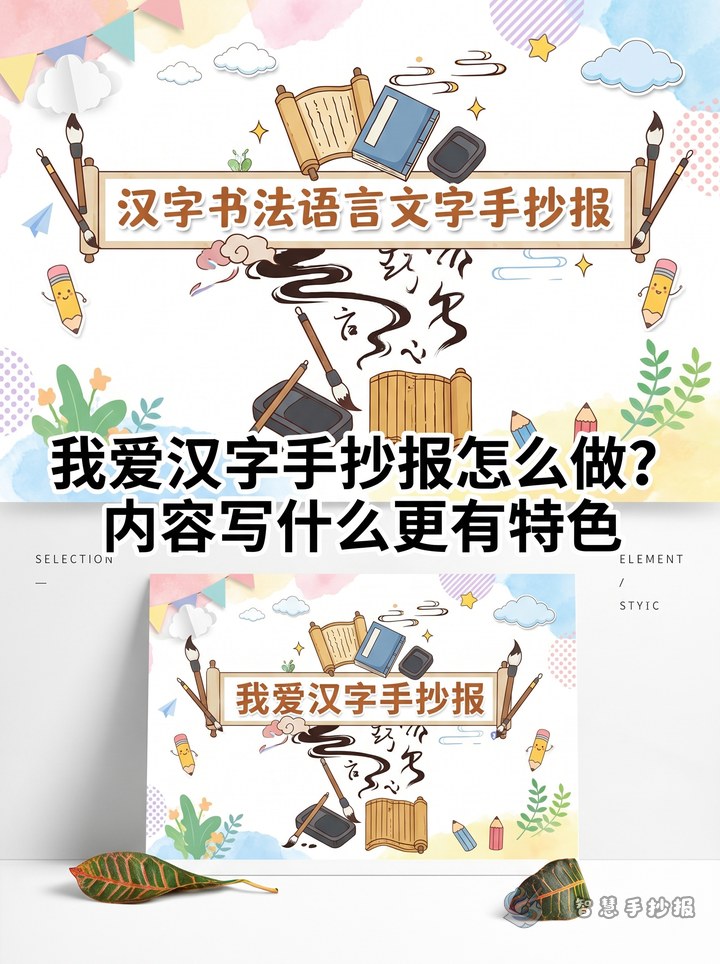
A calligraphy handwritten newspaper looks better when it has one strong theme instead of covering everything at once. You can build it around ideas like The Beauty of Chinese Calligraphy, Good Handwriting Habits, Calligraphy in My Study Life, or Writing Chinese Characters Carefully.
For primary school students, it is best to keep the theme simple, meaningful, and easy to illustrate. A focused topic makes it easier to select text, headings, and decorations.
Useful sections that make the page feel complete
Section 1: What is calligraphy?
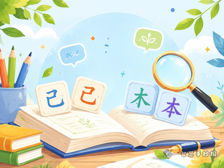
You can write a short explanation: calligraphy is the art of writing Chinese characters beautifully and carefully. It pays attention to strokes, structure, and overall balance.
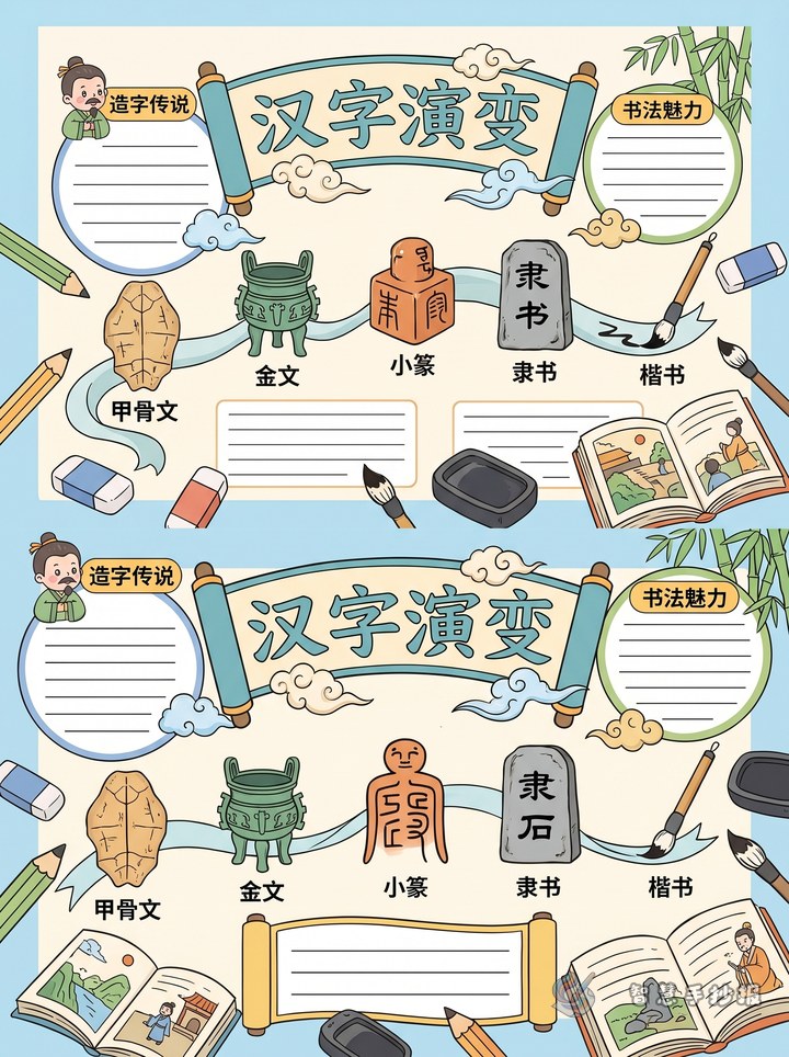
Section 2: Common script styles
- Regular script: neat and clear, great for beginners.
- Running script: smoother and more natural.
- Clerical script: wide and graceful in shape.
- Seal script: even lines with a traditional feeling.
Section 3: Handwriting tips
- Sit upright and keep a proper distance from the paper.
- Hold the pen naturally, not too tightly.
- Practice basic strokes first, then complete characters.
- Write a little every day for better results.
Section 4: Short quote corner
You may add simple sayings such as “Careful writing shows careful thinking” or “One stroke at a time builds good habits.” Short lines are easy to copy and look elegant on the page.
Ready-to-use text ideas
If you are not sure what to write, choose from these types of content.
- Short theme paragraph: Calligraphy teaches me patience and helps me see the order and beauty of Chinese characters. Every careful stroke shows focus and effort.
- Personal reflection: Practising handwriting is not only about writing neatly. It is also about learning to stay calm and attentive.
- Quote option: Write neatly, think clearly, and grow steadily.
- Study goal: Start from posture, learn from strokes, and build good handwriting habits every day.
Short content blocks usually work better than one long passage because they are easier to read and arrange.
Layout ideas that match the topic well
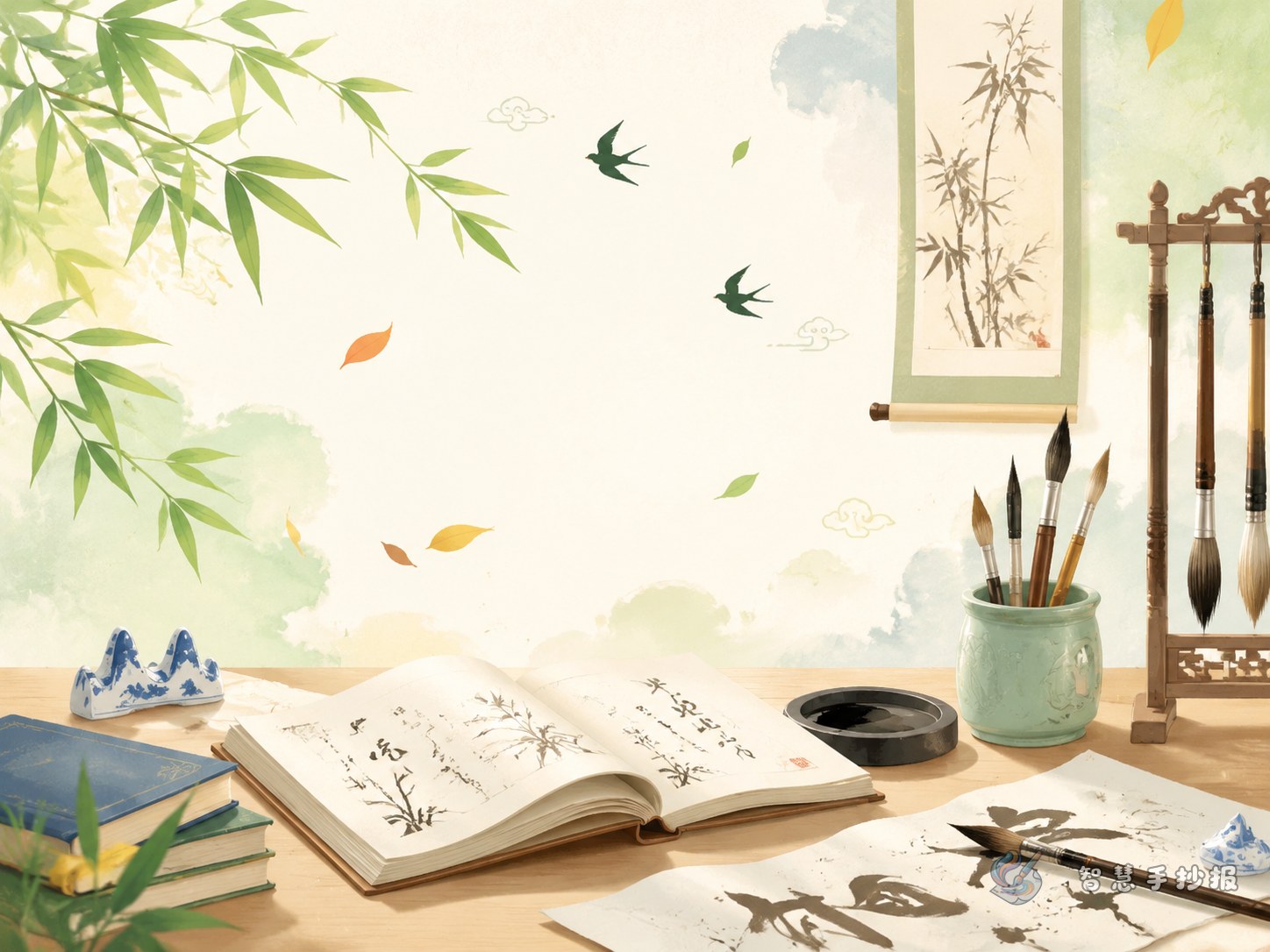
Place the title at the top center and design it with a strong calligraphy feeling. Around the title, you can add brush shapes, ink drops, seals, scroll borders, bamboo leaves, or square writing grids.
For the main body, a center title with four surrounding sections or a two-column layout with a reflection box at the bottom works very well. Colors such as black, dark blue, ink green, and red suit this theme. Do not overfill the page. White space can make the work look cleaner and more refined.
Small details that improve the final result
- Highlight a few beautiful Chinese characters such as harmony, beauty, calmness, or elegance.
- Add tiny stroke practice boxes in the corners.
- Use thicker lines for headings and thinner lines for body text.
- Finish with one short personal note about what calligraphy means to you.
If you already have a theme and want to continue improving the layout, sections, and color choices, you can also explore more ideas in the Zhihui Shouchaobao WeChat mini program.