Build a Focused Dunhuang-Inspired Palette
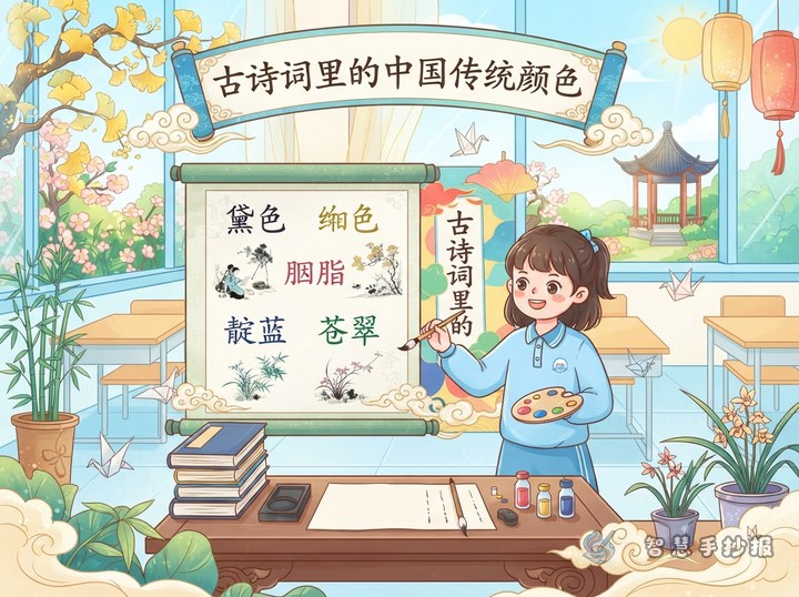
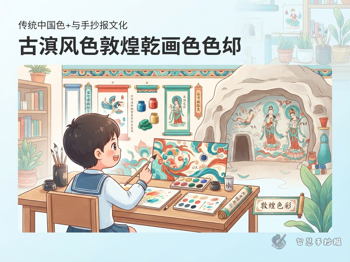
The page does not need to copy a particular mural. Instead, begin with the broad color impression of Dunhuang art. Use cream, ochre, and earthy red for warmth, add mineral blue and green for contrast, and reserve a small amount of gold for important details.
A useful rule is to apply the main color generously, the supporting colors moderately, and the brightest accent sparingly. For example, use cream for the background, ochre for borders, blue for the headline, green for patterns, and gold only for dots or thin lines.
Shape the Page Like an Unfolding Art Treasure
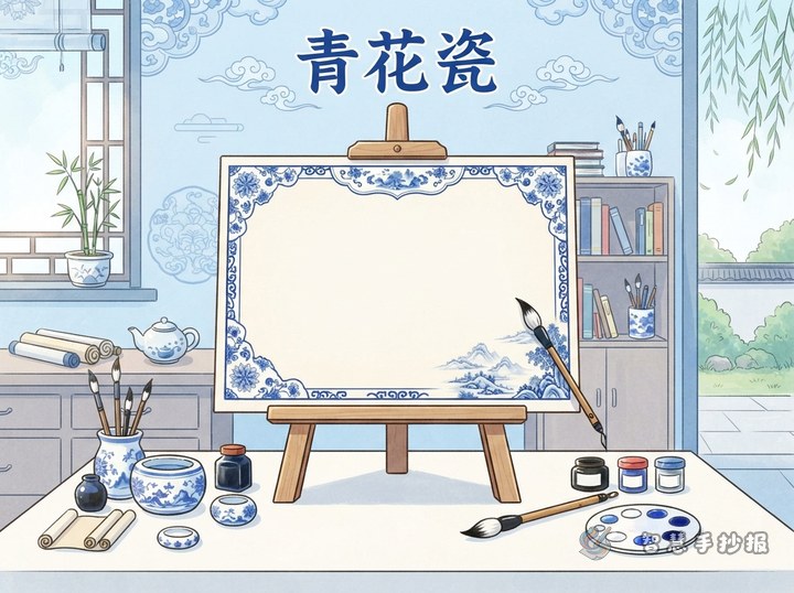
Draw a simplified cave arch across the top and place the headline beneath it. Curved ribbons can guide the eye toward sections on both sides, while a narrow pattern band along the bottom can make the whole page resemble an unfolding mural.
- Headline area: Write the title in blue or earthy red with a thin golden outline.
- Centerpiece: Add a simple flying figure silhouette, lotus, or geometric ceiling motif without using more than one-third of the page.
- Text areas: Create three or four boxes of different sizes and decorate their edges with clouds or repeating shapes.
- Open space: Leave gaps between illustrations, patterns, and text so the colors do not merge into a crowded block.
Three Sections That Connect Color and Culture
The Color Impression of the Murals
Suggested text: Dunhuang murals create a rich yet calm visual impression. Earthy red and ochre feel warm and substantial, while blue and green add clarity. Together, these colors help figures, patterns, and story scenes stand out.
Balancing Warm and Cool Tones
Suggested text: Warm colors work well for backgrounds, frames, and a sense of history. Cool colors can emphasize titles, ribbons, and selected patterns. The two groups do not need equal space; one dominant color and several supporting tones create better depth.
Reading Cultural Beauty Through Color
Suggested text: Traditional colors do more than decorate a picture. They also reflect historical ideas of beauty and imagination. In Dunhuang-inspired art, lines, patterns, and colors work together to create a mood that feels dignified, lively, and harmonious.
Turn Complex Art into Easy Decorative Motifs
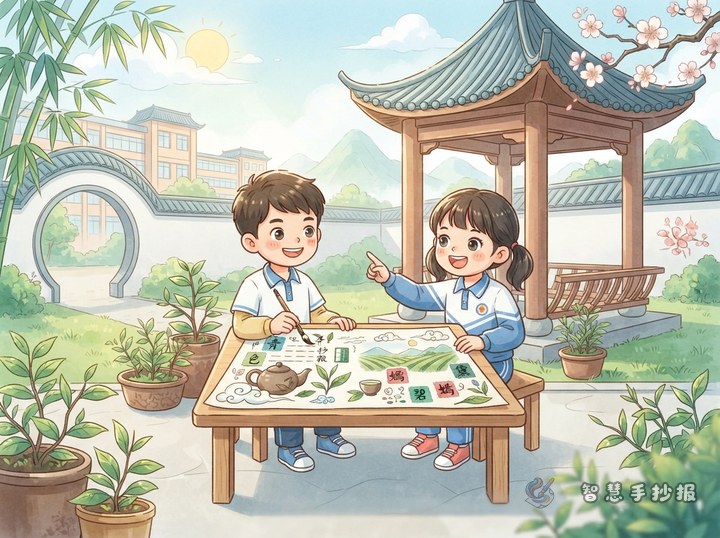
Students can break difficult designs into basic shapes. Repeated semicircles become lotus petals, curved lines and teardrop shapes suggest flowing ribbons, and circles arranged with squares can create a ceiling-pattern border. Decorations should support the written content rather than imitate an original mural exactly.
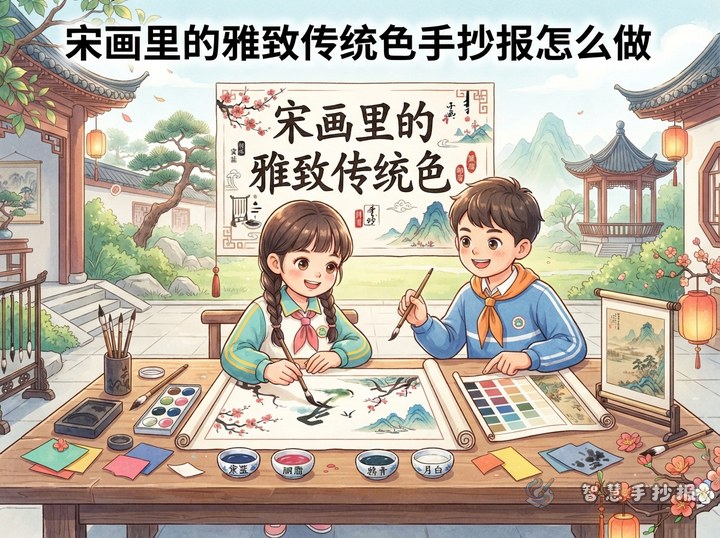
- Sketch the positions of the title, illustrations, and text boxes in pencil.
- Establish the cream background and ochre border to unify the palette.
- Add blue and green to the title, ribbons, lotus forms, and other focal points.
- Write the short text sections, then add a few golden highlights and dividers.
- Check readability and remove any repeated patterns or color blocks that feel crowded.
Run a Final Color and Readability Check
Make sure the title is the first element viewers notice and that the sections follow a clear reading order. If the page feels too cool, add thin ochre lines. If it feels overly warm, balance it with small blue motifs. Avoid heavy layers of color that may cover outlines or make handwriting difficult to read.
After preparing the draft, scan the code to open the 智慧手抄报 WeChat Mini Program, where you can continue choosing a suitable layout and refining the placement of sections and decorations.