Begin with the palette of a cup of tea
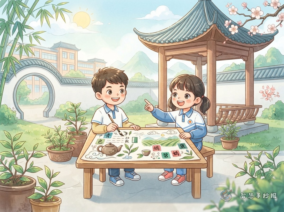
A tea-inspired page gives traditional Chinese colors a clear visual thread. Choose one type of tea as the starting point. Green tea works well with bamboo green, willow yellow, and moon white; black tea can use reddish brown, chestnut brown, and deep red. Limit the page to three or four colors. Let a light shade cover most of the page, use supporting colors for boxes and borders, and save the darkest color for headings and outlines.
Arrange the sections like a small tea setting
- Tea Color Notes: List three traditional colors, their visual feeling, and where each can appear on the page.
- One Leaf, One Color: Describe how tea changes from a fresh leaf to brewed tea, with short captions and small leaf or cup drawings.
- Matching Tips: Add simple rules such as using a light background, placing similar colors together, and adding dark accents sparingly.
- My Favorite Tea Corner: Write one or two sentences about a color pair you like, such as bamboo green with moon white.
Ready-to-use text
Opening: Traditional Chinese color names carry observations of nature and the beauty of everyday life. A cup of tea, from leaf to liquor, can introduce fresh, warm, and quiet East Asian color combinations.
Color cards: Bamboo green recalls young bamboo and new leaves, making a page feel fresh. Moon white is like moonlight on white porcelain and keeps the layout clean. Reddish brown resembles earth and pottery, creating a warm, simple mood. Chestnut brown is calm and works well for small headings and thin borders.
Closing: Notice the colors in tea and record the warmth of traditional shades with a pencil and brush. Let the finished page feel like a small, peaceful tea table.
Keep the layout light and balanced
Use white or pale beige paper as the tea table. Draw a round tea tray in the center for the main heading, then place uneven small cards around it for the sections. Write the heading in dark brown or ink black, with small bamboo-green and yellow accents. A few tea leaves, cups, and steam lines are enough; open space makes the colors look more elegant.
Check before you finish
- Keep the palette to three or four colors.
- Give every section a short, clear heading.
- Make sure dark text is easy to read against light areas.
- Connect each color name with tea, nature, or daily life instead of listing names alone.
After choosing a tea palette, use the Wisdom Handwritten Newspaper WeChat mini program to arrange headings, sections, and decorative elements for a complete project.