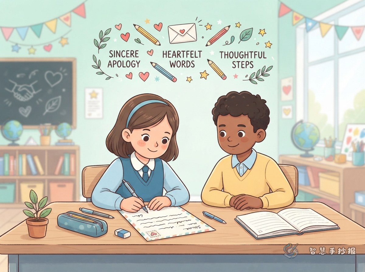
Why Apology Letter Posters Often Feel Forced
The first line is usually "I was wrong, I promise never to do it again," and then the same idea appears three more times in different words. The page ends up reading like a punishment essay rather than a letter. A handwritten newspaper is read by classmates, parents and teachers, so the page has to show what actually happened.
Before drawing anything, decide three things: who you are apologising to, what the apology is about, and what you want the reader to feel at the end. Once those are clear, the layout has a backbone and the sentences stop wandering.
Four Blocks Every Apology Letter Poster Should Have
- Greeting: the name on the top left, followed by one soft opening line.
- What happened: two or three plain sentences, no excuses and no exaggerated self-blame.
- The apology and your feelings: why you are sorry and what you understand about the other person.
- Putting it right: one or two things you can do straight away, which sound far stronger than "I will change".
Finish with your signature and the date in the bottom right corner. Greeting on the left, signature on the right: this small detail makes the whole page read like a real letter.
Building the Body: Happened, Understood, Will Do
Step one: say what happened, without defending yourself
Stick to facts. You borrowed a book and forgot to return it. You put the broom in the wrong place during cleaning duty. You spoke too quickly and embarrassed someone. One sentence, one event, so the reader can follow.
Step two: name their feeling and your own
This is the heart of the letter. Try: "I thought about it later, and you must have been really worried." Naming the other person's feeling carries more weight than writing "sorry" ten times.
Step three: offer a fix you can actually check
Make it visible. "I will cover the book again and bring it back tomorrow." "I will take an extra day of cleaning duty this week." A concrete step is where an apology lands.
Layout Choices That Make the Tone Feel Serious
The biggest mistake is filling every corner. Leave about a third of the paper empty so the eye has somewhere to rest, and the whole page will feel calmer.
- Make the main title a little larger, in neat handwriting rather than a flashy display font.
- Keep colours low-saturation: beige, light grey and pale blue, with red only on one or two small icons.
- Divide the body with thin lines; breathing room matters more than decorative borders.
- Leave a small box in one corner titled "Three things I will change", each point on its own short line.
Sentences to Borrow, Drawings to Add, and a Final Check
Good openers: "I thought about this for a long time before writing." / "I want to explain something that has been on my mind."
Good bridges: "I know one apology cannot change much, but I still want to say it." / "If it were me, I would probably feel sad too."
Good closings: "I hope you can give me a chance to do better." / "Whatever you decide, I will still get this small thing right."
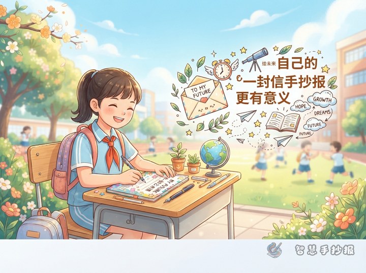
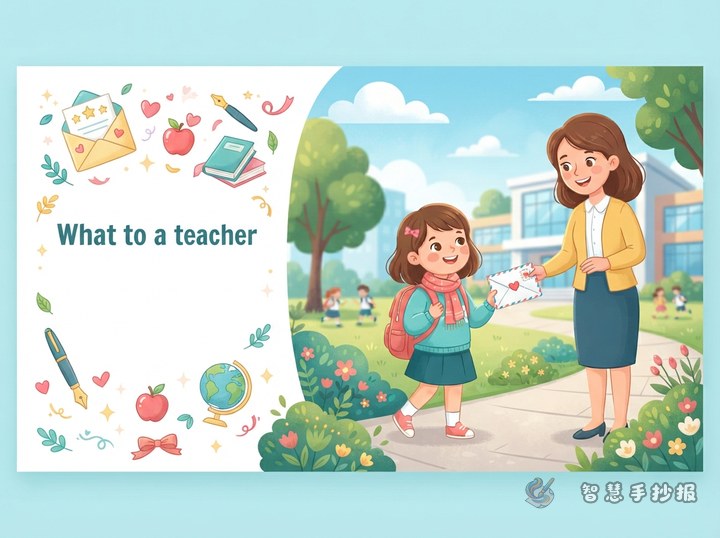
For drawings, an envelope, a paper plane, two hands clasped together, a small watered plant or a paper boat by a desk corner all fit the theme and take only a few minutes.
Before handing the poster in, check that the greeting, body, signature and date are all present, that no sentence blames someone else, that the fixes are realistic, that names are spelled correctly, and that the text is not touching the border. If you want to save time, open the WeChat mini program and search for the template library to drop your finished sentences into a ready-made practical-writing layout.