
Make the Mountain the Main Character
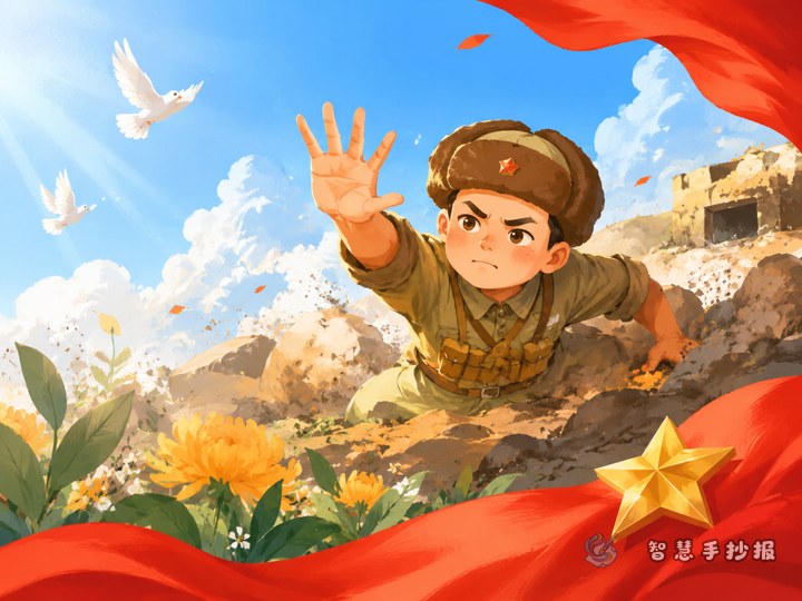
A Langya Mountain Five Heroes handwritten newspaper differs from most red-story projects because it involves five people in one very short event. Writing five separate paragraphs usually fills the page and flattens the reading experience. A better approach is to let the mountain carry the design and let the five names become markers on it. The page then has a clear hierarchy.
Before starting, jot down three things on scrap paper: where the event took place, what the five soldiers were doing, and what you want readers to remember. Once those three sentences are clear, the final copy will not need constant erasing.
Split the Page With a Mountain Outline
Lightly divide the page into three areas, roughly in a 1:2:1 ratio.
- Left slope: draw a thick zigzag rising from the lower left toward the centre and close it into a shape. Inside, stack five small name cards with even gaps between them.
- Central peak: the largest area, holding the main text about what happened. Use a slightly larger font and generous line spacing.
- Right side: leave it fairly open, with only a short closing sentence so the eye has somewhere to rest.
The mountain does not need to look realistic. Two levels of peaks built from straight lines are enough. Outline first, then colour with two shades of green or blue-grey. Avoid filling the whole shape with dark colour, or the handwriting will disappear.
Three Columns Work Better Than Five Stories
Column one: what happened at that moment
This is the main text area. Use three to five sentences to explain the overall event: the five soldiers drew the enemy toward a dead end so that civilians and the main force could move away, and finally jumped from the cliff. Favour verbs over adjectives and keep sentences short, which is easier to arrange on a page.
Column two: five names, five cards
Write each name on its own small card shaped like a peak or a little flag. Add one short role label under each name, and avoid repeating the same sentence pattern five times.
Column three: the line I remember
Write one or two sentences of personal response, kept to three lines. This is the landing point of the whole page, so do not copy a long passage. Something like “After reading this, I thought about…” feels genuine and fits the space.
Keep the Writing From Getting Crowded
- Draw light pencil lines in every column and keep the spacing identical throughout.
- Limit the main text to about fourteen to eighteen characters per line and start a new line two squares before the edge.
- On the name cards, write only the name and role, with no explanation, so they do not turn into dark blocks.
- Put the title on the summit, one size larger than the body text, with spaced characters and a clear gap beneath.
If a column still has empty space, do not force extra words into it. A few small pine trees, rocks or cloud shapes look better than cramped text.
A Two-Minute Check Before Handing It In
Hold the page at arm’s length and ask: is any single block of text too dense? Are the five names aligned in the same direction? Is the title the most noticeable line? Have I used no more than three colours? If all four answers are yes, the layout is solid. To adjust the design, try different title lettering or add a few short passages, open Smart Handwritten Newspaper in the WeChat mini program and continue from this mountain layout without redrawing the grid.