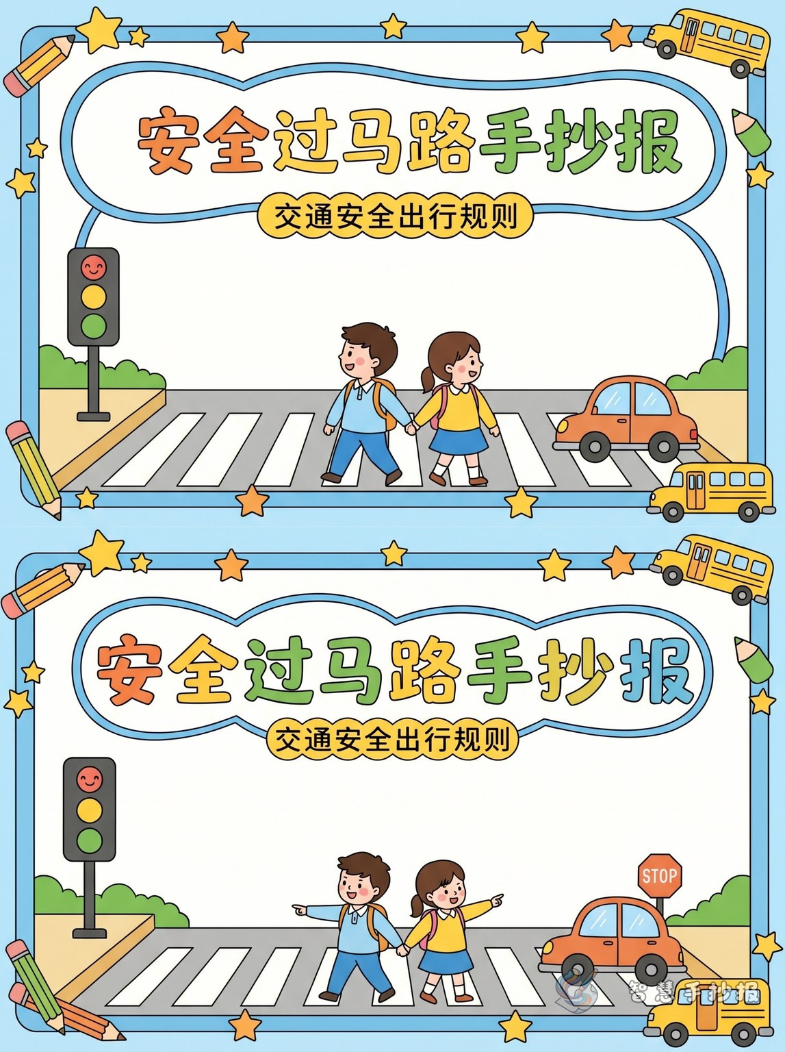
Start with a clear center theme
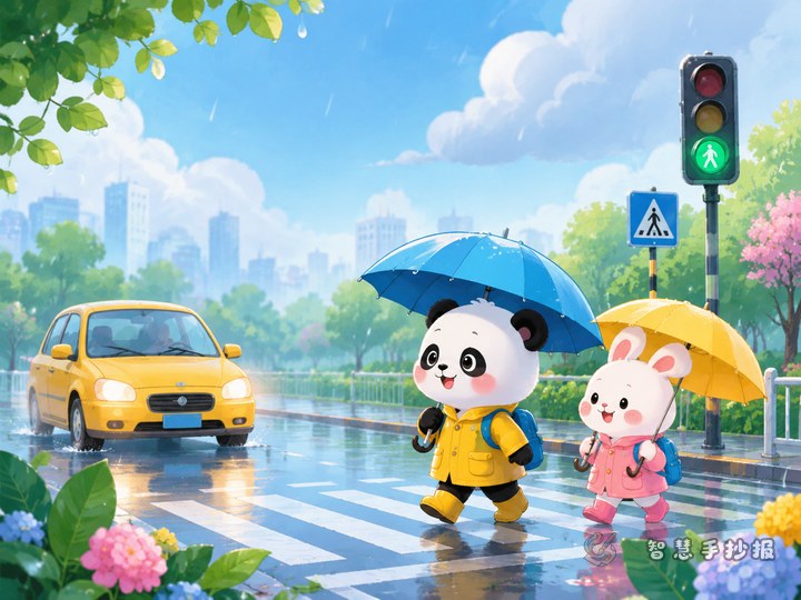
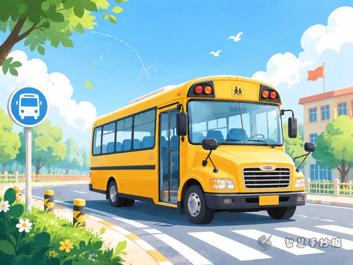
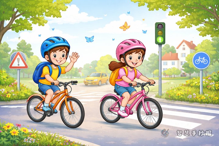
This handwritten newspaper works best when it focuses on safe road crossing for primary school students. A strong main title can include ideas like safe crossing, road safety on the way to school, or walking with traffic rules. In the middle of the page, draw a zebra crossing, traffic lights, and a child with a schoolbag so the topic is easy to understand at first sight.
To make the page organized, build the content around four key points: obey the traffic lights, use the sidewalk, do not run or play near the road, and stay away from vehicle blind spots. Keep the writing short and easy to copy.
Useful sections to include
Section 1: Four steps for crossing the road
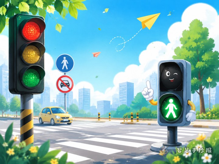
- Stop first and do not rush.
- Watch the traffic lights carefully.
- Use the zebra crossing.
- Look both ways before crossing.
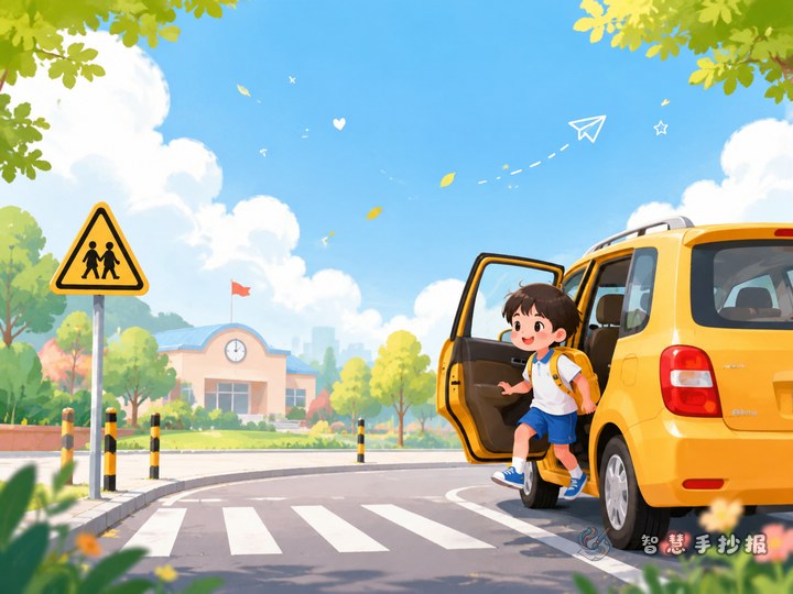
Section 2: Good habits on the way to school
- Walk on the sidewalk in an orderly way.
- Do not chase or push others near the street.
- Do not eat while walking or get distracted.
- Be extra careful at crossings and corners.
Section 3: Behaviors to avoid
- Climbing over barriers.
- Running out in front of a car.
- Standing too close to large vehicles.
- Rushing when the green light is flashing.
Short text you can copy into the poster
Safety lines: Learn traffic rules and travel safely every day. Stop at red, go at green, and cross at the zebra crossing. Watch the lights, watch the road, and watch nearby vehicles.
Mini paragraph: On the way to and from school, we often need to cross roads. Following traffic rules is not only a school requirement, but also a way to protect ourselves and others. We should cross at zebra crossings, pay attention to traffic lights, and never run or play near the road. When everyone follows the rules, travel becomes safer and our streets become more orderly.
Short slogans: Walk with care, return home safe. Better to wait than to rush. Small steps with rules, big safety every day.
How to organize the page
A simple layout is to place a main picture in the center and small content blocks around it. Put a zebra crossing and traffic lights in the middle. In the corners, add crossing steps, warning tips, safety slogans, and good habits. This makes the information balanced and easy to read.
Use bright colors such as red, yellow, green, and blue. Red can mark warnings, green can show safe actions, yellow works well for borders or icons, and blue helps the whole page look clean. Make the title larger than the body text.
Tips to make the poster look better
Lightly divide the page with pencil before writing so the content will not feel crowded. Keep each section short, around three to five lines, for a neat result. Do not fill every space with drawings; some blank space makes the page cleaner. If you want to continue improving the title style, layout, and color matching, you can also visit the Zhihui Shouchaobao WeChat mini program for more poster-making ideas.