Choose a focused and visual theme
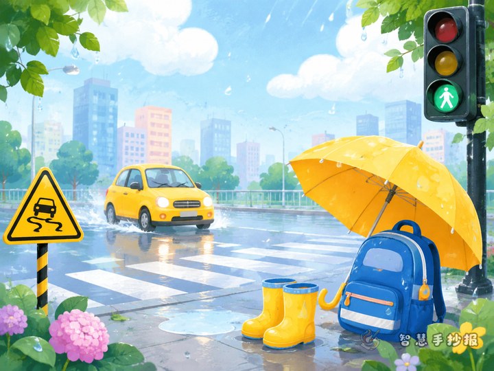
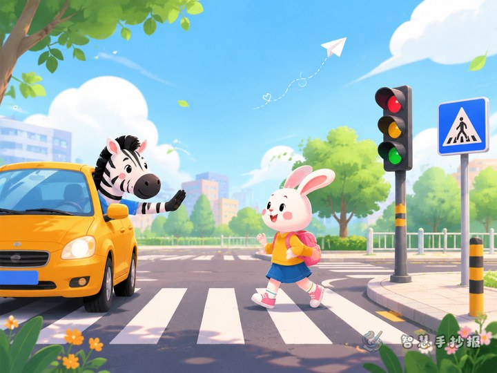
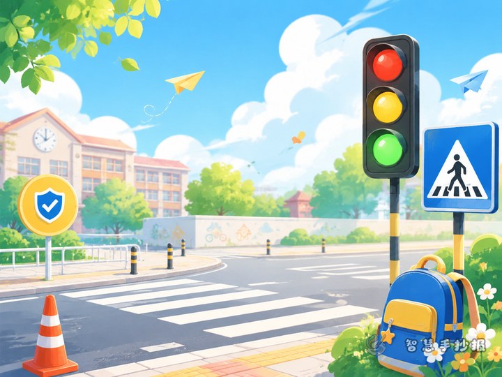
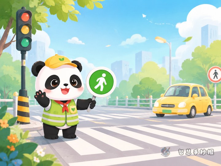
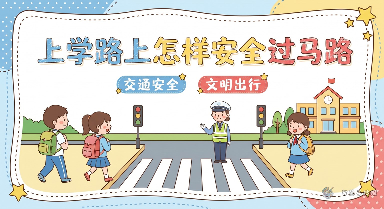
If you want your traffic safety poster to feel clear and practical, a strong angle is how to cross the road safely on the way to school. It connects directly with students’ daily life and is easy to illustrate with zebra crossings, traffic lights, school gates, sidewalks, and warning signs.
You can place the title at the top center and decorate it with simple icons such as red-green lights, road lines, footprints, or a stop sign to make the theme stand out immediately.
A clear layout that is easy to fill
- Section 1: Three steps to cross safely — stop, look, then walk.
- Section 2: Good manners on the road — do not run, do not push, do not cross on red.
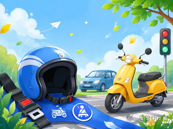
- Section 3: Risky actions to avoid — looking at a phone while walking, suddenly running into the road, chatting side by side while riding.
- Section 4: Safety slogans — short lines that work well as decorations around the page.
This structure makes the poster easy to read and gives each area a clear purpose.
Ready-to-use text materials
Three steps to cross the road safely
Before crossing the street, stop and check both directions for vehicles. Use the zebra crossing and obey the traffic lights. When the light turns green, walk across calmly and do not run back or stop in the middle of the road.
Short paragraph on civilized travel
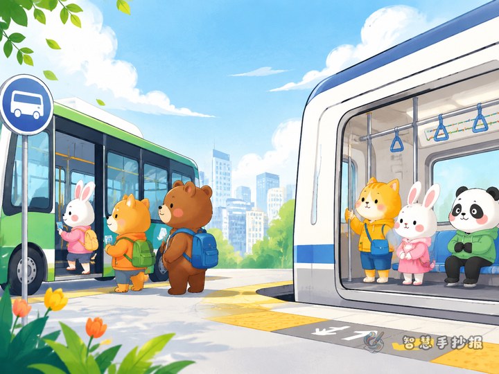
Civilized travel means following traffic rules and caring about your own safety as well as the safety of others. Walking on the sidewalk, waiting in line for the bus, and giving way in an orderly manner are all good habits. When everyone follows the rules, the road becomes safer and smoother.
Slogan ideas
- Stop at red, go at green, keep traffic rules in mind.
- Be polite at the zebra crossing, stay safe on every trip.
- Courtesy on the road brings safety to all.
- Do not run on the way to school, safe arrival matters most.
Make the page look lively
A creative idea is to design the whole poster like a school route map. Draw a road across the page and place each section at a different point such as the school gate, a crossing, a bus stop, or a sidewalk. This makes the content feel connected and fun.
Color choices can include red, yellow, blue, and green. Red highlights warnings, yellow brightens titles, while blue and green keep the page fresh and friendly. Borders can be shaped like road signs, dashed lane markings, or small traffic cones.
How to make a simple poster still feel complete
- Keep each section short, about three to five lines.
- Use small icons and numbering to make the layout neat.
- Place short slogans in blank spaces to fill the page naturally.
- Write the title larger and the body text in tidy smaller handwriting.
If you want more templates, border ideas, and layout help, you can continue creating in the Zhihui Shouchaobao WeChat mini program.