Start with a clear angle: make the warning memorable
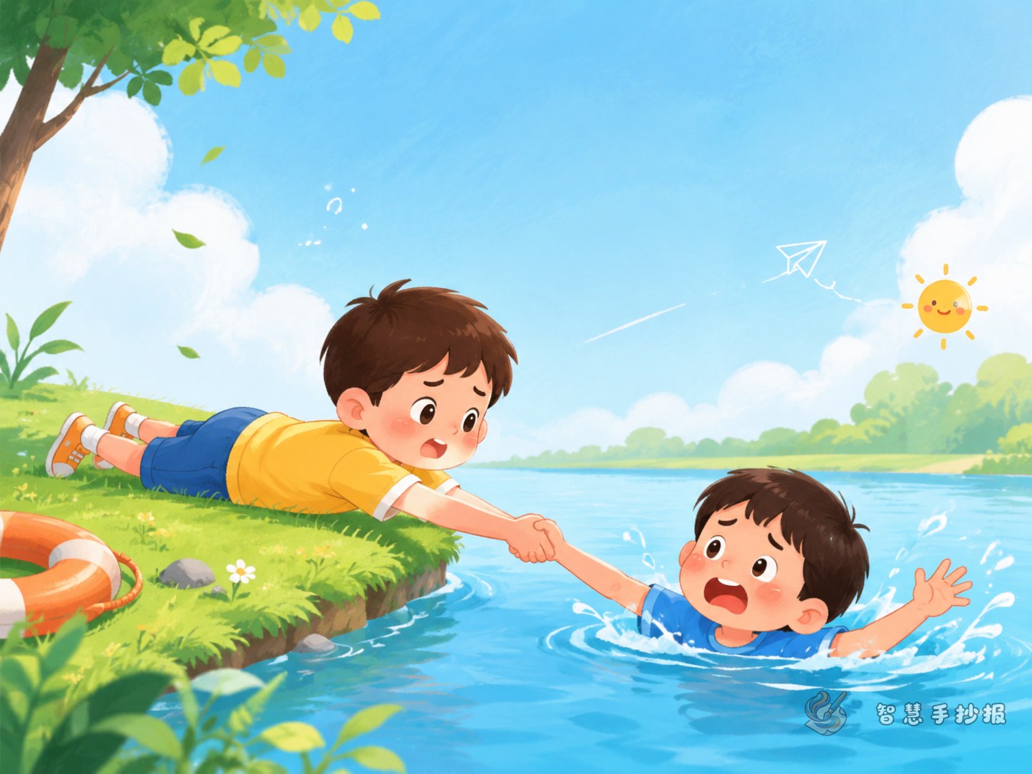
This poster works best when it focuses on one specific question: Should children form a human chain to save a friend who falls into the water? That is more useful than writing only general drowning prevention tips. A strong title and a short subtitle about calling for help, finding adults, and using rescue tools can make the page more practical.
Instead of scattering facts across the page, organize the content around a contrast between unsafe actions and correct responses. This makes the handwritten newspaper easy for children to read and remember.
The key message to place in the center
You can put the main safety statement in the most visible area:
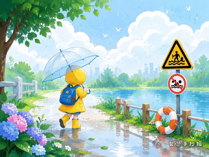
If a classmate falls into the water, do not jump in blindly and do not try to pull them out by forming a hand-in-hand chain. Wet banks are slippery, balance is unstable, and one emergency can quickly turn into several. The correct response is to shout loudly for help, find teachers, parents, or nearby adults at once, and call emergency services if needed. If it is safe, help from the shore with a life ring, long pole, rope, or floating object.
This short paragraph is ideal as the central message of the poster because it answers the reader’s most important question directly.
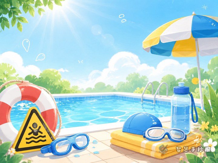
Ready-to-use writing materials
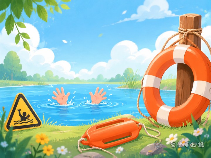
Unsafe actions to avoid
- Jumping into the water immediately after seeing someone fall in.
- Several children standing by the bank and pulling hand in hand.
- Running or playing near rivers, ponds, or slippery edges.
- Going to the water without adult supervision.
Correct response steps
- Call out loudly to attract adult attention.
- Find a teacher, parent, guard, or another nearby adult quickly.
- Call emergency services when the situation is urgent.
- Help from a safe place with a rope, long stick, life ring, or float.
- Step back from slippery edges to protect yourself.
Short slogans for borders and small boxes
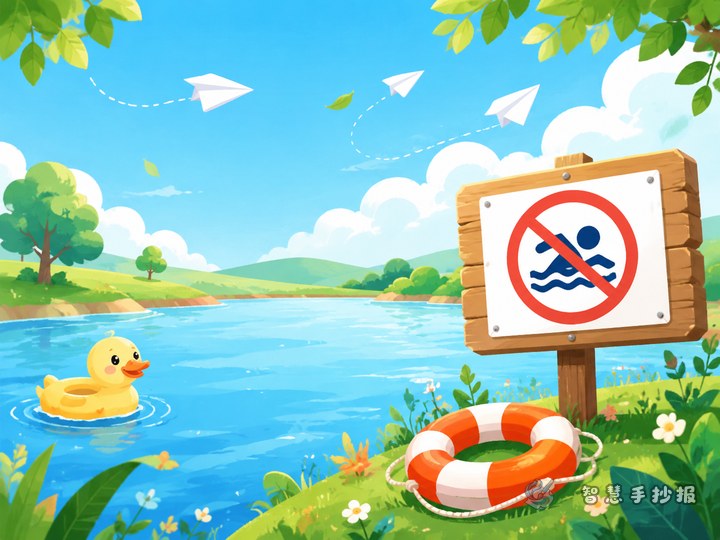
- Protect life, prevent drowning.
- No private swimming, no risky rescue.
- See danger, call for help first.
- Safety first, smart rescue.
A layout idea that is easy to understand
This topic fits a comparison layout very well. Put “Do Not Do This” on the left and “Do This Instead” on the right, with a large safety slogan in the center. Readers can understand the key point at a glance.
- Header area: use bold title letters with blue or red outlines.
- Center area: place the one-sentence core rule in larger writing.
- Side columns: list wrong actions and correct actions separately.
- Bottom area: add small tips such as dangerous water areas or after-school reminders.
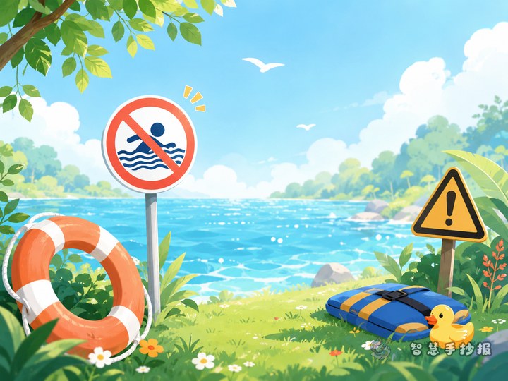
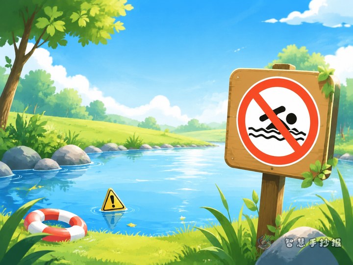
Decorations can include water waves, life rings, warning signs, a whistle, or a rescue pole. Keep drawings simple so the safety text stays clear.
A strong ending for students
You can finish with a simple and powerful closing line such as: Safety is never a small matter. Stay calm in an emergency, do not show off, do not take risks, protect yourself first, and help others in the right way.
If you want to keep improving the title design, color matching, border style, and overall layout, you can continue creating your poster in the Zhihui Shouchaobao WeChat mini program.