Turn the theme into a real community scene
Many students only list the four waste categories, which can make the handwritten newspaper look plain. To show a green community, start with a neighborhood scene: sorting bins near the entrance, clean paths, residents disposing of trash correctly, volunteers giving reminders, and trees or flower beds around the buildings. This makes the poster feel lively and relevant.
You can choose a title with a stronger everyday feel, such as “Sort Waste, Build a Better Community” or “Green Neighborhood Starts with Proper Sorting.” A short subtitle can add warmth and purpose.
Section ideas that are easy to use
Section 1: Quick guide to waste sorting
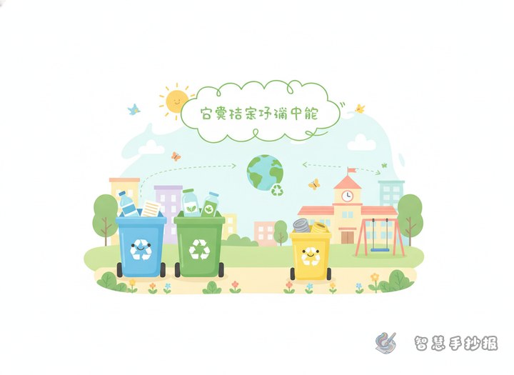
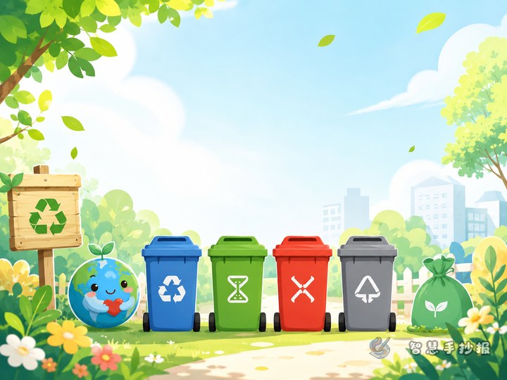
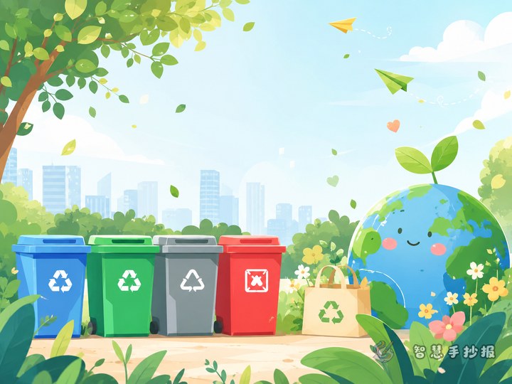
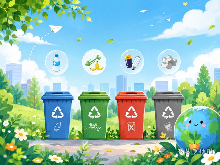
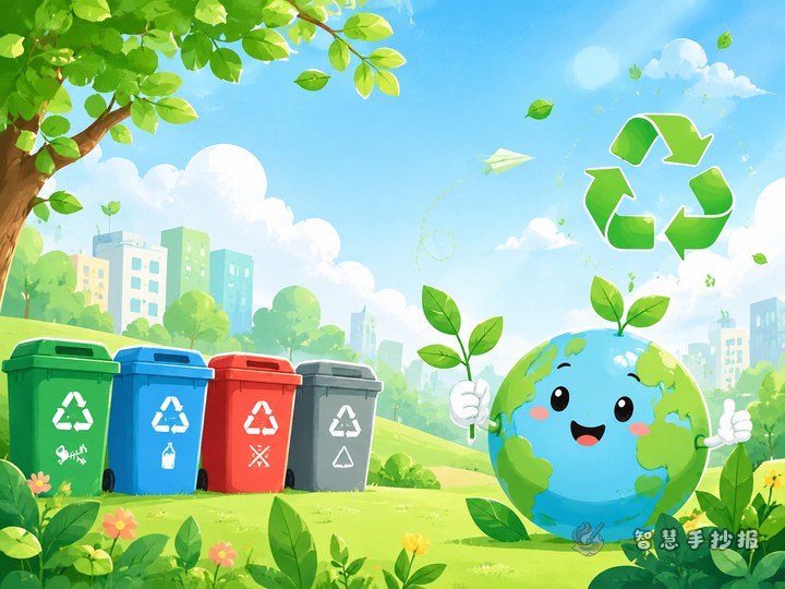
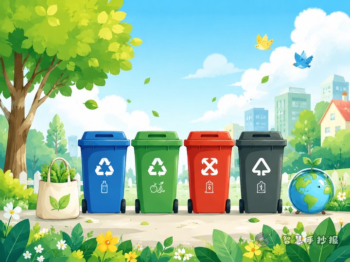
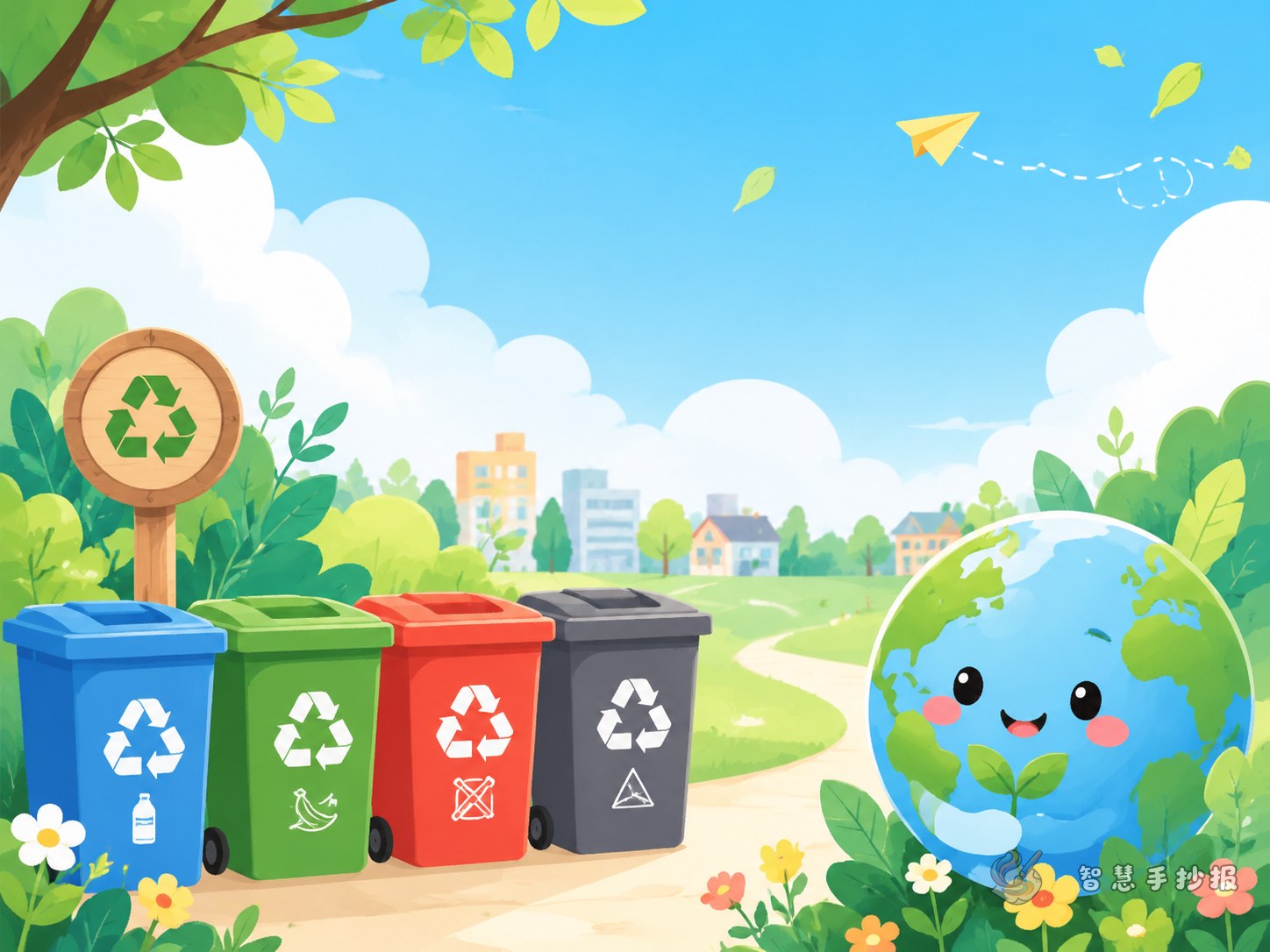
- Recyclables: paper, plastic bottles, metal, glass
- Kitchen waste: fruit peels, vegetable leaves, leftover food
- Hazardous waste: batteries, expired medicine, used light tubes
- Other waste: dirty tissues, disposable lunch boxes, dust
Section 2: What residents can do
- Sort waste before throwing it away
- Tie trash bags properly and keep the area clean
- Read the labels on each bin carefully
- Encourage family members to join in
Section 3: Changes in a green community
Write in short lines: cleaner public areas, less odor, better recycling, more environmental awareness, and a more beautiful neighborhood for everyone.
Section 4: My eco promise
This part works well in the first person, such as “I will reduce disposable items” or “I will help my family sort waste at home.” It makes the handwritten newspaper feel personal and active.
Short slogans and copyable lines
- A small sorting step makes a greener community.
- Sort every bag right, protect our shared home.
- Cleaner halls, kinder neighbors, better community life.
- Sort today for a greener tomorrow.
- Environmental action starts beside us.
- Small hands sort waste, big changes grow.
If you still have empty space, add one or two short statements about shared responsibility and daily habits.
Simple layouts that still look creative
This theme works especially well with three layouts. The first is a four-block layout for clear and balanced content. The second is a center-image layout, with sorting bins in the middle and each section around them. The third is a community map layout, using roads, buildings, and collection points to organize the text.
For colors, green, blue, and yellow are a good match. Green suggests eco living, blue feels clean, and yellow helps highlight reminders. Small decorations like leaves, bins, houses, and recycling symbols can make the page more vivid without becoming messy.
Small details that improve the final result
- Make the title larger than the other text.
- Use short bullet points instead of long paragraphs.
- Draw community elements, not only trash bins.
- Leave some blank space for a cleaner look.
- End with a call to action, such as building a cleaner and greener neighborhood together.
If you already have the theme but still need help with layout, colors, or titles, you can explore more ideas in the Smart Handwritten Newspaper WeChat mini program.