Make Safety Signs the Star of the Poster
The most common problem with a drowning prevention poster is that it looks like a page of writing. Once you enlarge a few safety signs and pieces of rescue equipment, the page instantly looks like a public notice. Signs catch the eye, while words explain the reason. Together they make the topic clear even from a metre away.
Sketch three or four signs on scrap paper first, and give each one a single short caption instead of a long paragraph.
Signs That Belong on a Drowning Prevention Poster
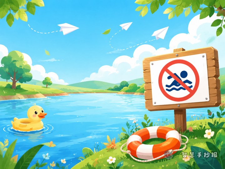
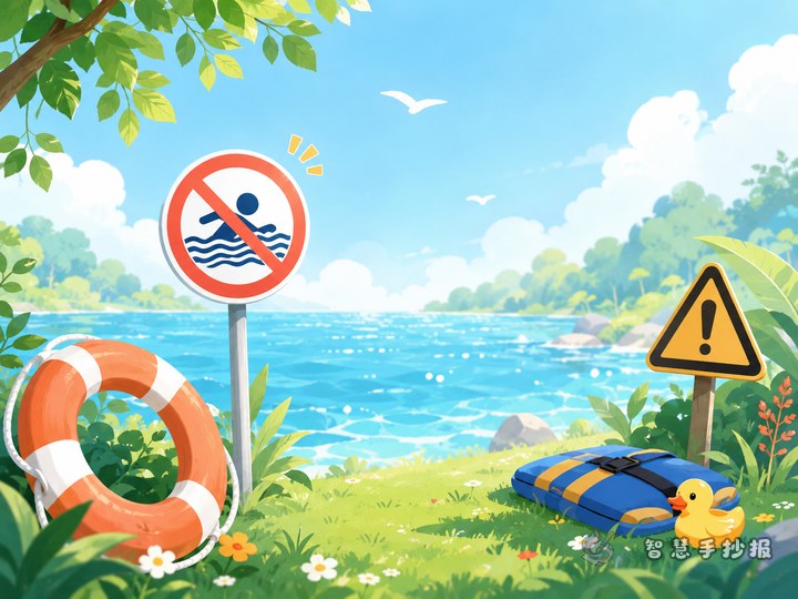
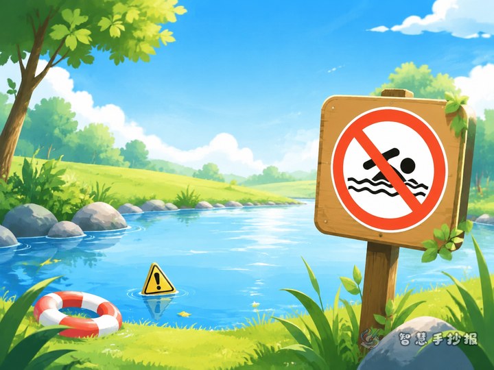
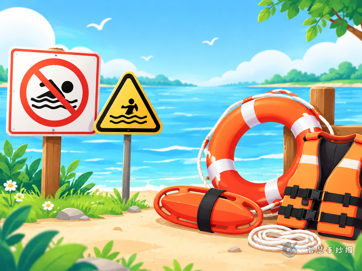
- No swimming sign: a red circle with a diagonal slash and a swimmer or wave inside. Caption: "Dangerous water. Do not go in."
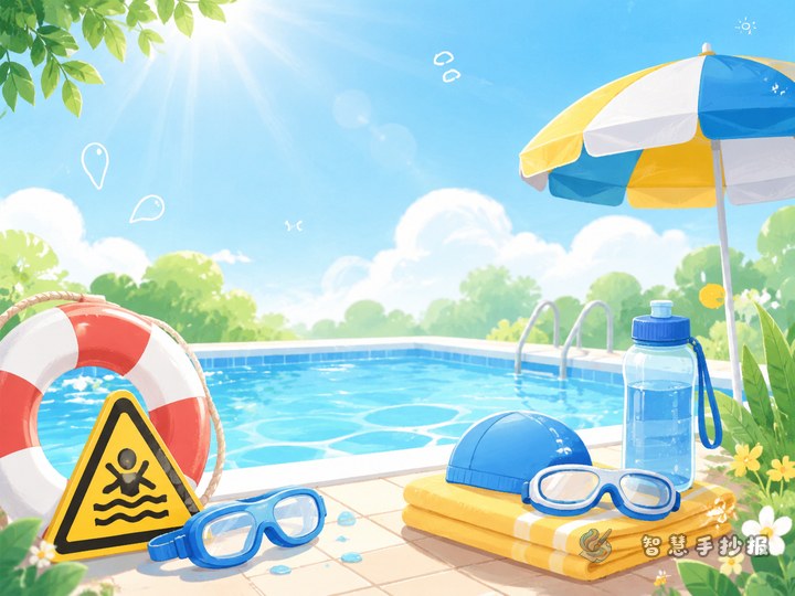
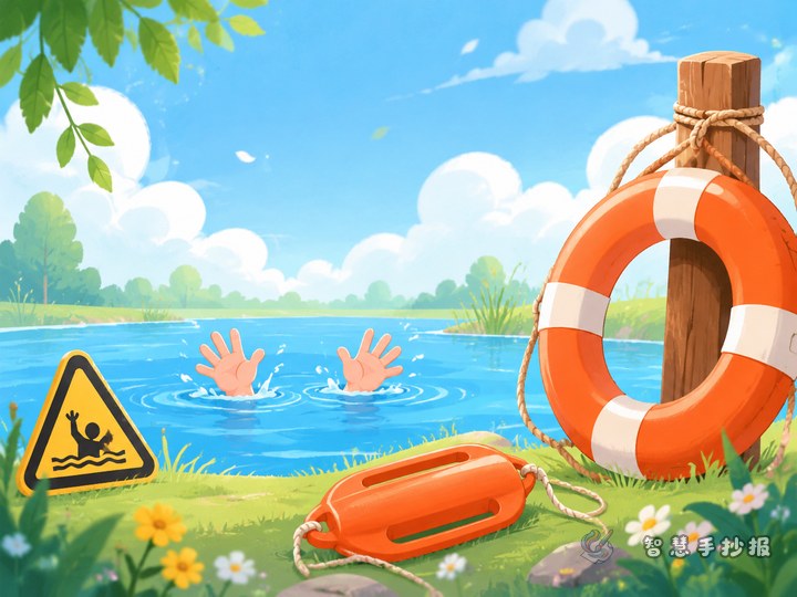
- Deep water warning: a yellow triangle with waves and an exclamation mark. Caption: "Stay away. Never test the depth."
- Slippery bank or falling water warning: a triangle with footprints and splashes, good for a pond, river bank or canal section.
- Rescue equipment sign: a green square holding a life ring or life jacket. Caption: "If someone falls in, call an adult and find rescue gear first."
Remember the three-color rule: red circle for prohibition, yellow triangle for warning, green square for information. Correct colors make the signs look convincing.
Simple Rescue Equipment Anyone Can Draw
- Life ring: two circles, an orange or red outer ring, four white straps, and a thin rope around the outside.
- Rescue rope: a curved line with a few knots and a small float at the end. Write "Throw it to the person. Do not go in yourself."
- Rescue pole: a long stick with a small hook or rope loop. Note "Use it only if you can reach from the bank. Otherwise shout for help."
- Life jacket: a simple vest shape with two straps, colored bright orange, with "Put it on before boating or swimming."
Short on time? Draw just a life ring and one warning sign, and turn the rest into small text cards.
Three Text Boxes You Can Copy
Box 1: When you see a warning sign
Do not go closer, do not test the water, do not show off. Tell a parent or teacher where the sign is, and remind friends to walk away with you.
Box 2: If someone falls into the water
Shout loudly for an adult, call the emergency number, and pass a life ring, empty bottle or long pole. Never jump in and never form a human chain.
Box 3: Equipment is not a toy
Life rings and ropes are for emergencies. Do not play with them, and put them back where they belong so the next person can find them.
Laying Out Signs and Text Without a Mess
A simple plan is to divide the page into three columns. Put the largest drawing in the middle, such as a no-swimming sign with the headline "Cherish Life, Prevent Drowning." Use the left and right columns for text and small signs. You can also line several signs along the edge like a warning strip and leave the middle for writing.
- Place the title first, and keep it under one third of the page width.
- Draw light pencil lines for the columns, then enlarge the signs.
- Keep each text block to three lines and break long sentences into short ones.
- Finish with dark outlines and light color fills so the page does not blur together.
Check Your Poster Before You Hand It In
Hold the finished poster at arm's length. Can you tell at once that it is about drowning prevention? Are the red, yellow and green signs clearly different? Does the text include key reminders such as "call for help first," "find an adult" and "never jump in"? If so, your poster is both attractive and useful. To save time on layout and materials, search for the Smart Handwritten Newspaper mini program in WeChat, choose a drowning prevention template, and drop your signs and text into the ready-made boxes.