Start with a Theme Young Children Can Understand
For younger students, a drowning prevention poster should be easy to read and easy to remember. The most important thing is not writing a lot, but making the safety message clear. Good title ideas include “Stay Safe Near Water”, “Prevent Drowning”, or “Life First, Water Safety Always”. A short title is better for early grades because it is easier to copy and decorate.
Think of the poster as one main idea with a few simple reminders. If children can understand where water is dangerous, what they should not do, and how to ask for help, the poster has done its job well.
Short Safety Lines That Are Easy to Copy
Younger children do best with brief lines instead of long text blocks. Here are some useful choices:
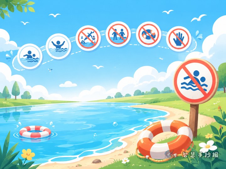
- Do not go near water alone.
- Never swim without an adult.
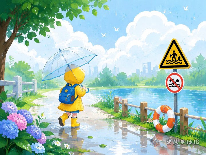
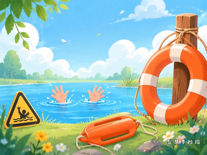
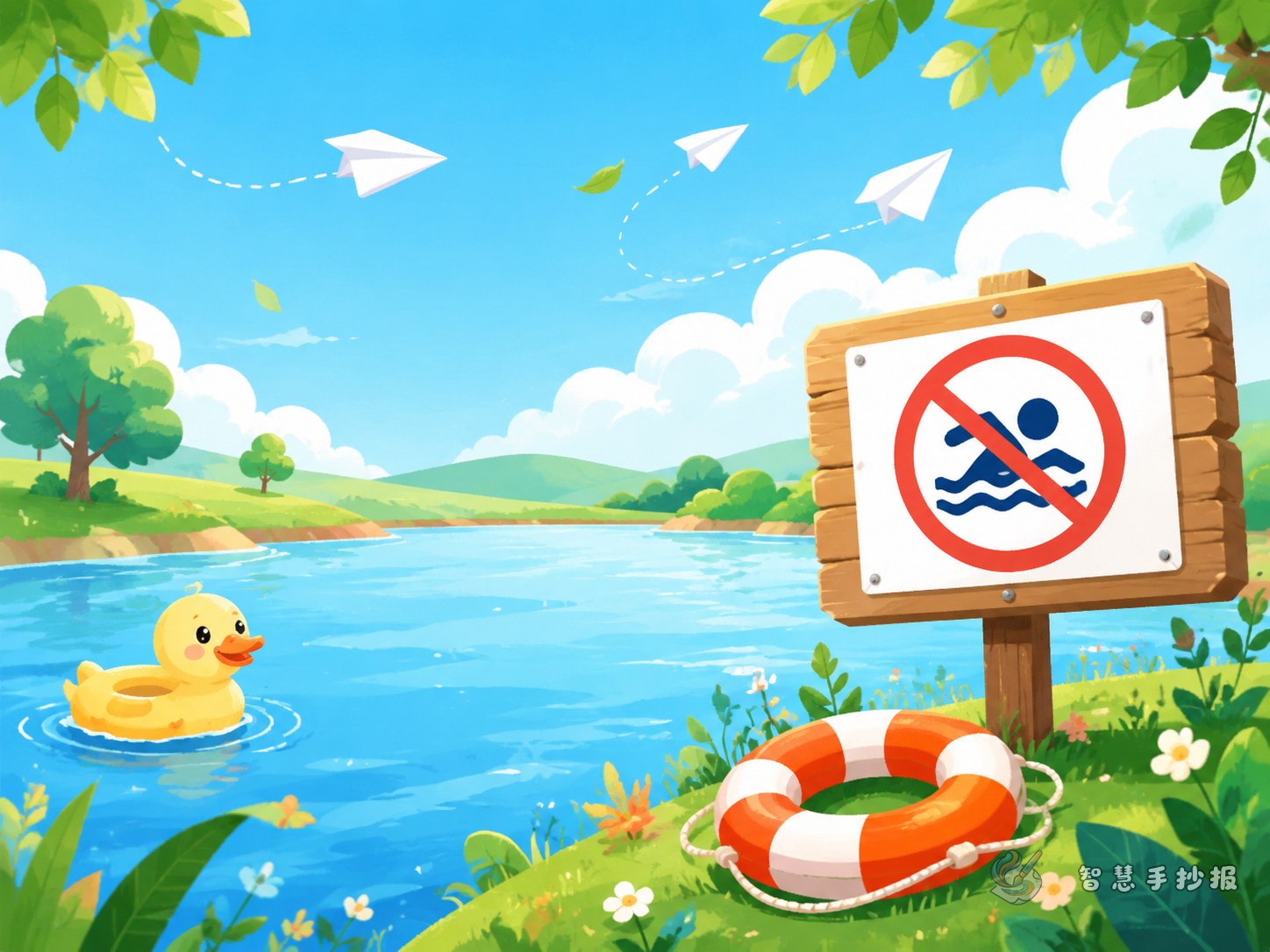
- Stay away from rivers, ponds, and reservoirs.
- Do not play near deep or unknown water.
- Do not push or play around near the water’s edge.
- If someone falls in, do not jump in to help alone.
- Call loudly for adults right away.
- Life is precious. Safety comes first.
If a short paragraph is needed, children can write: Hot weather can make water look fun, but water can also be dangerous. We should not go to rivers, ponds, or lakes by ourselves. If someone is in danger, we must call for help and find an adult quickly.
A Simple Four-Part Layout Works Best
You do not need a complicated design. A four-part layout is clear and friendly for school posters:
- Top center: the main title with waves, clouds, or a sun.
- Upper left: dangerous places near water.
- Upper right: things children should never do.
- Bottom area: what to do in an emergency.
If the child enjoys drawing, let pictures take more space than text. A warning sign beside a pond or a life ring next to a safety sentence can make the message stronger and easier to remember.
Good Small Sections for a Complete Poster
Danger Spot Finder
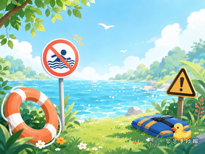
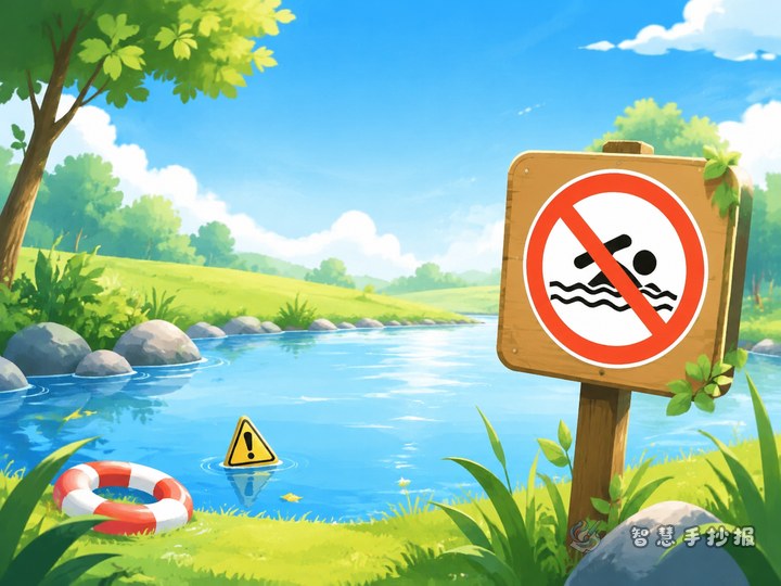
List places that may look ordinary but can still be risky, such as ponds, rivers, reservoirs, ditches, construction puddles, or water areas without fences.
Safety Rhyme Corner
A short rhyme can make the message memorable: Hot days may make children run to play, but safe choices lead the way. No adult, no swimming trip. Stay away and do not slip.
What I Will Do
First-person lines work well for younger students, such as “I will not go near water alone” or “I will tell an adult if I see danger.”
Keep the Poster Bright but Clear
This theme needs warning elements, but it should still feel suitable for children. Use light and fresh colors for most of the page, and save orange or red for warning words like “danger” or “stop.” Blue can frame the page, green can show grass, and simple icons such as life jackets, whistles, waves, and warning signs can make the design more lively.
It is better to avoid frightening drawings. The goal is to build safety awareness in a calm and understandable way.
Finish with a Strong Closing Line
A short closing sentence can make the whole poster feel complete, such as “Protect life and stay away from dangerous water areas.” Another good ending is: Let us learn water safety and become careful safety helpers.
If you want to improve the title style, borders, and full page arrangement, you can also continue making the poster in the Zhihui Shouchaobao WeChat mini program for a cleaner school-ready result.