Decide the main message first
An eye care and myopia prevention poster should not feel crowded with facts. The goal is to help readers quickly understand why eye care matters and what they can do every day. You can start with a simple main idea such as Protect your eyes through healthy daily habits.
If the poster is for elementary students, keep the wording short and easy. If it is for classroom display, combine basic knowledge with practical actions so the poster is both attractive and meaningful.
These 4 to 6 sections are the easiest to use
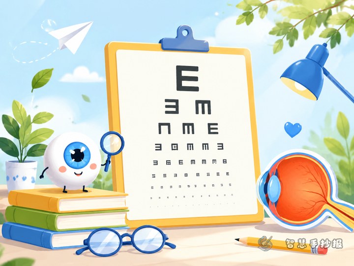
1. Why our eyes are important
Write a short introduction about how eyes help us read, learn, observe, and enjoy the world.
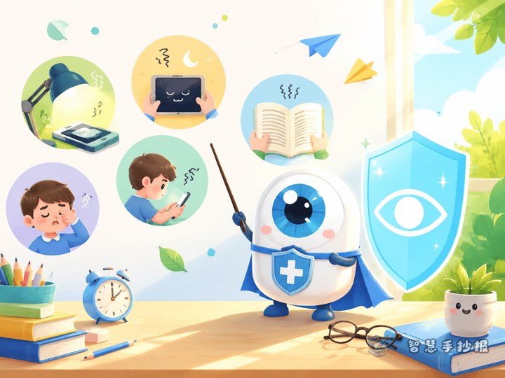
2. Habits that can harm our eyes
- Reading while lying down
- Writing in poor lighting
- Using screens for too long
- Holding books too close
- Reading with the wrong posture
3. Good daily eye care habits
- Sit properly when reading and writing
- Keep a proper distance from the book
- Look into the distance after using your eyes for a while
- Do eye exercises regularly
- Spend more time outdoors
4. Actions I can start today
This section can be written as promises, such as reducing screen time, taking breaks on time, and not reading while walking.
5. Slogans or short rhymes
Short lines work well in the corners of the page and also make the theme stronger.
Ready-to-use text ideas
You can directly use short sentences like these:
- Eyes are the windows to the world, so we should protect them well.
- Good posture makes reading easier on the eyes.
- Do not use your eyes for too long without a break.
- Less screen time, more outdoor time.
- Healthy vision starts with small daily habits.
If the page still feels empty, turn the text into reminder cards or a personal promise section for a more lively effect.
Try a layout that feels fresh
You do not have to use a plain box layout. You can place a big eye drawing in the center and build small idea bubbles around it for bad habits, good habits, slogans, and action lists. This style looks lively and easy to follow.
If you prefer a safer design, use a top-and-two-column layout: the title and main illustration go at the top, and the lower part is split into left and right sections for knowledge and advice.
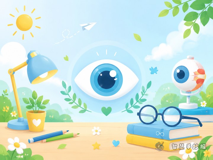
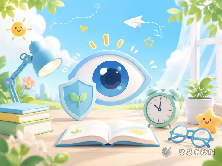
Colors and decorations that match the theme
Use green, blue, and light yellow as the main colors. Green suggests health, blue feels fresh, and yellow helps highlight the title. Decorations can include eyes, leaves, clouds, the sun, books, pencils, or windows. Keep them simple so the page does not feel too full.
You can also use wave lines, leaf-shaped borders, or rounded boxes. Highlight key reminders in bold so classmates and teachers can quickly catch the main points.
A strong ending makes the poster feel complete
Finish with a short call to action such as Let us protect our eyes and build healthy vision habits every day. This works well as a bottom banner and gives the whole poster a complete ending.
If you already have your theme and section ideas, you can also continue refining the layout, title style, and content combinations in the Zhihui Shouchaobao WeChat mini program.