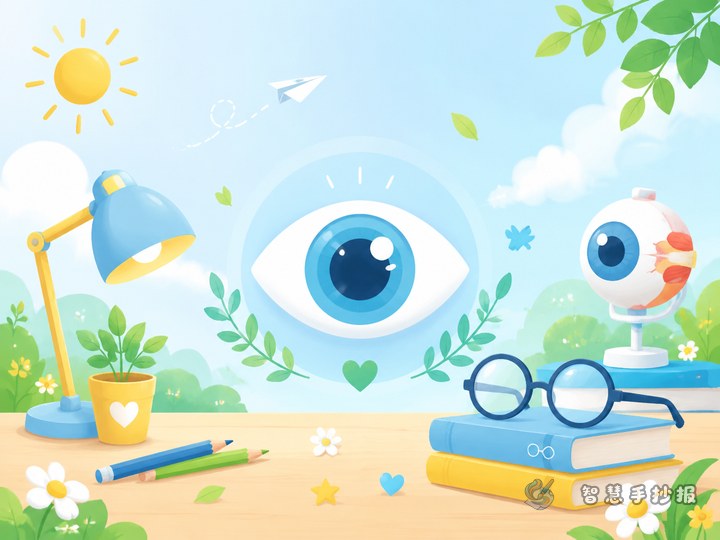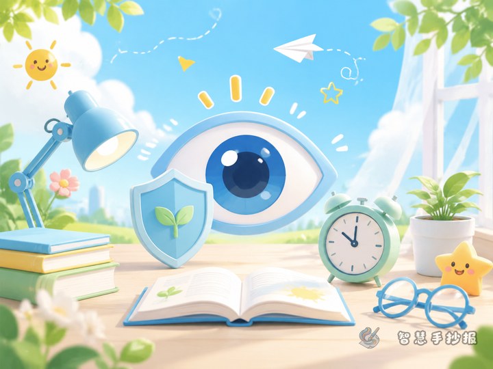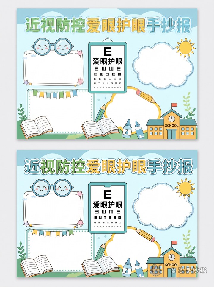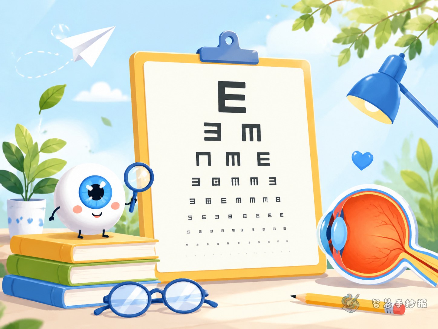
Let the Eye Chart Be the Center of the Poster
For a myopia prevention and eye care handwritten newspaper, an eye chart is a strong visual anchor. It immediately shows the topic and helps connect the poster to eye exams, healthy vision, and daily eye care habits. Place a simplified eye chart in the middle, add the title above it, and build the rest of the page around this central image.
If the page feels empty, add small drawings such as eyes, books, sunshine, leaves, or a desk lamp. These details fit the theme and make the poster look more lively.
Choose a Few Practical Sections
Why Eye Protection Matters
Use two or three short sentences to explain that our eyes help us read, learn, and explore the world. This section should be brief and easy for children to understand.
Habits That Harm Eyes
- Reading with poor posture
- Studying in lighting that is too dim or too bright
- Using phones, tablets, or TV for too long
- Rubbing eyes with unclean hands
Healthy Eye Habits
- Keep proper reading and writing posture
- Look into the distance after focused work
- Be active during breaks
- Sleep on time and avoid staying up late
My Daily Eye Care Actions
This section is great for younger students. They can list simple actions such as sitting properly, spending time outdoors, and reducing screen time.
Useful Sentences to Write on the Poster
Theme line: Protect your eyes through small daily habits.
Information line: Our eyes are important windows to the world, so preventing myopia should start with healthy eye use.
Reminder line: Sit properly, rest your eyes often, and study in comfortable light.
Slogan: Bright eyes, bright future.
Ending line: Let good eye care habits stay with us in study and daily life.
A Layout That Looks Clear and Balanced
This theme works especially well with a center-image layout. Put the eye chart in the middle, the title near the top, a short slogan in one corner, and use the lower and side areas for content blocks. A balanced layout makes the poster look organized and easy to read.
- Decide the size of the eye chart first.
- Divide the page into four small content areas.
- Use simple borders like waves, rounded frames, or leaf lines.
- Highlight important words such as posture, rest, distance, and outdoor time.
Color Choices and Final Touches
Fresh colors such as green and blue are ideal for an eye care theme. A little yellow or orange can be added for contrast. Keep the title neat, the writing readable, and avoid overcrowding the page. A clean layout often looks better than filling every space.
If you want to refine the layout, replace the title, or add more sections, you can continue your poster in the Smart Handwritten Newspaper WeChat mini program for a more polished final result.