Start with one clear central message
A practical theme for this poster is Speak Standard Mandarin, Write Chinese Characters Properly. Once the main message is clear, the whole page becomes easier to organize. Mandarin represents clear communication, while calligraphy and standard characters represent neat and beautiful writing. Together, they create a strong school-friendly topic.
You can place the main title at the top center in a larger font. A neat regular script style works well. Add a short subtitle such as “Clear speech begins with us” or “Careful speaking, careful writing” to make the theme feel complete.
Simple sections that work well on a poster
If you are not sure how to divide the page, use four practical sections.
- Section 1: Theme paragraph — explain why Mandarin and standard Chinese characters are important.
- Section 2: Calligraphy tips — introduce basic strokes or neat writing habits.
- Section 3: Common mistakes corner — list words that are often mispronounced or misspelled.
- Section 4: Slogans — add 3 to 5 short lines around the page as fillers.
This structure is very suitable for a handwritten newspaper because each area has a clear purpose and the topic is easy to understand at a glance.
Ready-to-use text materials
Sample theme paragraph
Mandarin is an important bridge for daily communication, and standard Chinese characters are an important carrier of Chinese culture. Speaking Mandarin well makes communication smoother, and writing Chinese characters properly makes expression more accurate. Promoting Mandarin and standard writing on campus helps students build good language habits and appreciate the beauty of Chinese culture through every stroke.
Sample slogans
- Speak Mandarin and be a polite student.
- Write standard characters and show the beauty of Chinese writing.
- Clear words in speech, careful strokes in writing.
- Mandarin connects us, standard characters brighten the campus.
- Speak well, write neatly, grow confidently.
Ideas for a correction corner
- Include words that are often pronounced incorrectly.
- Include characters that students often write in the wrong way.
- Add reminders such as neat spacing, proper structure, and fewer messy corrections.
How to show both calligraphy style and poster style
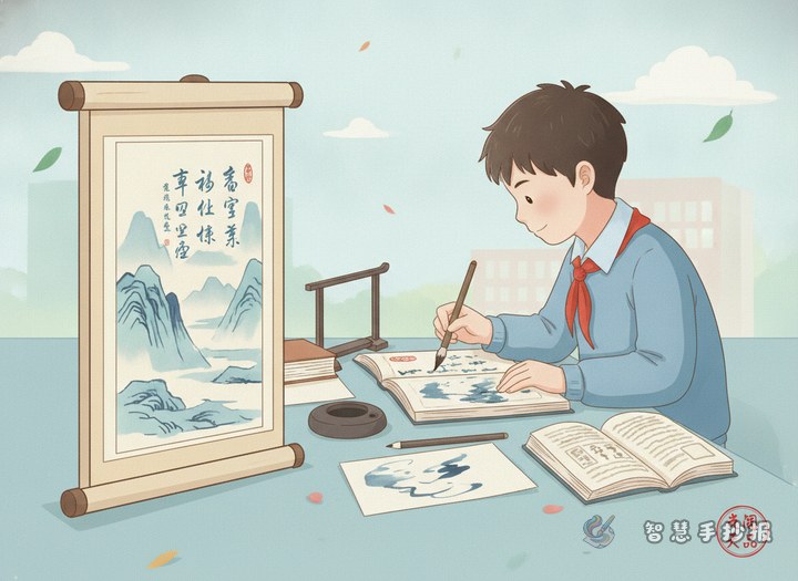
A common problem with this topic is that the page may look like handwriting practice instead of a poster. The solution is to combine decorative design with writing display. Use a calligraphy-style title, but keep the main text clean and readable. You can add brushes, ink drops, scroll shapes, or grid patterns to create a calligraphy atmosphere.
You may also leave a small calligraphy display area and write a short phrase such as “Speak Mandarin, Write Properly” in larger characters. This becomes a visual focus and makes the poster more attractive.
A neat layout that is easy to finish
A useful layout is “title at the top, two side sections in the middle, summary at the bottom.” Put the title in the center top. Place the theme paragraph and slogans on one side, and the calligraphy tips and correction corner on the other side. Add a final sentence or short appeal at the bottom.
- Use only 2 or 3 main colors.
- Keep the body text dark and easy to read.
- Leave enough blank space between sections.
- Highlight only key words instead of making everything bold.
- If time is short, draw the frame first and fill in short text later.
Before finishing, check whether the page includes these three points: Mandarin, standard Chinese characters, and a calligraphy feeling. If all three are present, the theme will feel complete. If you want to keep refining the layout, title, or text blocks, you can continue designing in the Zhihui Shouchaobao WeChat mini program.