Start with a clear focus: safety on the way to and from school
If a traffic safety handwritten poster covers too much, it can feel messy. A better idea is to focus on school commute safety. This topic is close to students' daily life and makes the poster easier to plan. Think of the whole page as a reminder card for a safe trip to school.
Use a title that highlights school commute, school gate safety, or safe travel. Instead of listing too many rules, choose the points that children can really use every day.
Useful section ideas for the poster
Section 1: Rules to remember on the way to school
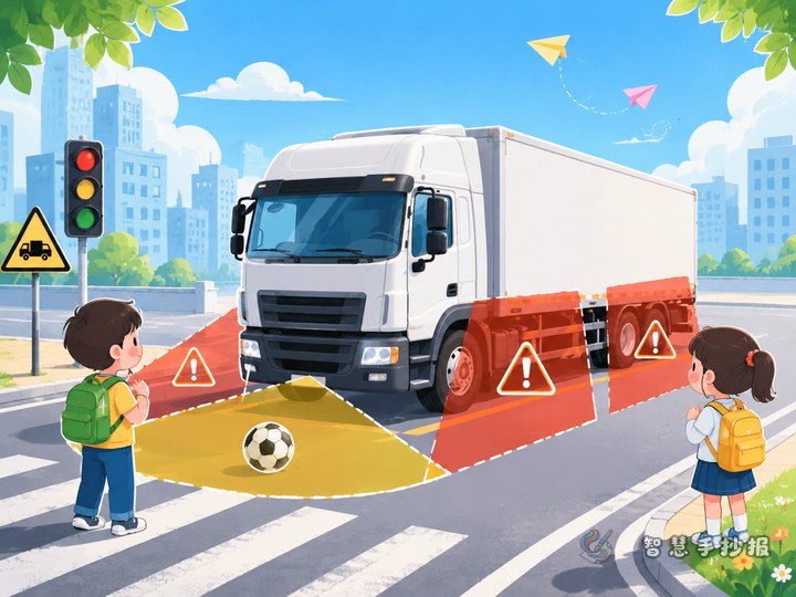
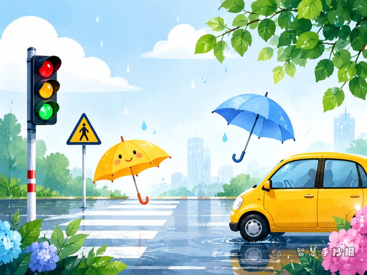
- Walk on the sidewalk and do not play near the road.
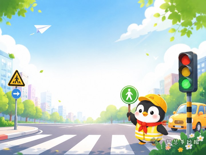
- Use the crosswalk when crossing the street.
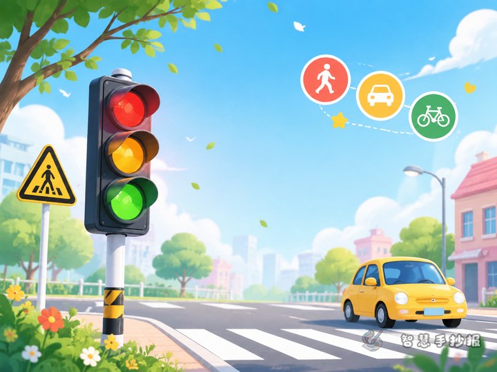
- Stop at red, go at green, and slow down when the light changes.
- Do not climb over barriers or rush into the road.
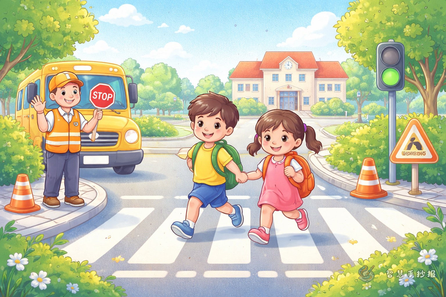
Section 2: School gate safety reminders
- Walk in order during busy arrival and dismissal times.
- Do not stay and play near the school gate.
- Wait for parents in a safe area.
- Be careful of turning vehicles.
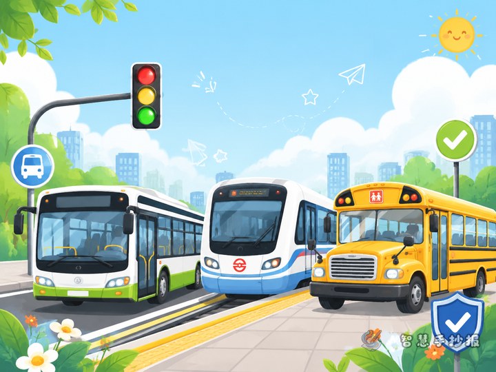
Section 3: Riding and cycling safety
- Sit properly in the vehicle and hold on when needed.
- Do not stick hands or head out of the window.
- Look around before leaving the vehicle.
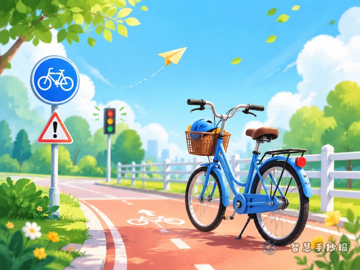
- Wear a helmet when riding a bicycle or electric bike.
Section 4: My safety promise
This part can include short personal promises such as: I will use the crosswalk. I will follow traffic lights. I will remind my classmates to stay safe. I will be a polite traveler. This makes the poster more active and personal.
Short slogans you can write directly
A good poster needs short and memorable lines. You can choose from these examples:
- Safety on the road,文明 in the heart.
- Follow the rules on every trip to school.
- Pause at the crosswalk and travel safely.
- Better to wait a moment than rush in danger.
- Keep order at the school gate and arrive safely.
- Follow traffic rules and be a polite student.
If you have extra space, add one or two short explanations under the slogans so the page has both ideas and action tips.
Make the content feel close to real life
The best handwritten posters do more than list rules. They show situations children actually face. You can add examples like these:
- Even when you are late, do not run through a red light.
- On rainy days, walk slowly because the ground may be slippery.
- After school, stay calm when there are many people and cars.
- Wear a helmet properly when riding on an electric bike or motorcycle with adults.
These examples make the poster more practical for class display and family reading. Students can also write one or two of their own daily habits to make the poster more personal.
A layout idea that matches the theme
This topic works well with a road-style layout. Put the main title in the center and arrange the sections around it like stops along a route to school. Decorations can include simple drawings of crosswalks, traffic lights, school buses, road signs, helmets, or backpacks.
- Place the main title at the top with bold colors.
- Use the left side for commute rules.
- Use the right side for school gate reminders.
- Put slogans and a safety promise at the bottom.
Blue, green, and yellow are good color choices because they feel bright and clear. Leave enough blank space so the poster does not look crowded.
Small details that improve the final result
Many students only write simple rules like “Stop at red, go at green,” which can make the content feel thin. A better poster combines rules, real-life scenes, slogans, and actions. This gives the page more depth and makes it easier to read.
Before finishing, check three things: Is the topic clearly about school commute safety? Are the sections easy to see? Is the language suitable for children? If you want to save time on the final layout, you can continue designing in the Smart Handwritten Poster WeChat mini program.