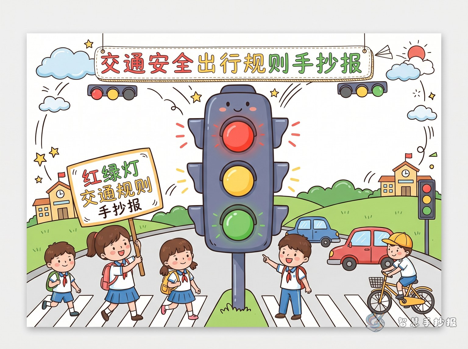
Choose a simple and eye-catching angle
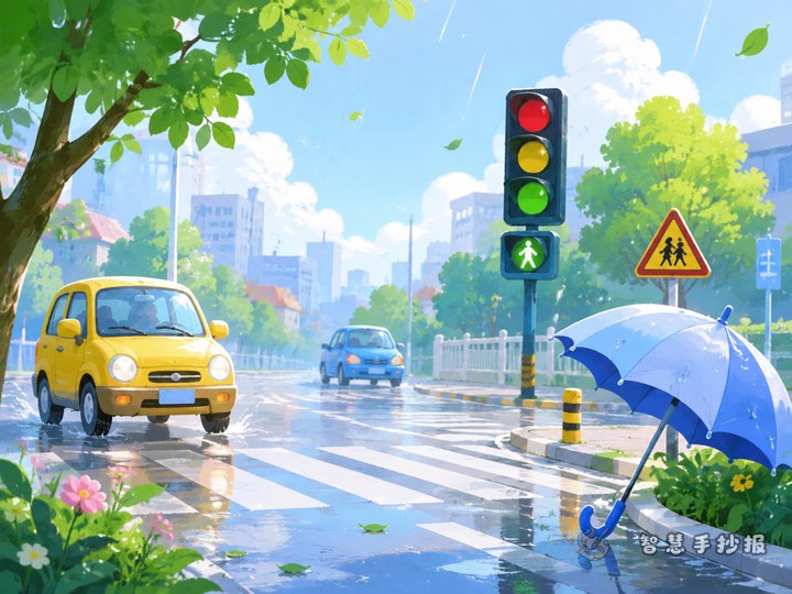
A traffic safety handwritten newspaper becomes easier to make when the topic is specific. Instead of using a broad title, you can focus on “Stop at Red, Go at Green, Wait at Yellow”. This sounds natural, fits what students learn in daily life, and works well as the main headline. Add small drawings such as traffic lights, a crosswalk, school bags, or cars to make the theme clear at first glance.
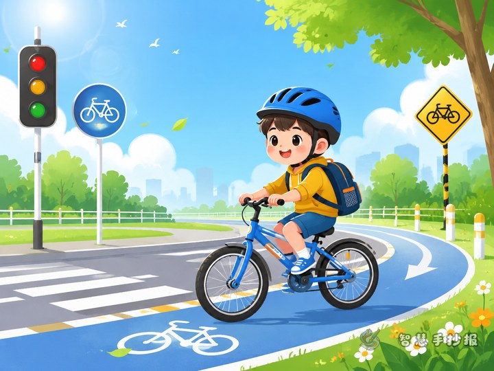
To make the page more complete, divide the content into walking safety, riding safety, cycling reminders, and polite travel habits. This gives the poster clear sections and keeps the writing organized.
Easy sections students can actually use
Section 1: Traffic Light Basics
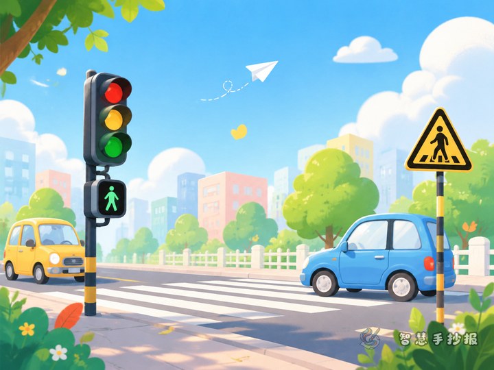
Write short and direct rules: stop at red, go at green, and do not rush when the yellow light appears. Cross the street at the zebra crossing, look left and right, and make sure it is safe before crossing.
Section 2: I Am a Safe Pedestrian
- Do not run or play on the road.
- Do not climb over barriers.
- Do not look down at things while crossing.
- Watch for cars carefully at intersections.
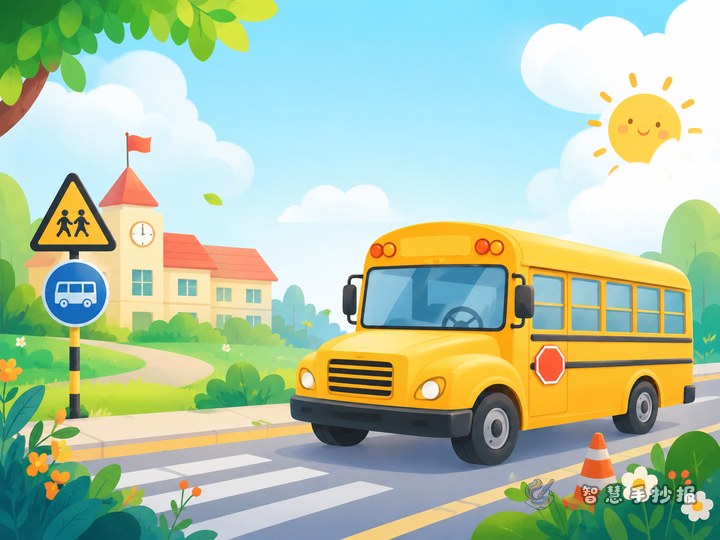
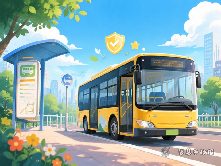
Section 3: Safe Riding Tips
- Line up when getting on and off.
- Sit properly and hold on during the ride.
- Do not cross in front of or behind a vehicle right after getting off.
This combination is practical for elementary students because it is clear, short, and easy to arrange on a handwritten newspaper page.
Useful text materials for the poster
Short slogans help fill the page and strengthen the message. Good examples include “Safety starts with every step”, “Follow traffic rules, travel in peace”, “Better to wait than rush”, and “Safe travel, happy every day”.
You can also add a short appeal paragraph: Traffic safety matters to everyone. As students, we should obey traffic lights, use zebra crossings, follow order when taking buses, and remind our family members to travel safely and politely.
Layout ideas that look neat and lively
This theme works especially well with a street-crossing layout. Put the title at the top, draw a road or crosswalk in the center, and place text blocks on both sides. Another good option is a four-box layout with sections for walking, riding, cycling, and safety slogans.
- Use bright colors for the headline.
- Decorate borders with road signs, traffic lights, or tire patterns.
- List key rules with bullets or numbers.
- Fill blank spaces with simple drawings such as a crossing guard, school bus, helmet, or bicycle.
If students worry about spacing, they can lightly sketch the layout in pencil first and then write and color it neatly.
How to make it both pretty and practical
A good handwritten newspaper does not need too much text. The key is making the rules easy to understand at a glance. Keep the title large, use short sentences in the body, and highlight phrases like “Stop at Red” or “Use the Crosswalk” in thicker color.
Parents and teachers can first help children choose sections, then pick the most useful rules to copy. After the draft is ready, they can also continue organizing ideas and materials in the Smart Handwritten Newspaper WeChat mini program to make the final design easier.