Start with an observation theme, not just facts
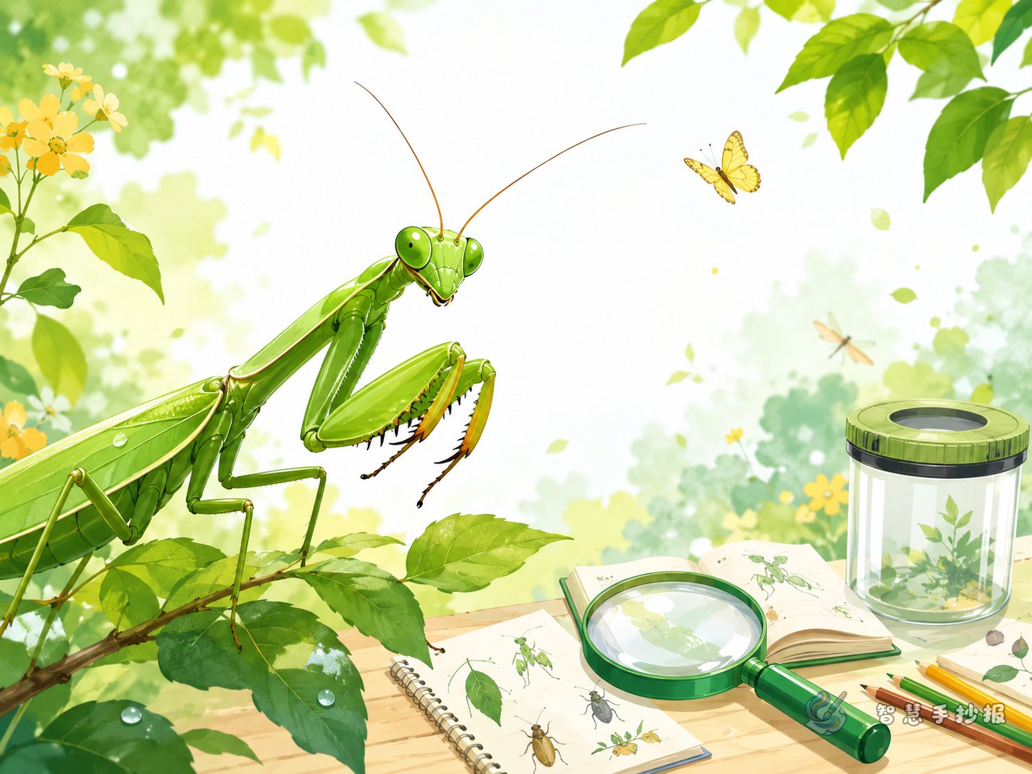
A praying mantis poster works best when it feels like a real observation page. Instead of listing too much science content, focus on appearance, movement, habitat, and personal notes. A mantis is easy to describe because of its triangular head, folded front legs, and quiet waiting posture. Good titles include “My Praying Mantis Observation” or “A Little Hunter in the Grass.”
Useful sections to place on the poster
- Insect profile: name, color, body parts, antennae, and wings.
- What it looks like: triangular head, long body, strong front legs, camouflage colors.
- Behavior notes: standing still, moving slowly, raising its legs, staying alert.
- Where it lives: grass, bushes, garden edges, and leafy areas.
- My discovery: one or two details you noticed by yourself.
Short writing materials students can use
The praying mantis is a special-looking insect with a triangular head and large eyes. Its most interesting body part is the pair of front legs that look like small sickles. It often stays on leaves or branches, and its body color helps it hide in the environment.
When I observed a mantis, I found that it was not always moving fast. Most of the time, it stayed still as if it was watching carefully. When something changed around it, it became alert quickly. This observation helped me see how amazing the insect world can be.
A layout that makes the poster feel like a field note
You can use a center title with four surrounding sections. Put the main title in the middle, then arrange sections such as “Appearance,” “Behavior,” “Habitat,” and “My Observation” around it. If there is enough space, add a small box for the date, weather, or place of observation.
Green, light yellow, and soft brown are good color choices because they match a natural outdoor theme. Simple decorations like leaves, grass, magnifiers, or tiny insect shapes can make the page lively without making it crowded.
Tips for a cleaner and better poster
- Use short and clear sentences. A poster should be easy to read.
- Keep each section to 2 to 4 sentences so the layout stays neat.
- Make the title larger and highlight important words clearly.
- If you want to keep improving the design, you can continue arranging sections, colors, and poster styles in the WeChat mini program.