Why one red bin beats four crowded bins
Many pupils try to draw all four waste bins in a neat row, then find they can only write two or three sentences under each one. The poster looks busy but has no clear focus. Try a different approach: make the red bin in your neighbourhood the star of the whole page and write only about hazardous waste. Batteries, expired medicine, broken lamps and leftover pesticides are all close to daily life, so the details come easily.
Let the title name the star, for example, The Little Red House in Our Community, or Do Not Let a Battery Sleep in the Wrong Place. This stands out more than a general slogan about sorting rubbish.
A layout of one main picture and three small columns
You only need four areas on the page:
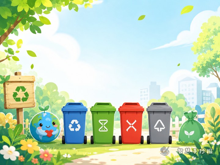
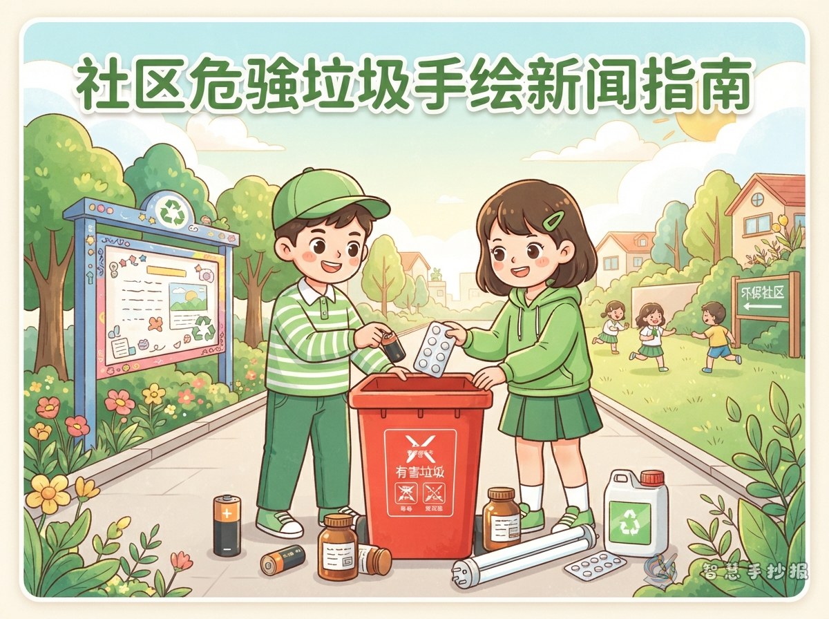
- Main picture area on the left or in the centre: an enlarged red bin marked Hazardous Waste, with a child and a parent putting items in.
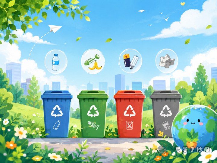
- Column one, Know Them: short lines listing common hazardous items, each with a small icon such as a battery, medicine box, lamp or spray can.
- Column two, Why It Matters: two or three short sentences about the harm caused by mixing these items with ordinary rubbish.
- Column three, What I Can Do: practical actions, such as keeping a small box at home, labelling it and taking it to the collection point when it is full.
Leave a slogan strip across the middle or bottom in decorative lettering to give the page a clear rhythm.
Short lines you can copy onto the page
Poster text should be brief and picture-like. Change the length to fit your boxes:
- One used battery in the soil can hurt a whole patch of grass.
- Expired medicine is not ordinary rubbish. It has its own way home.
- Keep a small box, take it when full, and never mix it with food waste.
- Lamps break easily, so wrap them before you bring them in.
- Three small habits at home: store separately, label the box, remember collection day.
You can also add a short community observation: when is the red bin fullest, does the building put up notices, where do neighbours keep old medicine boxes. Real details make the poster feel like it belongs to your own neighbourhood.
Colors and drawings that look local, not industrial
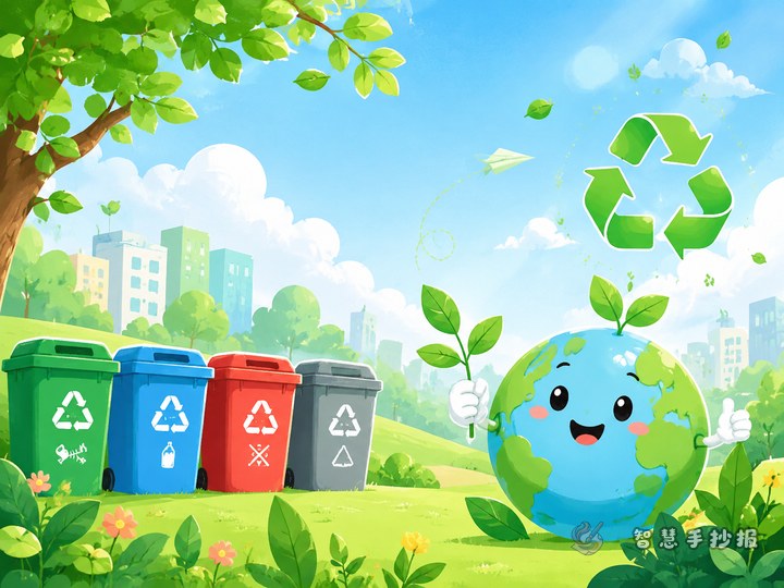
Use pale green or cream for the background and save red for the bin and the title, so the page stays tidy. Apartment blocks, entrance doors, bicycle sheds, flower beds and a neighbour walking a dog are all good background details. Two or three are enough; do not fill every corner. Giving the bin a small face or waving hand can make it feel like a friendly new neighbour in the community.
Order of work and easy mistakes to avoid
- Sketch the boxes on scrap paper and decide the size of the three columns and the slogan strip.
- Draw very light pencil guides on the final sheet and check the title length before writing it.
- Write the text first, then draw and color, so your hand does not smudge the artwork.
- Check the waste categories and collection method, and keep the handwriting from becoming too cramped.
The two most common problems are mixing hazardous waste with other categories, which confuses the reader, and filling the page with too much writing and too few pictures. Keep each column to three or five lines and leave white space for drawings. If you want ready-made title lettering, borders and small icons, open the Smart Handwritten Newspaper mini program, set the layout first and then write the text by hand for a smoother finish.