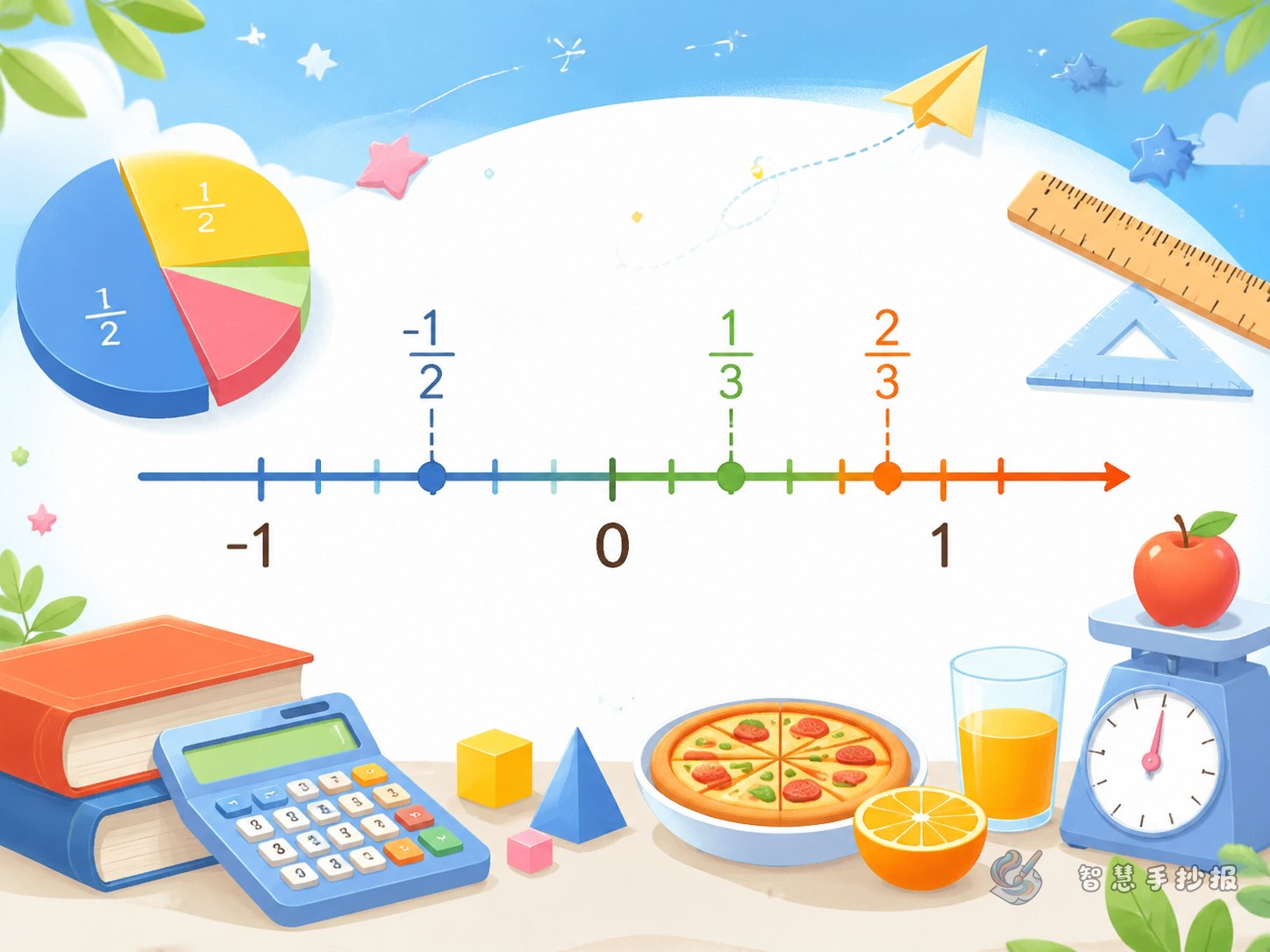
Turn comparison into a visual number line
When decimals and fractions appear together, students may feel that the numbers are hard to compare. A handwritten poster can begin with a colorful number line from 0 to 1, then continue to 2. Mark important points such as 0, 1/2, and 1. This shows a simple rule: the farther right a number is, the greater it is.
Add small speech bubbles near the number line, such as 0.25 equals 1/4, 0.5 equals 1/2, and 0.75 equals 3/4. These common matches are useful writing materials and help readers see the connection between fractions and decimals.
Comparison methods to include
Start with benchmark numbers
Before calculating, ask whether the numbers are close to 0, 1/2, or 1. For example, 3/4 is greater than 1/2, and 0.6 is also greater than 1/2. Benchmark numbers help students make faster and more reasonable estimates.
Change to the same form when needed
If the answer is not obvious, change the numbers into the same form. For example, 3/5 can be written as 0.6, so it is greater than 0.58. A short poster phrase can be: “Use one form, then compare.”
Use real-life situations
Math becomes easier when it connects with daily life. For example, one cup has 3/4 of the juice left and another has 0.7 cup left. Which one has more? Cake slices, rulers, shopping discounts, and running distances all make good poster examples.
Short writing materials for the poster
- Comparison rhyme:Decimals and fractions meet; find their place on the number line. If you are not sure, use the same form and compare again.
- Learning reminder:Do not judge only by the length of the number. The value matters more than the number of digits.
- Math card:1/2 equals 0.5, 1/4 equals 0.25, and 3/4 equals 0.75. These common values help quick comparison.
- Life example:Which is a better discount, 0.8 of the price or 3/4 of the price? Real situations make comparison meaningful.
A clear poster layout idea
A horizontal number line can be the main visual element. Place the title at the top, comparison steps on the left, real-life questions on the right, and a “Try It Yourself” area at the bottom. Use small icons such as rulers, pencils, cake pieces, shopping bags, and flags for decoration.
Keep the colors clean. Blue and yellow can be the main colors, while important numbers can be circled in red. Students and parents can also open the Zhihui Shouchaobao WeChat mini program to get layout inspiration, then add their own examples and notes for class assignments.
Make the poster show thinking, not just answers
A good math poster should explain why an answer is correct. Beside each example, add one short reason. For instance, “3/4 is 0.75 on the number line, and 0.7 is to its left, so 3/4 is greater.” This turns the poster into a clear mini math lesson.