Two Small Details That Shape Every Study Session
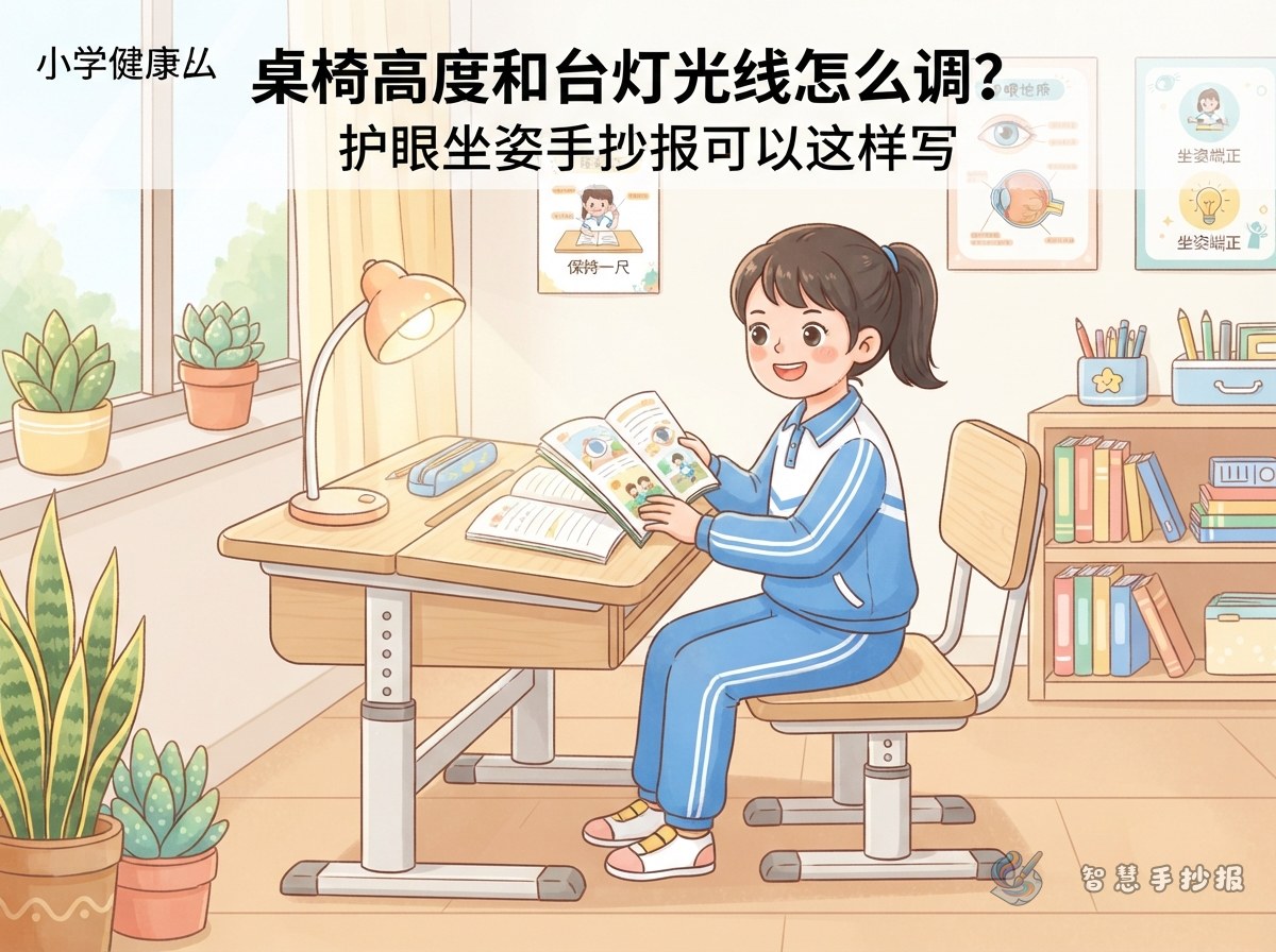
Most eye-care posters repeat the same few slogans, and then there is nothing left to write. Desk height and lamp lighting are the details that quietly decide how a child sits and how close the eyes get to the page. A desk that is too high leaves the feet dangling and the body sliding forward; a desk that is too low pulls the eyes closer and closer; a lamp in the wrong spot throws the writing hand's shadow right across the words.
Put these two ideas on the poster and the content moves from slogans to a checklist anyone can test in a minute.
Three No-Tool Checks You Can Draw
These checks need no equipment and make a neat three-panel illustration:
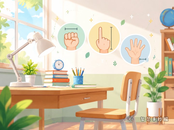
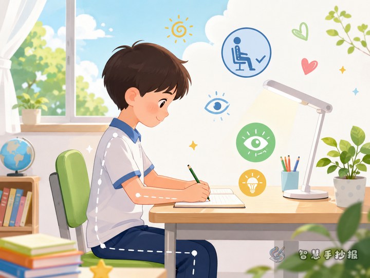
- Feet check: after sitting down, can both feet rest flat on the floor, with thighs and lower legs at about a right angle and knees clear of the desk?
- Back check: does the back rest lightly against the chair back without slumping or floating forward?
- Elbow check: with arms hanging naturally, is the desktop a little below chest level, so the shoulders do not creep upward?
If the desk and chair do not match, a cushion, a footrest or a simple height adjustment can help. A good caption for the poster is: feet, back and shoulders tell you if the desk fits.
Where the Lamp Goes and Why the Ceiling Light Stays On
Lighting is usually summed up in one sentence, but it can be written in detail:
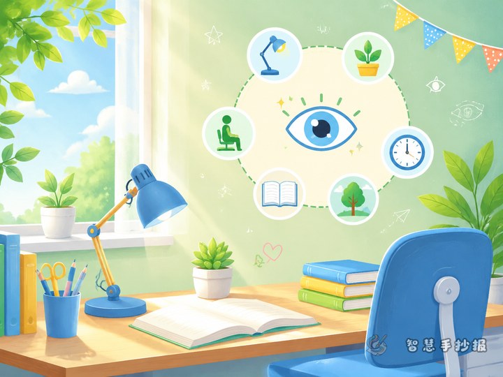
- Position: put the lamp on the opposite side of the writing hand, so a right-handed writer places it to the front left and the shadow falls beside the page.
- Brightness: the writing should be clear, not glaring, and the paper should not look washed out. Too bright is as tiring as too dim.
- Room light: with the ceiling light off, the desk glows while everything around it is dark, which tires the eyes faster. Keep both lights on.
- Angle: tilt the shade slightly downward so light lands on the desk and page, never straight into the eyes, and avoid a bright reflective patch.
A row of light-bulb shaped boxes works well for these four points.
A Layout Idea: The Bright-Versus-Dim Comparison Column
To keep the page from looking flat, split it into two halves:
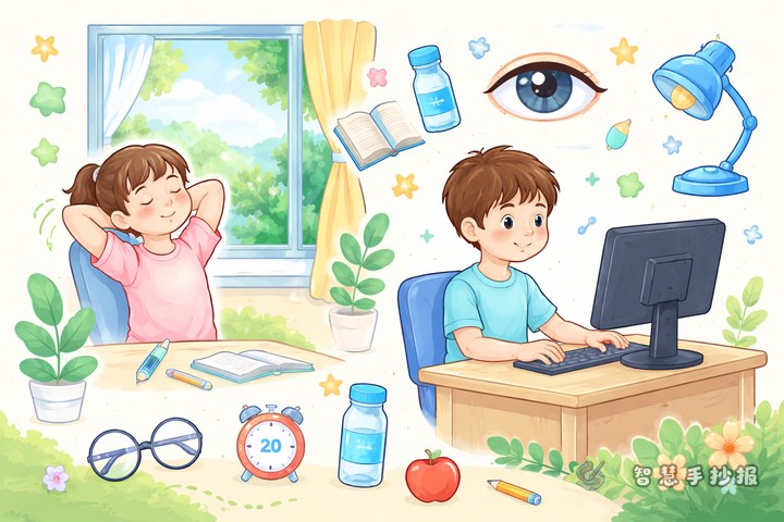
- Left side, "does not fit": draw someone slumped over the desk, feet in the air, lamp on the writing-hand side, ceiling light off, with the caption "closer and closer".
- Right side, "fits well": draw someone with feet on the floor, back against the chair, lamp to the front left, ceiling light on, with the caption "my eyes feel better".
Divide the halves with a thick line or a ruler drawing, and title the section Height and Light Both Matter. Leave a strip at the top for a short introduction and a small box at the bottom for "my own check-up results". The copying load stays light, but the poster looks complete.
Adjusting the Depth for Different Grades
- Lower grades: mostly pictures and short phrases such as "feet flat, back supported, lamp opposite", each with a small icon.
- Middle grades: add the three checks and the lighting notes, plus one or two sentences about how it feels.
- Upper grades: explain the reasons, such as the eyes constantly refocusing when light is wrong, or reading distance shrinking when posture slips, and add a simple self-check table.
One Small Step After the Poster Is Finished
Once the poster is done, try it out: adjust your own desk, chair and lamp using the checks on the page, then write the result in the little box in the corner. The poster becomes a working eye-care list instead of just homework. If you want a different layout, colour scheme or extra sections, you can keep designing in the 智慧手抄报 WeChat mini program and copy the finished page onto paper afterwards.