Start with a clear angle: show the beauty of contrast
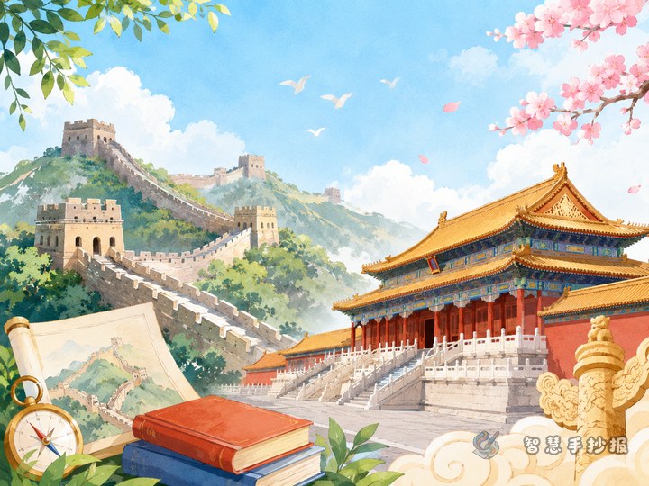
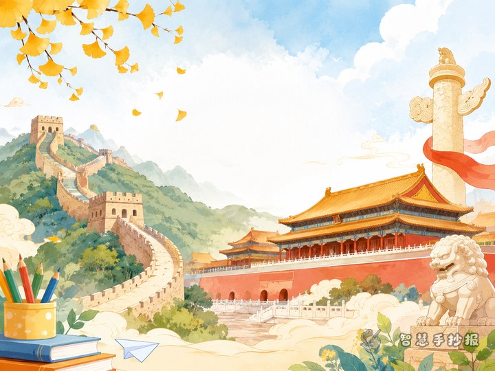
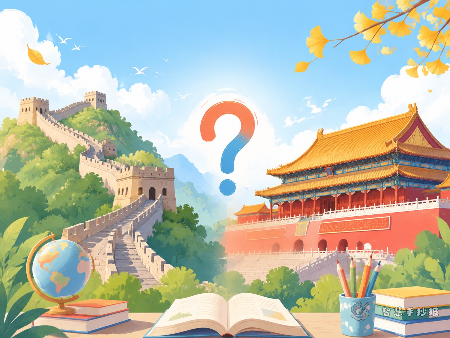
If you want a handwritten newspaper that looks organized and meaningful, a great topic is “How are the Great Wall and the Forbidden City different?” This angle is easy for children to handle because it naturally creates categories. One site shows strength and defense, while the other shows royal architecture and classical beauty. A comparison layout helps readers understand both landmarks at a glance.
You may use titles such as “How Are the Great Wall and the Forbidden City Different?”, “The Great Wall and the Forbidden City in My Eyes”, or “Two Famous Historic Sites, Two Different Styles”. These titles sound natural and fit common search habits.
What sections should be included
Section 1: Simple introduction
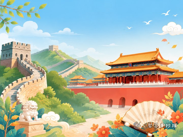
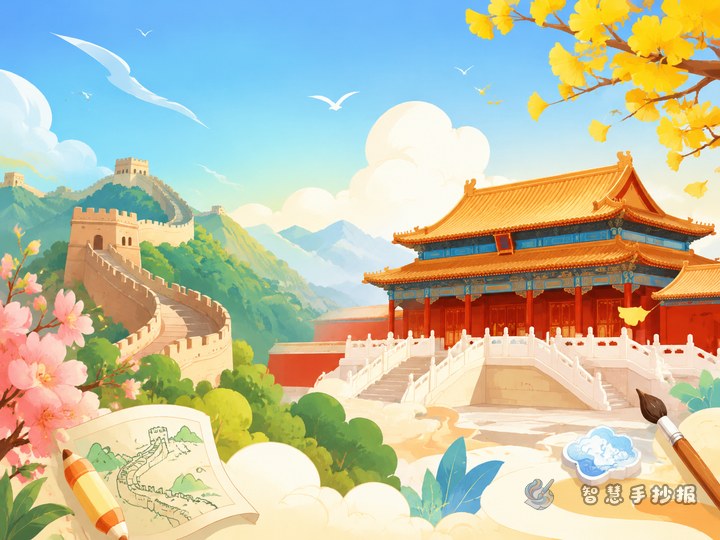
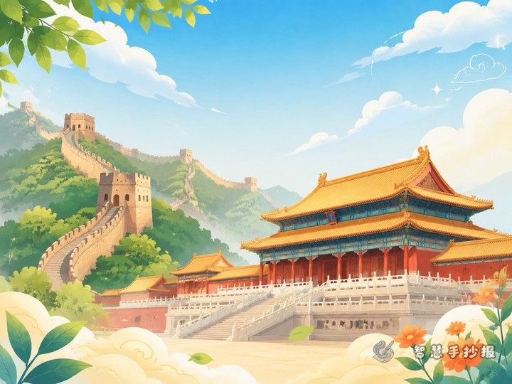
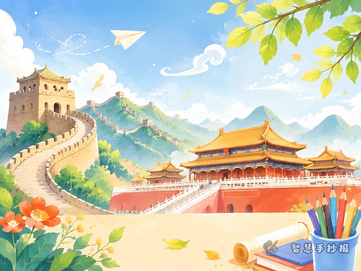
- The Great Wall: a famous ancient defensive project in China, known for its winding shape and powerful presence.
- The Forbidden City: a famous ancient palace complex in China, known for its orderly layout and elegant architecture.
Section 2: Appearance and feeling
- The Great Wall follows the mountains, with strong lines and earthy colors that feel solid and grand.
- The Forbidden City has neat symmetry, red walls, and golden roofs, giving a formal and majestic feeling.
Section 3: Different purposes
- The Great Wall reflects ancient military defense.
- The Forbidden City reflects palace life and traditional architectural culture.
Section 4: What I learn from them
- The Great Wall reminds us of perseverance and protection.
- The Forbidden City helps us appreciate history, tradition, and beauty in design.
Short writing materials you can copy
To make the page fuller and easier to read, add short sentences like these:
- The Great Wall stretches across the mountains like a giant dragon.
- The Forbidden City, with red walls and golden roofs, shows the beauty of ancient Chinese architecture.
- Although the Great Wall and the Forbidden City had different uses, both carry rich historical and cultural value.
- Historic sites are worth visiting, learning about, and protecting.
If the text feels too long, turn these ideas into short keyword labels such as “grand,” “solemn,” “history,” “culture,” and “protect heritage”.
A layout idea that works well
This topic is perfect for a comparison layout. Put the main title at the top, divide the page into left and right sections, use one side for the Great Wall and the other for the Forbidden City, and add a small area below for “similarities,” “differences,” and “my thoughts”.
- Suggested colors: gray, green, and earthy yellow for the Great Wall; red, gold, and orange for the Forbidden City.
- Border ideas: mountains, bricks, and watchtowers for the Great Wall; lanterns, palace roofs, and gates for the Forbidden City.
- Writing tip: make the title larger, bold the section labels, and keep the body text neat and readable.
If you want to improve the layout, colors, and decorative details, you can continue making your work in the Zhihui Shouchaobao WeChat mini program.
Useful tips before finishing
- Do not turn the page into a long encyclopedia-style article. One sentence should explain one key point.
- For a comparison topic, the two parts must be clearly separated.
- The drawings do not need to be complicated. Simple lines of the wall and the palace roof are enough.
- Add one final sentence about protecting historic sites to make the theme more complete.
A good handwritten newspaper is not the one with the most words. It is the one that helps readers remember the main ideas quickly and clearly.