Start with the right focus, not just a place introduction
A Chengde Mountain Resort poster should do more than say where the site is or what it is called. The real strength of this topic is showing why it represents Chinese garden art. Two ideas are especially important: royal garden style and the harmony of mountains and water. Once these are clear, the whole page will feel more meaningful and better organized.
Your title can be written as a question or as a theme line, such as “The Beauty of Chengde Mountain Resort” or “A Royal Garden Full of Natural Charm.” Adding a short subtitle under the main title can also make the design feel complete.
Useful sections to place on the page
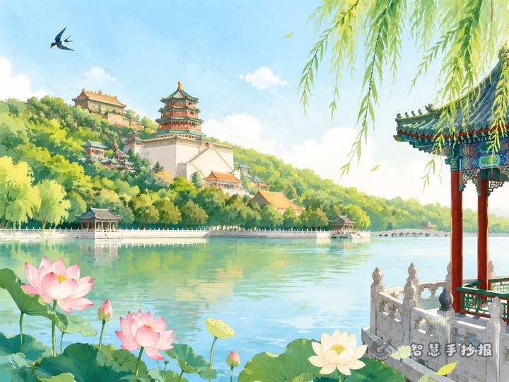
A quick garden profile
Use a few short sentences to explain that Chengde Mountain Resort is one of China’s famous gardens and is known for its royal atmosphere. This section works well near the top of the page.
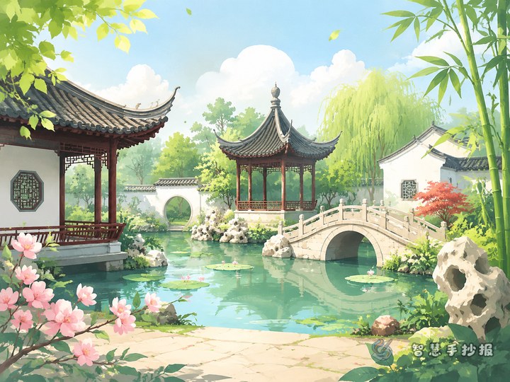
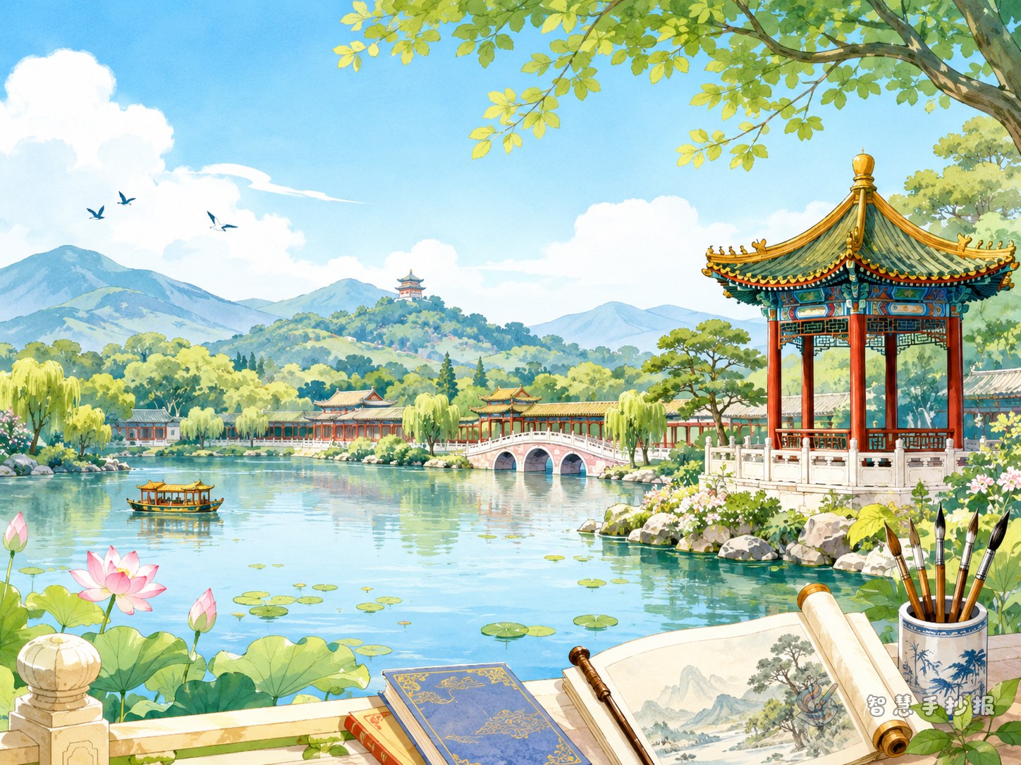
Why the landscape feels special
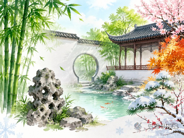
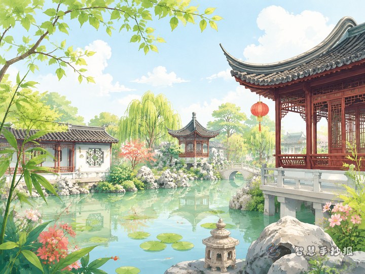
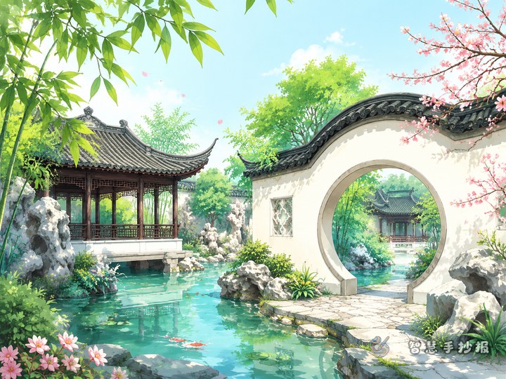
Write about the way mountains, lakes, trees, and buildings are arranged together. The design is not random. It creates changes in height, distance, openness, and balance, which is an important part of garden art.
Scenes I want to introduce
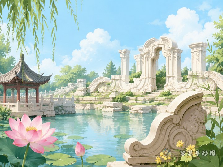
Choose one or two views that are easy to describe, such as water, hills, pavilions, or corridors. A few simple sentences for each scene are enough.
What I learned about garden art
- Borrowed scenery helps distant views become part of the picture
- Contrast makes mountains feel calm and water feel lively
- Layers create depth from front to back
- Nature and architecture work together instead of competing
This section helps the project feel thoughtful, not just descriptive.
Short lines you can use directly
If you are not sure how to begin writing, these simple lines can help. You may copy them or rewrite them in your own words.
- Chengde Mountain Resort combines mountains, water, trees, and buildings in a beautiful and balanced way.
- It has both the dignity of a royal garden and the freshness of natural scenery.
- The views are rich because they change with distance, height, and direction.
- Looking at a garden is not only enjoying buildings, but also understanding harmony between people and nature.
- This famous garden shows the elegance and wisdom of traditional Chinese landscape design.
These lines fit well in text boxes, reflection sections, or side notes near the title.
Try a layout that opens like a landscape scroll
Instead of using only straight boxes, imagine the page as an unfolding landscape painting. Put the title near the top center, then divide the page with curved lines or wave-like borders. This style fits the garden theme better than a rigid grid.
- Top area: main title and one short introduction
- Middle area: garden profile and landscape features
- Side areas: scenic spots, art points, and a personal reflection
- Bottom area: small decorative details such as trees, bridges, or pavilions
Color choices can include soft green, lake blue, cream, and a little red or gold. These colors feel calm, elegant, and suitable for a royal garden topic.
Small design details that improve the final work
Try to match your decorations with the writing. For example, use wave borders for lake content, roof shapes for pavilion sections, and layered mountain lines between blocks. This makes the page feel more unified.
If time is limited, do not aim for overly complex drawings. Focus first on a clear title, readable sections, neat handwriting, and comfortable spacing. A clean page with simple decorations often looks better than one that is too crowded.
A natural way to end the poster
Instead of ending with a broad slogan, write one honest thought. For example: I think the most beautiful part of Chengde Mountain Resort is not only its scenery, but the way nature and buildings are arranged in harmony. A simple ending like this is sincere and suitable for a school project.
If you have your topic ready and want to keep improving the text, title style, and full-page arrangement, you can continue creating in the Smart Handwritten Newspaper WeChat mini program.