Start with a clear central idea
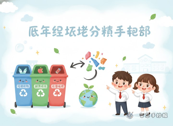
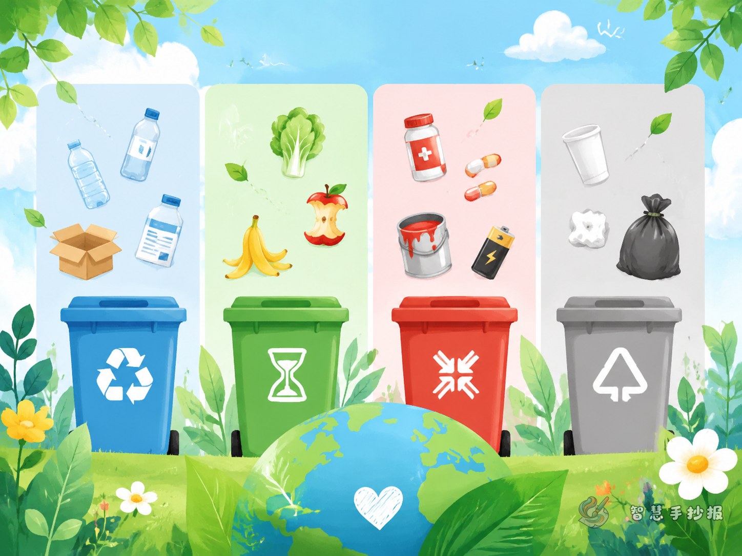
A waste sorting poster often looks messy when too many ideas are placed everywhere. A simple solution is the four-panel layout. Divide the page into four main areas for recyclables, hazardous waste, kitchen waste, and other waste. Put the main title in the center or top area, and use a different color for each section so the whole poster is easy to read at a glance.
Titles such as “Waste Sorting Heroes,” “I Know the Four Types of Waste,” or “Sort Waste, Recycle Resources” work well for school projects.
What to include in each section
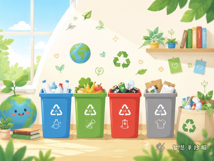
Panel 1: Recyclables
Write about newspapers, cardboard boxes, plastic bottles, metal cans, and glass bottles. Emphasize that these items can be collected and reused. A simple line can be: Keep recyclables clean and sort them correctly.
Panel 2: Hazardous waste
Include used batteries, expired medicine, fluorescent tubes, and paint containers. Remind readers that these items should not be thrown away casually. A useful sentence is: Hazardous waste may be small in amount, but it needs special care.
Panel 3: Kitchen waste
This section can mention leftover food, fruit peels, vegetable leaves, eggshells, and tea leaves. It is a good place for a short slogan like: Sort kitchen waste and keep the environment fresh.
Panel 4: Other waste
Write about dirty tissues, disposable lunch boxes, cigarette butts, and broken ceramics. This part helps students understand that not everything can be recycled. It is also a great place for “easy-to-mix-up items.”
Ready-to-use lines for the poster
- Waste sorting is not trouble. It is a good habit for protecting the environment.
- Put waste in the right bin and make the city cleaner.
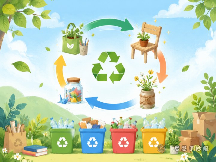
- Recycling saves resources and gives old items a new life.
- Less littering, more sorting, greener living starts with me.
- Sort carefully today for a better environment tomorrow.
If you still have space, add a short note explaining that waste sorting reduces pollution, saves resources, and helps build good daily habits.
Simple layout tips that make the page look neat
The key to a successful four-panel poster is clear borders, balanced text, and matching colors. You can use blue, red, green, and gray for the four waste categories. In each panel, keep the same structure: a small heading, a few examples, and one reminder sentence. This keeps the poster organized and easy to follow.
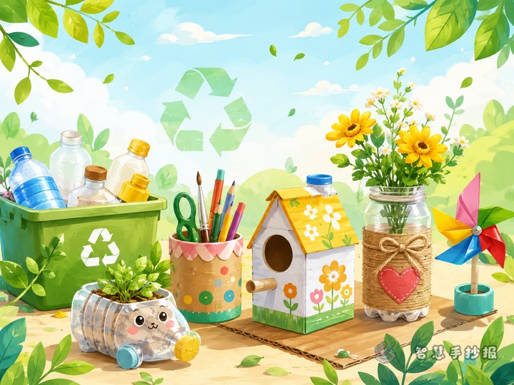
The main title should be larger than the body text. Drawings do not need to be complicated. Small icons like bins, bottles, fruit peels, and batteries are enough. Add leaves, a globe, or recycle arrows in the corners to create a fresh environmental theme.
An easy order for making the poster
- Choose the title and leave space for it first.
- Lightly divide the page into four main sections with a pencil.
- Write the section headings before adding examples.
- Add slogan lines and reminder notes so the page is not just a list of words.
- Finish with color and borders to highlight the key points.
If you want to keep improving the layout, try different color plans, or organize your content more quickly, you can continue your design in the Zhihui Shouchao Bao WeChat mini program.