Build the theme around three observations
When making a Mona Lisa handwritten newspaper, there is no need to copy every fact you find. Organize the page around the question “What do I notice?” Leonardo da Vinci, the sitter, and the painting’s details can become three clear lines of observation.
- Artist card: Leonardo da Vinci was an Italian Renaissance artist who was interested in painting, nature, the human body, and science.
- Artwork card: The Mona Lisa is a famous portrait. The sitter looks calm, her smile is subtle, and the distant hills and roads make the background feel deep.
- Detail card: Look closely at her eyes, hands, clothing, and the background colors, then write about the detail that interests you most.
Choose one sentence for the main idea
Under the title, add a short introduction such as: “One painting holds a mysterious smile; one careful look opens the door to art.” This tells readers that the page is about appreciating a famous painting, not simply copying a portrait.
Turn the research into four small sections
Keep the sections short. A few lines in each one are easier for elementary students to copy and leave enough room for drawings and decoration.
- Artist profile: “Leonardo da Vinci was an important artist of the Renaissance. He carefully observed life and used delicate brushwork to show people and nature. He also explored the connection between art and science.”
- What to notice: “The Mona Lisa’s smile is not exaggerated. From different viewpoints, it may seem to express different feelings. Her hands look natural, while the distant landscape is quiet and far-reaching.”
- Art vocabulary: “Sfumato” is a painting technique that creates soft transitions between colors and outlines. It avoids hard lines and makes a facial expression feel more gentle and mysterious.
- My response: For example: “I like the smile most because it does not give us one fixed answer. It allows every viewer to create a different story.”
Use a smile-shaped curve as the page’s visual path
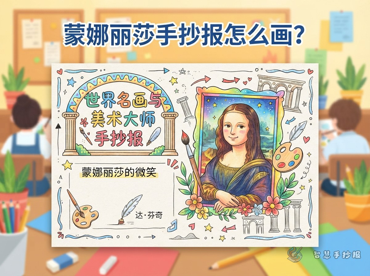
Try a vertical layout. Place the main title at the top, a simplified half-length portrait slightly to the left of center, and the Artist Profile and What to Notice sections on the right. Put Art Vocabulary and My Response below. This keeps the portrait prominent without crowding the writing.
- Shape the title in a gentle curve that opens from left to right like a smile. Add small stars, a paintbrush, or a palette beside it.
- For the portrait, draw the main outlines of the face, hair, sleeves, and hands. A calm and dignified pose matters more than perfect realism.
- Connect the four sections with thin lines that echo the curves of distant hills or roads, creating a visual journey from the foreground into the background.
- Fill empty spaces with small frames, paint boxes, or classical patterns, but keep decoration smaller than the main portrait and text.
Choose gentle colors and finish with a check
Use ivory, brown, olive green, and blue-gray to create a quiet, classical mood. A small amount of golden yellow can highlight the title. Start the skin with a light base, layer clothing and background colors from light to dark, and add facial features and outlines at the end. Avoid filling every area with black, or the page may lose its soft feeling.
- Use a pencil to plan the title, portrait, and section positions.
- Copy the text neatly and check the spacing between lines.
- Color the title and key words last, then add the border and small decorations.
Before finishing, check three things: Is the relationship between Leonardo and the Mona Lisa clear? Is there a personal response? Does the page have enough white space? If you want to arrange the sections and colors in a draft first, continue making the page in the WeChat Mini Program “智慧手抄报”.