Begin with the feeling behind the colors
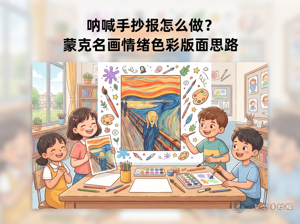
A handwritten newspaper about The Scream can do more than introduce a famous painting. Build it around two simple questions: Why does the figure seem to be shouting, and how do colors show emotion? A title such as “The Scream: An Emotion in Color” can be paired with the subtitle “Exploring Edvard Munch’s Art” to make the theme clear from the start.
- Main idea: Show tension, surprise, or uneasiness through lines and colors.
- Decorative direction: Use waves, spirals, and uneven color blocks to echo the movement of the painting.
- Writing style: Choose short observations and personal thoughts instead of difficult art terms.
Break the painting into three easy-to-draw parts
Before drawing, look at the front, middle, and back of the scene. Then simplify each part into shapes that work well on a school handwritten newspaper. This keeps the main features without making the drawing too difficult.
- Front figure: Draw a large figure with both hands near the face and an open mouth. Emphasize the eyes, mouth, and gesture.
- Middle bridge: Use a few diagonal lines for the bridge and railing to create depth.
- Background sky: Draw repeated curved lines for the flowing sky, then add orange, yellow, blue, and black color blocks.
Make the figure large and simplify the bridge and sky. The central image will look clearer and be easier for children to copy.
Four sections that keep the page informative
Painting profile
You can write: Edvard Munch was a Norwegian painter. The Scream is known for its exaggerated expression, curved lines, and intense colors, which create a powerful emotional atmosphere. Keep this section to three or four sentences so the page does not become crowded.
Looking at the colors
You can write: The orange-red sky immediately catches the eye, while the blue-black bridge and distant view create contrast. Warm colors make the scene feel intense, and cool colors add a sense of distance. Here, color is not only decoration; it helps the viewer feel the mood.
My response to the painting
Try a short paragraph like this: The first thing I noticed was the figure’s exaggerated expression. The curved sky seems to move, making the picture feel strange but powerful. The artist turns an invisible feeling into something we can see through color and line.
A mini art glossary
Explain three words: “exaggeration,” “contrast,” and “expressive lines.” Exaggeration makes an expression or action more noticeable. Contrast makes different colors, tones, or sizes stand out. Expressive lines use direction and shape to communicate a feeling.
Create an artistic layout without copying every detail
Try a layout with the title at the top, one large drawing in the center, information on both sides, and personal thoughts at the bottom. Let the central image take up about half the page width so the writing does not compete with it. Place the painting profile on the left, color observations and the glossary on the right, and connect the bottom section with a curved decorative line.
- Outline the title in orange or dark blue, while keeping the letters neat and easy to read.
- Use white or light cream for the writing areas to make the text comfortable to read.
- Use orange-red for emphasis and blue-black for the railing, outlines, borders, and small headings.
- Add a few waves to the border, but leave enough open space around every section.
Follow a simple making order
- Lightly divide the page into a title area, a central drawing area, and writing sections.
- Draw the figure and bridge first, then add the swirling sky and a simple background.
- Copy the painting notes, color observations, and personal response neatly.
- Finish by adding color, strengthening important outlines, and checking the spacing between sections.
If you want to organize the title, sections, and layout more quickly, continue in the WeChat mini program and adjust the details to match your drawing level. The finished world-art handwritten newspaper can then feel artistic while still showing your own ideas.