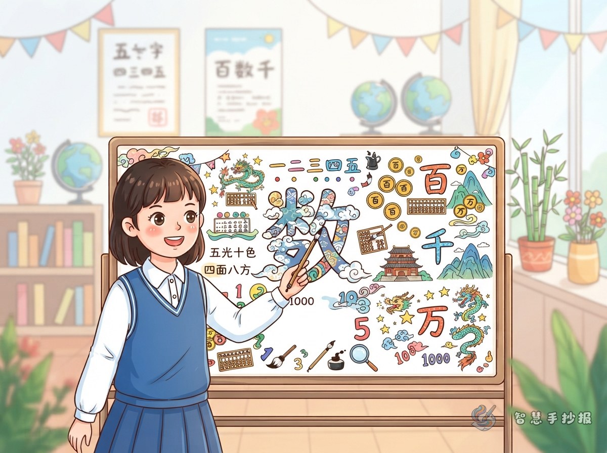
Choose a focus: number characters, not a math poster
Numbers can easily lead to calculations and formulas, but this poster should treat them as Chinese characters. The goal is to notice how they are written, how they sound, what words they form, and how they appear in daily life and culture.
A small focus works best. You can select a few characters from one to ten, or build the poster around “numbers in everyday life.” Once the main idea is clear, the columns and illustrations are easier to arrange.
Useful text to include
Character profiles
Pick three to five number characters and write the pronunciation, stroke count, and common words. For example, “一” has one stroke and appears in “一心一意,” while “十” has two strokes and appears in “十全十美.” If you mention ancient character forms, check a dictionary first and leave out anything you cannot confirm.
Number idioms and poem lines
- Number idioms: 一心一意, 三心二意, 五颜六色, 七上八下, 九牛一毛, 十全十美.
- Poem lines with numbers: 一去二三里,烟村四五家;飞流直下三千尺,疑是银河落九天.
- Common sayings: 六六大顺, 八九不离十. You can add a note that these are traditional expressions rather than facts.
Formal numerals and numbers around us
壹, 贰, 叁, 肆, 伍, 陆, 柒, 捌, 玖, and 拾 are formal numerals used on receipts and in accounts. They make amounts harder to alter. Door numbers, dates, phone numbers, and ruler marks can also become small observations on the poster.
Column ideas that are easy to fill
- Number character files: pronunciation, strokes, and one common word for each character.
- Number idiom chain: four to six idioms, with a short explanation for one of them.
- Number poem corner: two poem lines with a brief meaning.
- Numbers in daily life: notes about calendars, door plates, or height charts.
- My number discovery: two or three sentences about a favorite number character.
You do not need every column. Three or four well-filled sections look better than many sections with only one line each.
Layout: let large numerals organize the page
Draw large outlines of “1, 2, 3” or “三, 六, 九” and place a small column inside each one. Add a double or dashed outline to make the shapes stand out. Put the title at the top or in the center, and write it in clear standard characters. If you want to show stroke order, draw a grid box and place the character inside.
Limit the color palette to two or three colors. Use one dark color for the main title, another for section borders, and keep the body text easy to read. Leave some empty space at the bottom instead of filling every corner.
Writing and final check
- Sketch the title, text areas, and illustrations lightly in pencil before going over them with a black pen.
- Write standard characters, give punctuation its own space, and keep sentences away from the borders.
- Draw only simple pictures related to number characters so they do not crowd the text.
- Step back at the end and check whether the title stands out, the columns are clear, and there are no wrong characters.
If you want more column ideas or layout examples, open “智慧手抄报” in WeChat Mini Programs and continue building your poster by theme.