Pick One Thread Before You Start
The beauty of Chinese calligraphy sounds like a huge topic, but a handwritten newspaper only needs one clear thread. Talk it over with your child and choose from the three options below. Everything else on the page should support that choice.
- The script thread: list seal, clerical, regular, running and cursive script in order, write one or two features for each, and draw the same character in two styles for comparison.
- The tool thread: centre the page on brush, ink, paper and inkstone, explain what each one does, and add small drawings beside the text.
- The people thread: choose one calligrapher, tell a short story about his practice, and copy one famous line or the name of a well known inscription.
Text You Can Copy Straight Onto the Page
The paragraphs below run from about forty to eighty characters, which fits a small column almost perfectly.
Script styles at a glance
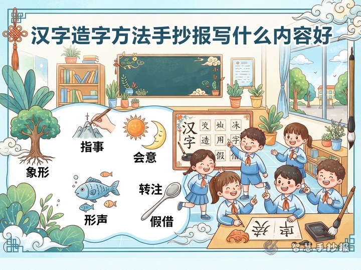
Chinese characters took on different shapes over time. Seal script curves in rounded lines, like a rope bending again and again. Clerical script turns those curves into flat, squared strokes and looks steadier. Regular script has clear strokes and balanced structure, which is why it is the most common today. Running script links strokes together so it is quick to write yet easy to read. Cursive script cuts strokes to a minimum and is all about momentum.
The four treasures of the study
Brush, ink, paper and inkstone are together called the four treasures of the study. Brush hairs may be soft or stiff, and the lines they produce differ in thickness. An ink stick is ground with water on the inkstone, so you control how light or dark the ink is. Xuan paper absorbs water, letting the ink spread slightly, which is part of what gives calligraphy its appeal.
A short story about practice
It is said that Wang Xizhi often washed his brush beside a pond, and over the years the water turned black. Later people called it the Ink Pond. The story may not be literally true, but its point is simple: good handwriting comes from practice, not from looking.
How to Divide the Page Without Crowding It
For a calligraphy poster, empty space matters more than filling every corner. Try an arrangement of one large area and two smaller ones: put the main title and a big character in the centre or top left, place two text columns elsewhere, and add a few strokes in the corners.
- Sketch the title area, text area and picture area in pencil, roughly in a ratio of two to five to three.
- Write the main title in a brush like style and the body text in ordinary regular script, so the sizes contrast.
- Keep each text column between sixty and one hundred characters. If it does not fit, use a shorter piece.
- Add lines and decorations last, otherwise you may run out of space for writing.
Titles, Colours and Simple Decoration
Limit yourself to three colours at most: cream or pale grey for the background, dark ink for the writing, and a touch of vermilion for a seal, a border or a small heading. Keep decorations restrained. One brush, one inkstone, one square seal and a few horizontal lines in different shades are enough. If your title has six characters, enlarge one character or give it a different colour to create a clear focal point.
What to Do After the Rough Draft
Once the draft is finished, you can continue the layout in the Zhihui Shouchaobao WeChat mini program. Column frames can be swapped, title sizes adjusted and small illustrations added without redrawing the whole sheet. Let your child write the content by hand first, then tidy the layout in the mini program, and the finished work will look more polished and be easier for the teacher to remember.