Start with a clear theme for the whole page
A solid shapes handwritten newspaper looks best when it has one simple focus. You can choose ideas such as getting to know common solid shapes, solid shapes around us, or how we observe 3D shapes. A clear theme helps the whole page feel organized instead of looking like a list of random facts.
For younger students, the page can focus on naming shapes and matching them with objects. For older students, it can include simple nets, faces, edges, and basic spatial thinking.
Use a few strong sections instead of too many boxes
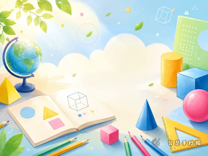
Section 1: Meet the common solid shapes
- Cube: six equal square faces, like a small gift box.
- Cuboid: six faces, often shaped like a tissue box or carton.
- Cylinder: two circular ends and one curved surface, like a cup.
- Cone: one circular base and a pointed top, like an ice cream cone.
- Sphere: round all over, like a ball.
Section 2: Solid shapes in daily life
This part is excellent for a handwritten newspaper because it is easy to draw and easy to understand.
- Cuboid: book box, milk carton
- Cube: toy block, gift box
- Cylinder: battery, thermos cup
- Cone: party hat, traffic cone
- Sphere: football, globe model
Section 3: How I observe solid shapes
Students can write simple ideas such as looking from the front, side, or top. They can also compare which shapes roll easily, which shapes stand steadily, and which shapes have flat faces.
Section 4: My hands-on discovery
This is a good place to add a personal touch. For example, a student can open a paper box to see its net or sort classroom objects by shape. It turns the poster into a learning record, not just copied text.
Short text materials that are easy to copy
- Solid shapes have length, width, and height.
- The same shape can appear in many different objects.
- We can understand a solid better by looking at it from different directions.
- Some shapes roll, while others stay still more easily.
- Learning solid shapes helps us understand the world around us.
Students can also add one sentence about their own feeling, such as “I found geometry in my classroom and home.” This makes the page feel more complete and personal.
Try a center picture with content around it
This topic is perfect for a layout that shows space and structure. Draw a group of solid shapes in the middle, such as a cube, a cylinder, and a sphere, and place the title above or across the center picture. Then arrange the content sections around it.
- Put the main title in the middle area.
- Place shape facts in one corner and real-life examples in another.
- Add observation notes and learning reflections in the lower sections.
- Decorate the edges with small cubes, circles, arrows, or line details.
This kind of layout looks more lively than dividing the paper into four equal parts.
Easy drawing tricks to make shapes look 3D
- Draw the front face first, then add parallel lines to show depth.
- Color different faces with lighter and darker tones.
- Add a soft shadow below the shape.
- Outline the title to make it stand out.
- Keep the main colors limited to two or three for a clean result.
If time is short, finish the title, text, and main shapes first, then add decorations last. For a faster and more polished final version, the design can also be continued in the Smart Handwritten Newspaper WeChat mini program.