Start With One Main Color
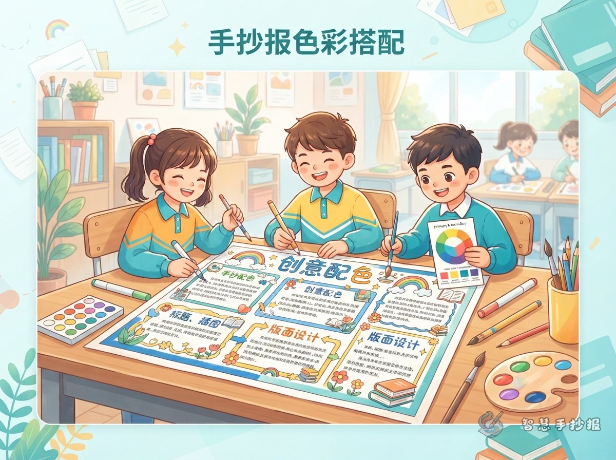
A handmade poster usually looks busy because no single color leads the page. Before you draw, choose one main color based on the topic: orange for autumn, blue-green for the ocean, deep green or ochre for a reading poster. That color sets the mood, and everything else should support it.
- School and sports day: blue, white and a touch of bright orange
- Traditional festivals: red, gold and cream
- Science and nature: green, sky blue and pale yellow
- Reading and poems: deep green, ochre and warm beige
The 7-2-1 Rule for a Calm Page
Think of the page in three shares. About seven tenths is the main color, used for backgrounds, text boxes and the main title bar. About two tenths is the support color, used for illustrations, borders and small headings. The last one tenth is the brightest accent, saved for two or three spots that need attention.
Three common mistakes
- Giving every section its own color, so the page looks like a paint chart.
- Using the accent color everywhere, which leaves nothing to stand out.
- Spreading a very dark main color over most of the page, which dulls the writing.
Color the Boxes, Borders and Titles in This Order
Work from large shapes to small details: fill the text boxes first, then draw the borders, and finish with titles and tiny decorations. This order keeps the paper clean if you need to fix something.
- Text boxes: a light tint of the main color, light enough for black writing.
- Borders: the support color, mixing thick and thin lines for interest.
- Titles: the darkest color, or white letters on a dark block for contrast.
- Accents: the brightest color, used in only two or three small places.
Short Color Sayings You Can Copy Onto the Page
If you need a short line to fill a small box or a color card, try one of these:
- Three colors feel calm, five colors get loud.
- Big areas stay light, small details stay bright.
- Dark for writing, light underneath.
- Close colors feel soft, opposite colors feel lively.
Palette Ideas for Common Poster Themes
Festival posters
Red, gold and cream is a classic mix. Do not flood the page with red: leave half of it cream so the poster still breathes.
Science and nature posters
Green with sky blue is safe and clean. Add a little bright yellow or orange in a corner, and let plants, insects or clouds use different shades of the same color family.
Reading and biography posters
Deep green, ochre, beige and pale grey are easy on the eye. Draw illustrations with fine outlines and the page will feel like an old book page.
Short on Time? Use a Ready-Made Palette
When the deadline is close, decide your main color on paper first, then open the 智慧手抄报 WeChat mini program, pick a palette and layout you like, and fill in the title, section names and text. Copy the result onto paper afterwards. Testing colors on a screen is far quicker than repainting a real page.