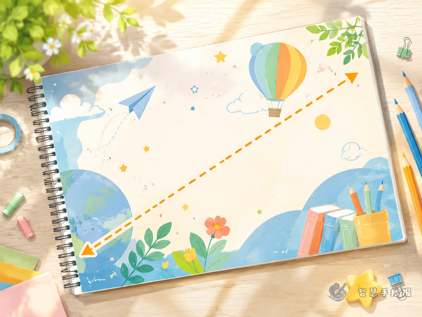
Build the Page Around One Invisible Diagonal
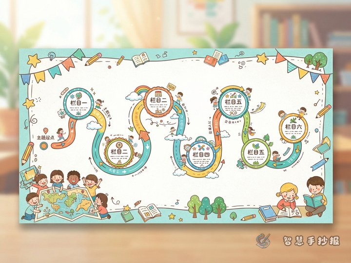
A diagonal composition does not mean writing every line at an angle. Instead, the title, illustration, and color blocks create a visual route from one corner to the other. A path from the upper left to the lower right is easy to follow: readers see the title first, then the main image, and finally the key message.
- Lightly mark an invisible diagonal with a pencil.
- Place the title near the starting point and the main illustration near the middle.
- Reserve the end of the path for a conclusion, slogan, or action list.
- Divide the remaining spaces into sections of different sizes.
Give the Two Sides Different Jobs
Once the diagonal divides the page, avoid filling both sides with identical boxes. The larger area should carry the main information, while the smaller area can provide quick and memorable details.
Ideas for the larger area
- Topic introduction: Explain the theme in two or three short paragraphs.
- Practical steps: List three to five actions readers can follow.
- Story or observation: Describe a relevant example from school, home, or daily life.
Ideas for the smaller area
- A short slogan or friendly reminder.
- Three keywords with simple definitions.
- A mini quiz, checklist, or personal action promise.
Use Short Text to Keep the Eye Moving
Diagonal layouts feel energetic, so long blocks of writing can slow the page down. Useful opening lines include “Small actions can create meaningful change” or “Let us begin with what we can do today.” A three-part phrase such as “Learn, act, and keep going” works well in a practical advice section.
Keep most paragraphs between three and five handwritten lines. Highlight only important words with color. If the material is too long, remove repeated information instead of squeezing in smaller handwriting.
Let Illustrations and Colors Support the Direction
Place the main illustration near the center of the diagonal and allow a few details to extend toward both content areas. A sports poster can use a running track or ribbon, a science poster can feature a rocket trail, a reading poster can show stars rising from an open book, and an environmental poster can use leaves or recycling arrows.
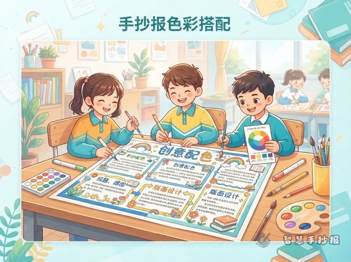
- Choose one main color, one supporting color, and a small accent color.
- Repeat the same small shape two or three times along the diagonal.
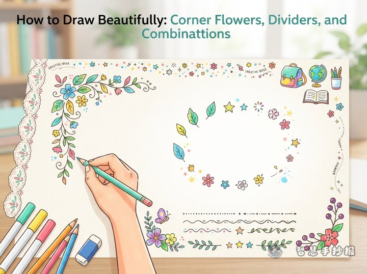
- Keep corner decorations light so they do not compete with the main image.
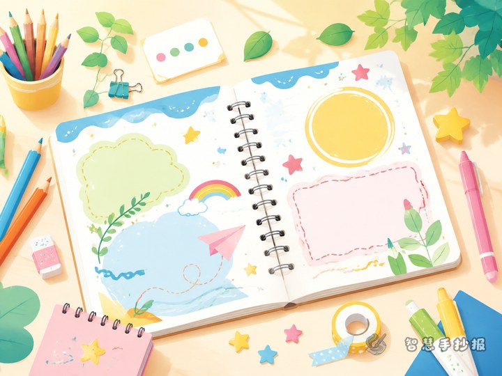
- Use consistent content boxes rather than a different shape for every section.
Finish the Poster in a Clear Order
- Choose the paper orientation and sketch the diagonal guide.
- Reserve space for the title and central illustration.
- Plan three to five content sections before writing.
- Add body text first, then outline and color the design.
- Check the reading order, erase guide lines, and preserve some open space.
If section sizes or illustration placement still feel uncertain, open the Smart Handwritten Poster WeChat Mini Program to continue selecting a theme, organizing content, and developing the layout before adapting it to the final paper size.