Start with what a mask pattern type actually is
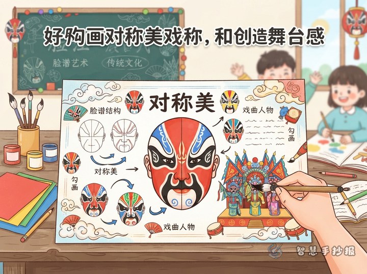
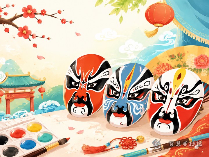
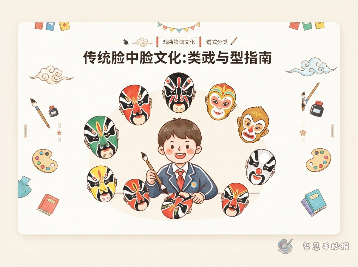
An opera mask is not colour smeared at random. It follows a set design in which some areas stay blank, some are blocked in black, and some are outlined. Explaining this idea on a poster gives readers a way to actually read a painted face, which is far more memorable than copying a few sentences of description.
Before starting, sketch three identical oval faces on scrap paper and use only black lines to place the brows, eyes, nose and mouth. Once your hand knows the proportions, move the drawing onto the real sheet and the page will look much tidier.
Five pattern types that fit five small columns
Divide the page into five boxes, either three across the top and two below, or five in a row. Use the pattern name as each box heading so readers can match text to picture instantly.
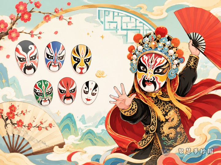
- Whole face: one main colour covers the entire face, with brows and eyes outlined in black. It looks steady and dignified.
- Three-tile face: the forehead and the two cheeks form three separate colour blocks divided by brow and nose lines, like three tiles laid over the face.
- Cross-gate face: a vertical stripe runs from the forehead down the bridge of the nose and meets the horizontal brow line, making a cross shape. It is very symmetrical, so it suits one large central drawing.
- Broken-flower face: the surface is packed with fine, dense patterns and many colours. Draw light grid lines in pencil first and fill in one layer at a time, or the face will turn into a blur.
- Pictographic face: an animal image is painted onto the face. This is the column younger readers will head for first.
A three-sentence pattern for every column
Small boxes get cramped fast. Keep a fixed sentence pattern: first say what the design looks like, then name the main colours, then explain which kind of character wears it. For a three-tile face you might write that the forehead and cheeks form three blocks separated by lines, that strong contrasting colours are common, and that it often marks an outgoing character.
Keep all five columns roughly the same length so the page looks even. If you want extra content, add one small line under the box naming a specific character as an example rather than copying a whole story.
Laying out the page so the masks have room
Pictures come first, words come second. Draw the outer border and column lines, decide where each mask drawing sits, and only then start writing, otherwise you may run out of space halfway through a paragraph.
- Place the title in the top left or top centre, make it bold, and leave a little breathing space around it.
- Make all five boxes the same size and put each mask drawing in the same position inside its box, such as the top left corner.
- Separate the boxes with thin lines or a simple repeating border pattern; avoid busy frames that compete with the faces.
- Save a small empty area in the bottom right for a one-line summary or your own comment, so the page ends with a proper finish.
Outlining, colouring and last checks
- Sketch lightly in pencil, check the left-right balance, then go over the lines with a black pen and wait for the ink to dry before erasing.
- Colour light to dark: lay down pale tones first, add darker edges on top, and finish with one clean black outline.
- Limit the whole sheet to three or four main colours; too many colours make the masks hard to read.
- Read the headings once more at the end, since pattern names are the easiest thing to misspell.
If you would rather not build all five columns from scratch, open a mask-themed layout in the Zhihui Handwritten Poster WeChat mini program, adjust the column titles and text, then print it and add your own drawings on top.