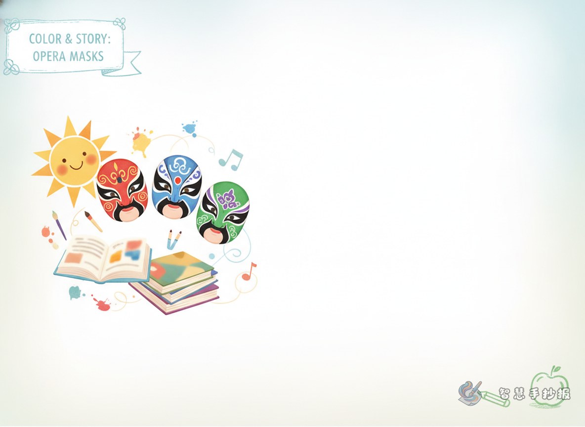
Make the theme about colors that tell stories
Many students turn an opera mask poster into a list of facts, but that often makes the page feel crowded and unfocused. A better approach is to build the whole poster around the stories behind mask colors. This gives the page a clear structure and keeps the traditional culture theme easy to understand.
You can choose a title like “Colors That Speak in Opera Masks” or “Learning Opera Masks Through Color Stories.” Under the title, add one short sentence explaining that different colors in opera masks help express personality and stage image.
Three content sections are enough
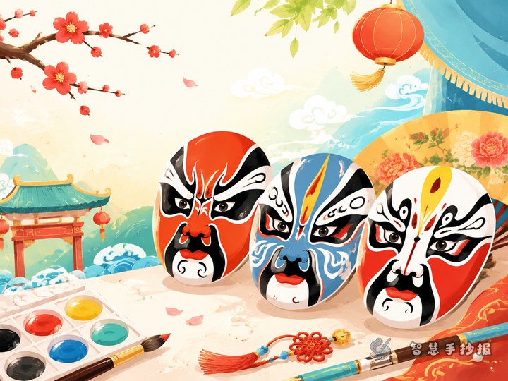
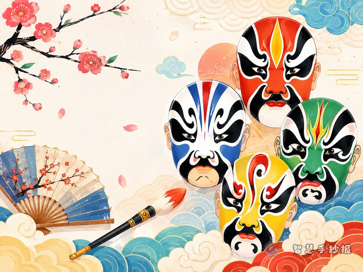
Section 1: Color cards
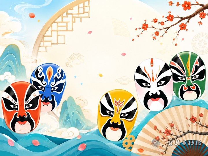
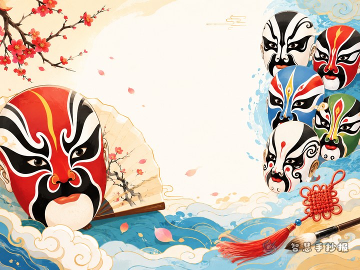
- Red: often suggests loyalty, courage, and warmth.
- Black: often gives a sense of fairness, strength, and seriousness.
- White: may suggest a complicated or calculating character image.
- Blue or green: can be used for bold, independent, or striking personalities.
Keep each explanation short. One or two sentences per color is enough for a school poster.
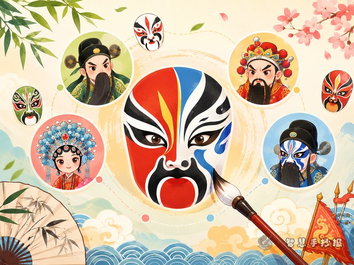
Section 2: Pattern observations
Students can also notice that many opera mask patterns are symmetrical. The forehead, nose line, and cheeks often echo one another. This section does not need deep theory. It works well as a simple observation area about what the student sees in the design.
Section 3: My own discovery
This can be written in first person. For example: I found that different colors make a mask feel completely different. I think opera masks show a person’s character through lines and colors, which makes the stage art easy to remember.
Short text materials that are easy to use
- Opera masks are a special visual art form in traditional Chinese opera.
- Colors and patterns help the audience understand character traits.
- One color can carry symbolic meaning and create a strong stage impression.
- Opera masks show both dramatic character and artistic beauty.
- Symmetrical lines and bold colors make masks highly decorative.
These short lines are useful for filling blank spaces and making the page look fuller.
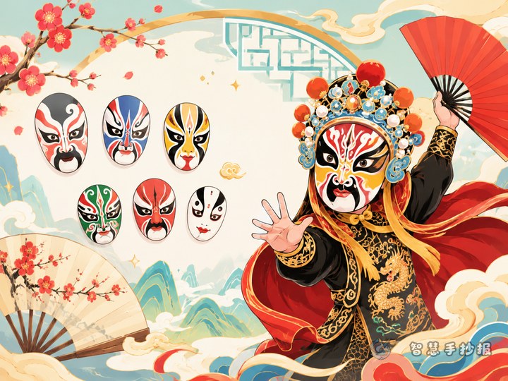
A layout idea that works well
This topic fits a center-image layout. Draw one large mask in the middle, then place different sections around it: color meanings, pattern observations, small opera facts, and personal reflections.
- Put the main mask image in the center as the visual focus.
- Place color sections on both sides for balance.
- Use the lower area for short notes and reflections.
- Add borders with curtain shapes, cloud patterns, fans, or drum elements.
If drawing feels difficult, sketch lightly with pencil first, then trace and color after the layout is fixed.
Color matching and finishing details
Do not fill the whole page with heavy colors. A good palette is red, black, and gold on a clean white background. The title should be bold, while body text should stay neat and readable. It also helps to keep one main color for each section so the page looks organized.
For a classroom assignment, choosing two to four key colors is enough. After the writing is done, add small details such as sleeve lines, lanterns, or cloud motifs to make the poster feel complete.
A simple ending for the poster
The ending can be short: opera masks bring together character image, stage art, and traditional aesthetics in one powerful visual symbol. This closes the theme neatly and fits the style of a handwritten poster.
If you want to keep improving your layout and poster materials, you can continue creating in the Zhihui Shouchaobao WeChat mini program.