Turn the Topic into a Mini Magazine Plan
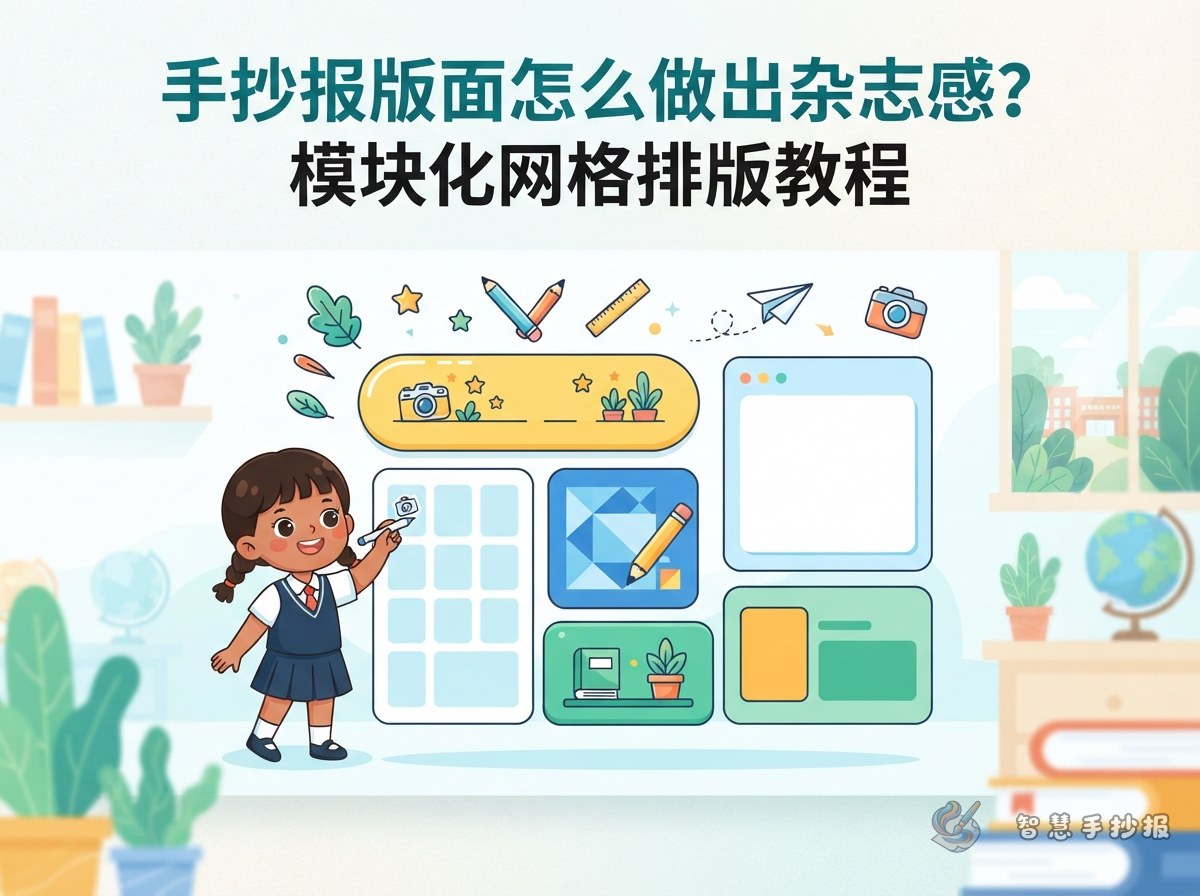
The key to a modular grid layout is not dividing the page into identical boxes. First give every part of the poster a clear role: atitle area, opening message, main content sections, and small decorative details. This keeps the writing, drawings, and labels from competing for the same space.
For a poster about “I Love Reading,” the main title can attract attention, while the opening message might say, “A good book is like a conversation with an interesting friend.” The main sections could be “What Reading Gives Me,” “Book Recommendations,” and “Good Reading Habits.” Small book, bookmark, star, and page-number details can fill the decorative area.
Build the Page with an Invisible Grid
During the sketching stage, imagine the page divided intothree or four vertical columns. Then combine neighboring spaces into larger modules according to the amount of content. The title may span two columns, while an illustration or short introduction takes one column. Body text can sit in rectangles of different sizes. The edges do not need to match perfectly, but their general alignment should feel intentional.
- Large modules: use them for the main title, key illustration, or most important message.
- Medium modules: use them for two or three main sections, such as facts, stories, or suggestions.
- Small modules: use them for quotes, keywords, reminders, and page decorations.
When there is little content, combine two small modules so the poster does not look fragmented. When there is a lot to write, add short subheadings instead of making the body text too tiny.
A Practical Module Arrangement
Create an identity zone at the top
Place the main title and a subtitle across the upper part of the page. The title can use a bold handwritten style, while the subtitle explains the topic in smaller letters. For example, write “Reading Makes Growing More Wonderful,” followed by “Start with one book and discover a bigger world.” Keep the decorations around the title simple so they do not overpower the words.
Use the middle for the main message
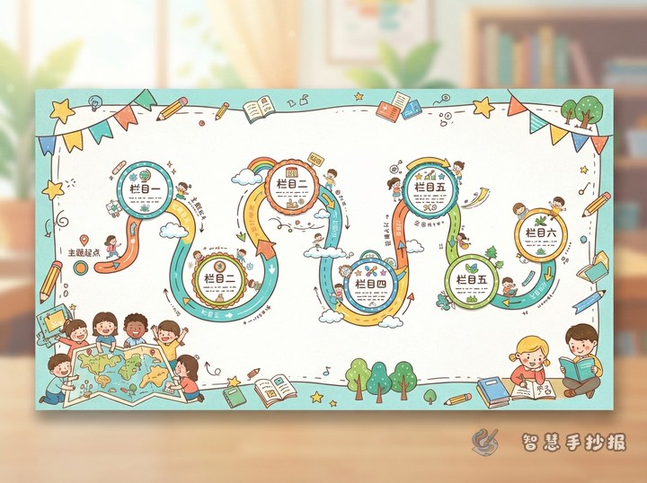
Divide the center into three sections that are not exactly the same size: “Why Reading Matters” on the left, “My Book Picks” in the middle, and “My Reading Habits” on the right. Give each section a similar heading strip or label, but vary the height of the text areas. This creates order without making the poster look like a worksheet.
Let the bottom bring everything together
The bottom area is a good place for a concluding sentence, a small reading goal, or a short action list, such as “Read for twenty minutes every day” and “Write down one new discovery.” A horizontal decorative band can visually close the page and make the whole composition feel complete.
Use One Consistent Visual Language
A beautiful poster does not need many colors. Choose one main color, one supporting color, and a dark text color. A reading theme might use book brown, cream, and deep green; an environmental theme could use green, pale yellow, and charcoal. Try to keep each module to no more than two accent colors, and repeat the title color in small decorations.
Text should also have a clear hierarchy: the main title is largest, section headings come next, body text stays easy to read, and short reminders can be emphasized with bold lettering or a colored line. Borders do not all have to be closed rectangles. You can combine rounded frames, short-line frames, and color blocks, but sections at the same level should share a similar border style.
A Smooth Order for Making the Poster
- Choose the page orientation, title, and about three main sections.
- Lightly sketch the grid and module boundaries with a pencil, checking that every section has enough writing room.
- Write the longest pieces of text first, then adjust headings and decorations around them.
- Add thematic drawings, icons, and separators to connect the modules.
- Finish the outlines and colors, erase extra pencil marks, and check that the title stands out and the body text is easy to read.
If you want to decide on a layout more quickly, you can browse a suitable topic structure in the Wisdom Handwritten Poster WeChat Mini Program, then adjust it for your paper size and amount of text. Choosing the modules before writing is usually much easier than squeezing words into empty spaces at the end.