Build the Page Around One Strong Center
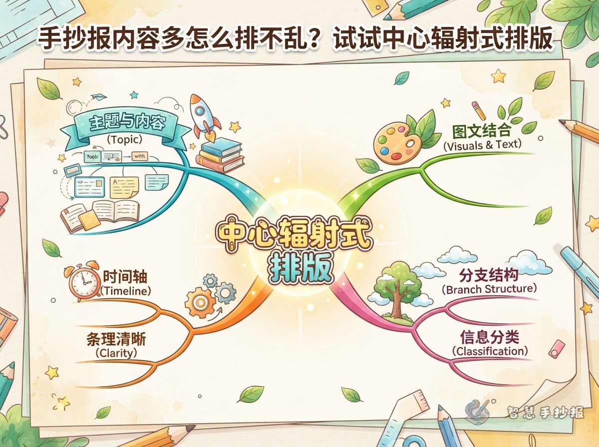
A radial layout begins with the one element readers should notice first. Place a globe, open book, sun, flower, badge, or theme character near the center, then position the poster title above it or weave the words into the illustration. Keep this focal area to roughly one quarter of the page so there is enough room for writing around it.
Choose a centerpiece that matches the subject. A globe, magnifying glass, or simple lab object works for science; books, pencils, and a knowledge tree suit a reading theme; lanterns, wreaths, or gift boxes fit celebrations. Limit the centerpiece to two or three clear details so it remains easy to draw and does not overpower the text.
Turn a Large Amount of Writing into Four Sections
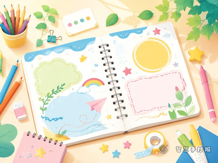
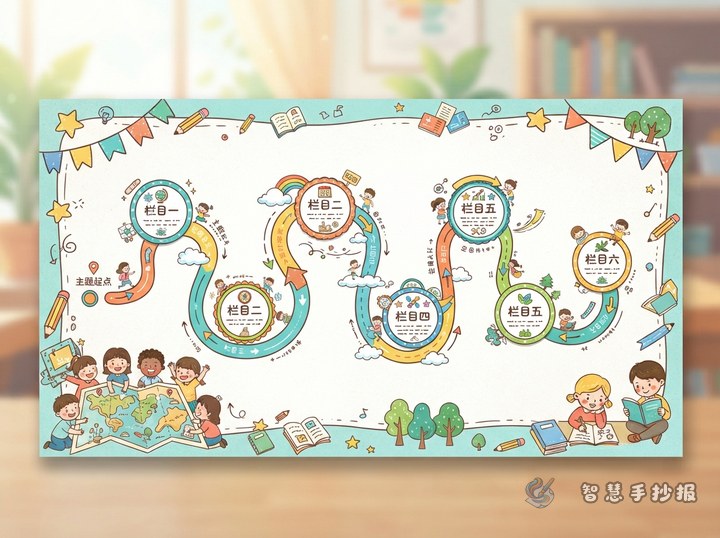
Sketch four light guides moving outward from the center to create upper-left, upper-right, lower-left, and lower-right reading areas. The section frames may look like petals, clouds, fans, or rounded boxes, and they do not need to be identical. Put the longest paragraph in a wider lower area and reserve the sides or upper areas for shorter facts.
- Theme introduction: Use two or three sentences to explain the subject and why it matters.
- Quick facts: Present three short points, keeping each one to one or two lines.
- Story or person: Add a brief story, an inspiring figure, or a personal reading response.
- Action list: Include three to five practical things readers can do.
Ready-to-Adapt Writing Ideas
An introduction can begin with: “This poster explores an interesting and meaningful subject. We can understand its value through facts, stories, and small actions in everyday life.” Short labels such as “Did You Know?”, “Key Words,” and “A Small Discovery” make fact sections easier to scan. A closing line might say: “Start with one small action and use what you learned today to build a better habit.”
Adapt the sections to the topic. An environmental poster could include “Earth Facts,” “Everyday Waste,” and “Green Actions.” A reading poster might feature “Book Pick,” “Character Notes,” “Favorite Lines,” and “My Reading Plan.” For a safety theme, try “Where Is the Risk?”, “The Right Response,” and “A Rule to Remember.”
Guide the Eye Without Adding Clutter
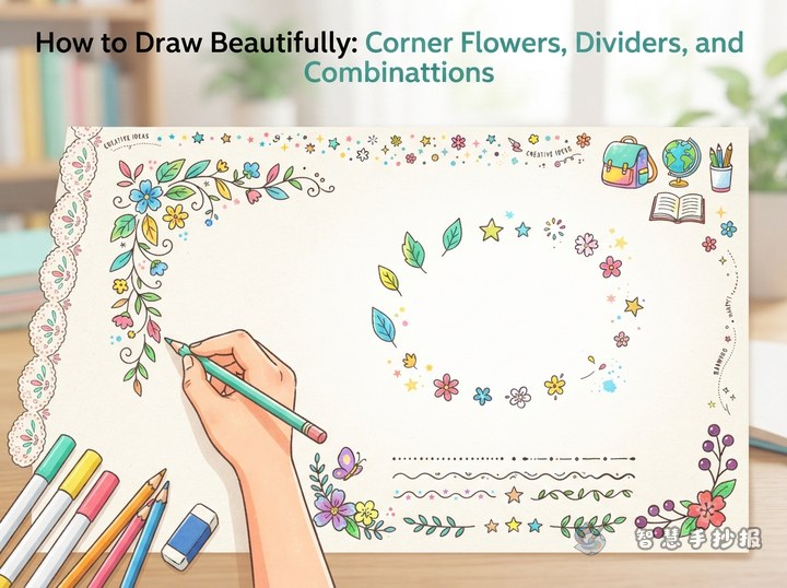
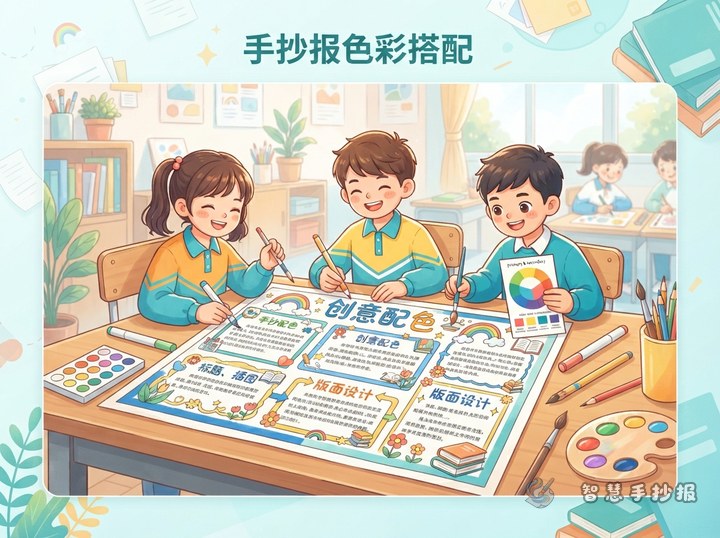
A radial design does not require heavy dividing lines. Small stars, leaves, dots, arrows, or gentle color changes can connect the center with each section. Use the darkest or strongest color for the central title, lighter shades from the same family for section headings, and one consistent dark color for body text. One main color plus one or two supporting colors is usually enough.
Balance the Corners
Do not fill all four corners equally. Add small illustrations to two opposite corners and leave the other two relatively quiet with thin lines or scattered dots. Keep the outer border lighter than the section frames so attention stays on the center and the written content.
A Practical Drawing Order
- Mark the center lightly in pencil and outline the space for the title and main illustration.
- Divide the remaining space according to text length, placing the longest section first.
- Add section headings, then draw light writing guides to estimate the number of lines.
- Finish the text before adding small illustrations, connectors, and the outer border.
- Check that the title stands out, no words touch the frames, and the palette is not too busy.
If choosing a centerpiece, section count, or color palette still feels difficult, continue in the Smart Handwritten Poster WeChat Mini Program. Select a theme and layout, organize the content framework, and then adjust the details to fit your paper size.