
Creative Layout Design and Composition Techniques for Posters Topics
Need to make a Creative Layout Design and Composition Techniques for Posters poster? Find topic options, copy references, section ideas and layout suggestions.
Topics you can use
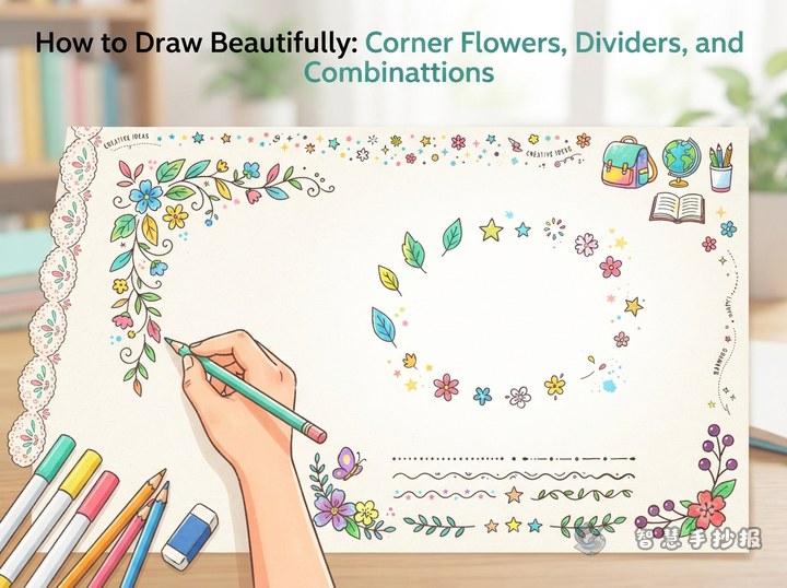
How to Draw Handwritten Poster Borders That Look Great: Corner Flowers, Dividers and Decorative Edges
Borders, corner flowers and dividers are what pull a handwritten poster together. Learn three border styles, four ways to arrange corner decorations, five divider variations, and how to place small patterns without overpowering the text.
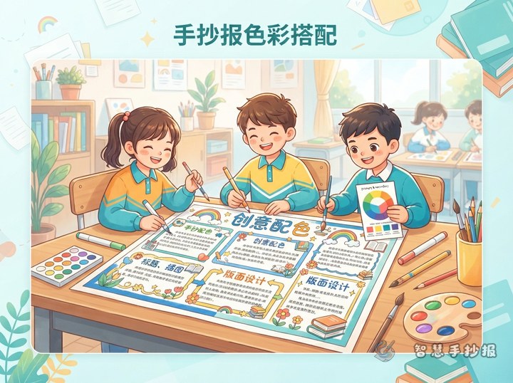
How to Pick Colors for a Handmade Poster So It Looks Polished
Good poster colors come from clear hierarchy, not from using many colors. Choose one main color, then split the page using a 7-2-1 ratio of main, support and accent colors. Keep backgrounds light, accents bright and titles dark, and the page will look tidy. The article also lists palette ideas for common themes and the right order for coloring boxes, borders and titles.
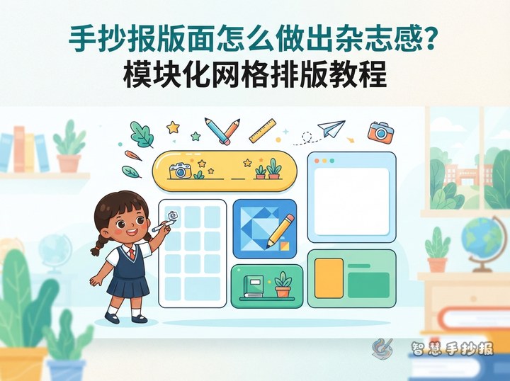
How Can You Give a Handwritten Poster a Magazine Look?
A modular grid helps organize the title, drawings, body text, and small notes on a handwritten poster. By combining invisible columns, varied module sizes, consistent colors, and clear text levels, students can create a creative layout that feels tidy and layered.
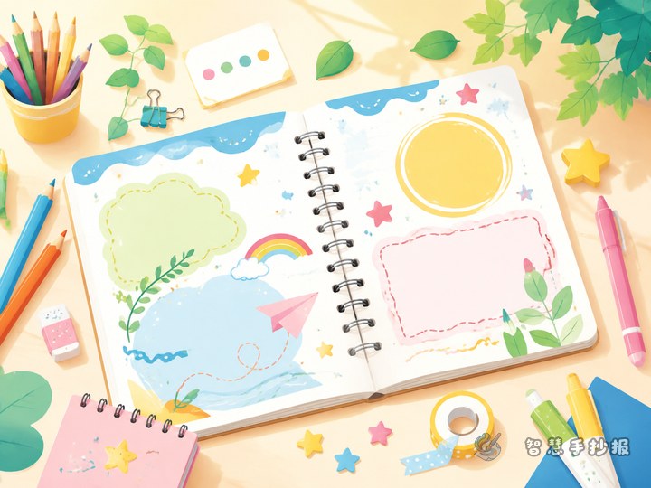
How Should Pictures and Text Be Arranged on a Handwritten Poster?
A strong handwritten poster uses illustrations with clear roles instead of filling every empty space. Choose one focal picture, build large-to-small visual levels, organize three or four short text sections, and limit the color palette. These practical steps help students create a page that is attractive, readable, and easy to follow.
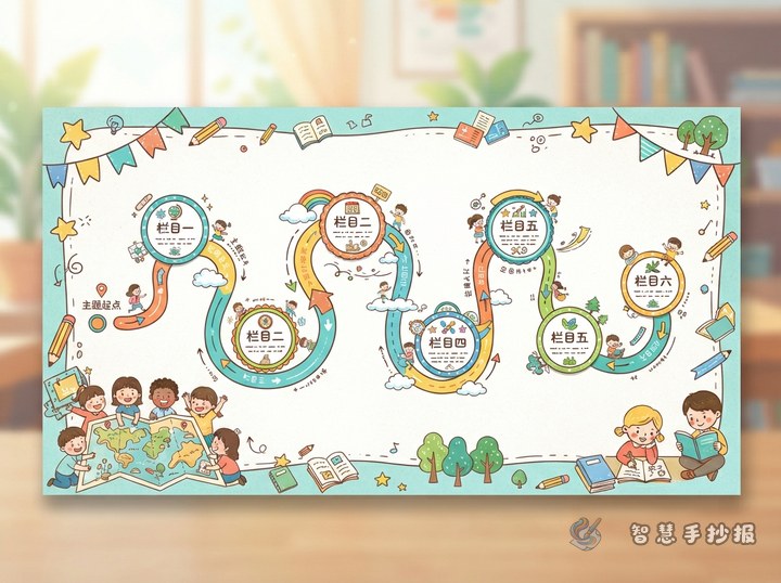
How Can You Connect Multiple Poster Sections? Try a Route-Map Layout
A route-map layout turns separate handwritten-poster sections into one clear visual journey. This guide explains suitable themes, useful section ideas, short writing prompts, and practical ways to coordinate paths, frames, colors, and illustrations without making the page look crowded.
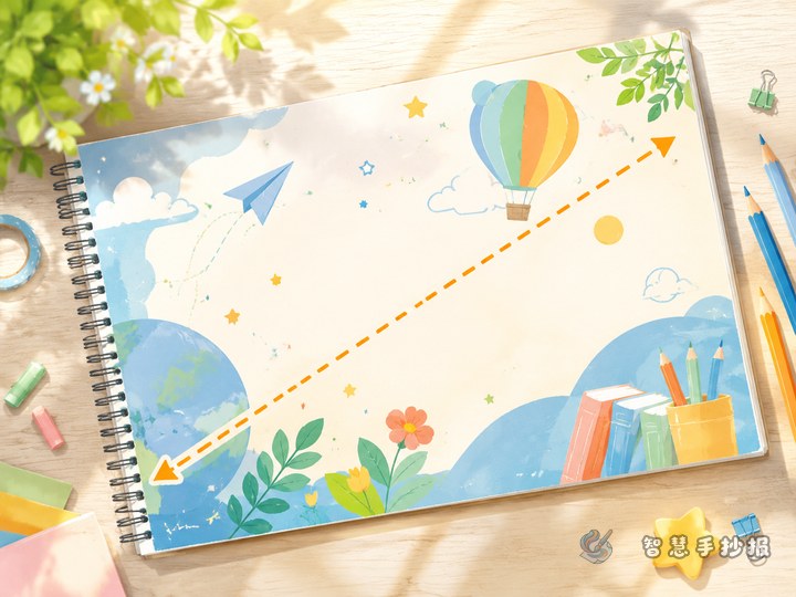
How Can You Make a Symmetrical Handwritten Poster More Dynamic? Try a Diagonal Layout
If a left-and-right layout feels too rigid, use one diagonal visual path to connect the title, main illustration, and key content. This guide explains section planning, short text ideas, color choices, and drawing steps for a lively yet readable school poster.

Too Much Content on a Handwritten Poster? Try a Radial Layout
A center-out radial layout is useful when a handwritten school poster needs several content sections while keeping the main topic prominent. This guide explains how to plan the central image, divide surrounding text, adapt ready-to-use writing ideas, control color, and complete the page in a reliable order.
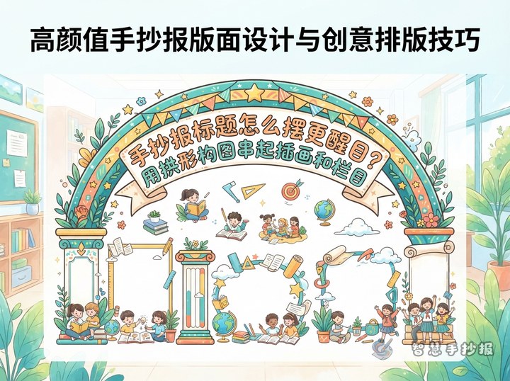
How to Make a School Poster Title Stand Out with an Arched Layout
An arched composition connects the title, central illustration, and text sections into one strong shape. This guide provides curve-marking steps, section ideas, sample writing, color rules, and a clear drawing order for reading, environmental, festival, and other school poster themes.
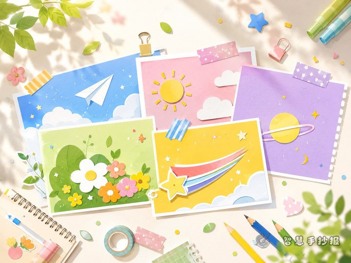
How Can You Make a School Poster Look Less Stiff? Try a Staggered Card Layout
A staggered card layout uses content boxes of different sizes and positions to make a school poster feel lively without losing order. This guide explains how to arrange the title, divide written material, coordinate colors, and add simple decorations.
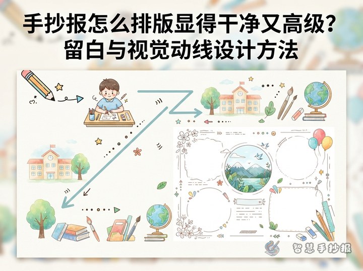
How Can You Make a Handwritten Poster Look Clean and Polished?
A clean handwritten poster needs a clear focal point, comfortable spacing, consistent column shapes, and a simple color palette. This guide explains two practical compositions, adaptable text ideas, decoration choices, and an easy production order for students, parents, and teachers.
Want to create a poster now?
Scan with WeChat, enter this theme, and generate the layout, section copy and line art.
 Scan with WeChat