Choose the Job of Each Illustration
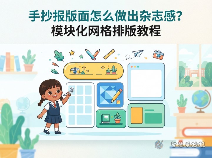
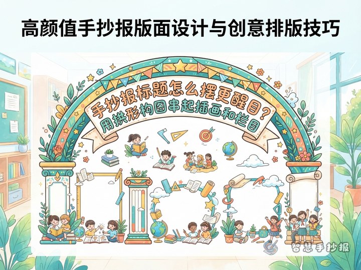
A page often feels crowded because every drawing demands equal attention. Start with one main illustration that expresses the theme. Smaller drawings should identify sections, connect the reading path, or fill a carefully chosen corner.
- Main illustration: Place the strongest image near the title or in another focal area.
- Section icons: Give each section one simple symbol, such as a book, leaf, star, person, or themed object.
- Decorative details: Keep corner patterns small, light, and limited in number.
Create Three Clear Size Levels
The title, main picture, content boxes, and decorations should not be the same size. Arrange them in large, medium, and small levels. The title and focal picture are largest, the content areas are medium, and icons or borders are smallest. This contrast helps readers notice the subject before moving through the written information.
- Mark the title and focal illustration lightly in pencil.
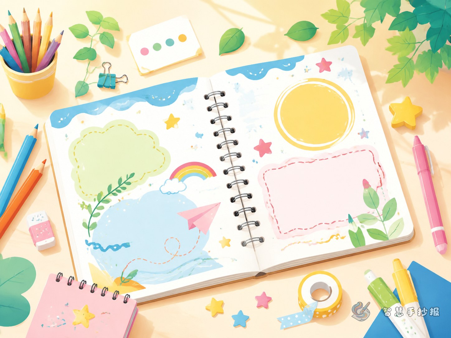
- Divide the remaining space into three or four readable sections.
- Add small decorations only after all writing areas have been reserved.
Make Pictures Part of the Layout
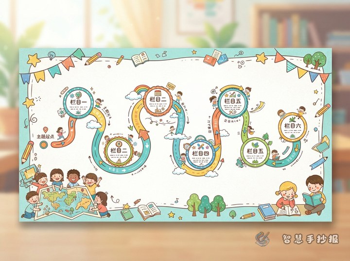
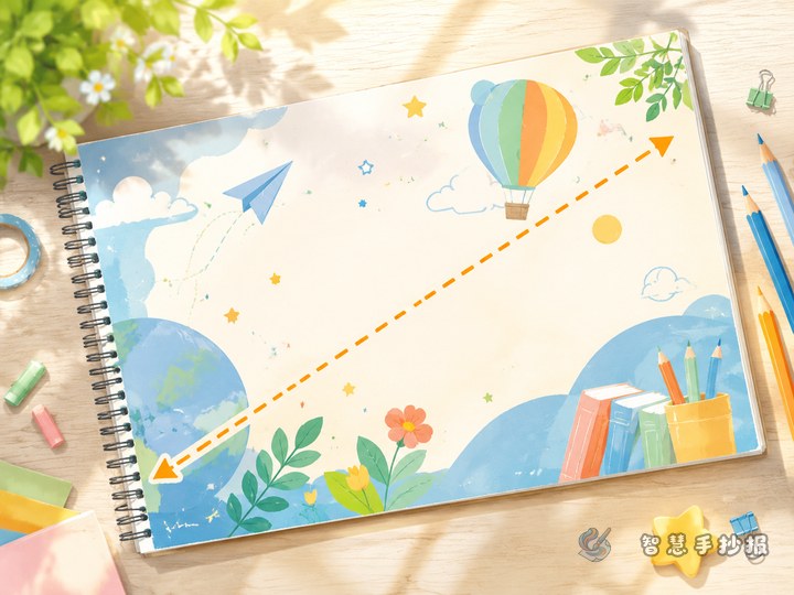
Illustrations can shape the sections instead of sitting beside them. A tree canopy can support a title, an open book can hold key facts, and a ribbon or branch can guide the eye across the page. A character may face toward a paragraph so that its pose directs attention to the content. Keep every outline clear of the actual writing.
Match the organizing shape to the topic. Pages about reading, nature, festivals, or school life might use book pages, vines, lanterns, or running-track curves to form their content areas.
Prepare Short Text That Fits the Design
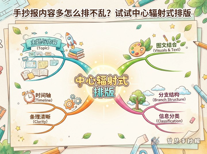
Illustrated handwritten posters work best with concise sections. Useful headings include Quick Facts, What I Can Do, Helpful Tips, and My Message. Prepare three to five short sentences for each section rather than one dense block.
- Introduce the importance of the topic in one or two sentences.
- List three facts, methods, or practical reminders.
- Finish with a personal action, reflection, or call to action.
Check the Page Before Coloring
Sketch boxes and pictures lightly, add the writing, and outline only after confirming that everything fits. Use one main color and two supporting colors while keeping body text dark and readable. View the draft from a distance: the title should appear first, no picture should cover the writing, and each section should have enough open space. To explore more arrangements, continue creating the poster in the Zhihui Shouchaobao WeChat Mini Program.