A border is not just a frame — it sets the rhythm of your layout
Many students start by drawing a big pencil square and then squeezing everything inside, which makes the page look like a test paper. A border actually does three jobs: it holds the layout together, separates the columns, and guides the eye from the title to the text. Once you know that, you can decide whether your border should be thick or thin, closed or open.
Sketch three different border lines on scrap paper first, then redraw your favourite one on the final sheet.
Three beginner-friendly borders: straight lines with details, wavy edges, angled corners
Straight lines with details
Draw four clean straight edges, then add one small detail at the midpoint or a third of the way along each line — a dot, a leaf, a tiny triangle. Straight lines feel steady, and the little marks bring them to life. This works well for reading or science themes.
Wavy edges
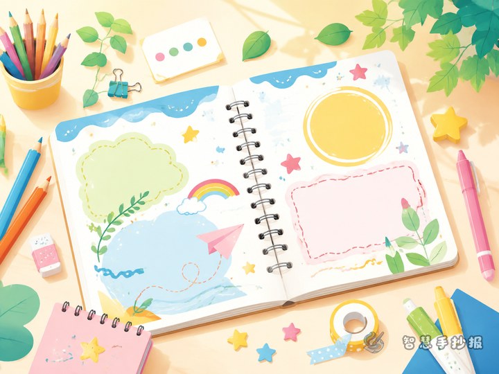
Replace the straight lines with waves, keeping the peaks and valleys even. Waves feel soft and friendly, so they suit festivals, nature, and fairy-tale themes. Dot out evenly spaced peaks in pencil before connecting them.
Angled corners
Draw small folded or cut corners at each end, then connect them with straight lines. This gives a crisp, organised look that fits technology, maths, or sports topics.
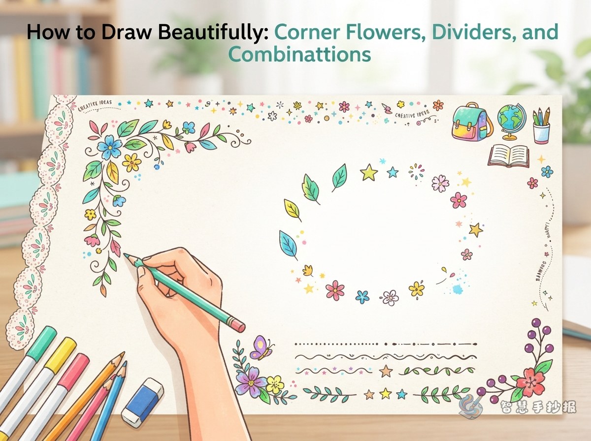
Corner flowers: the small details that make a poster look polished
They do not need to be complicated. The key is that all four corners should answer to each other, instead of one being full and the other three empty.
- Matching corners: draw the same decoration in all four corners. This is the safest choice, especially for younger students.
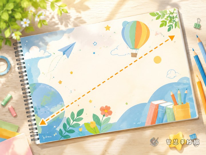
- Diagonal pairing: match the top-left and bottom-right corners, then leave the other two light with just a few dots. The page breathes more.
- Graduated size: one large corner, one medium, two small. This creates a nice rhythm.
- One corner breaking out: let a single corner flower cross the border slightly. The layout instantly feels less stiff.
Vines, clouds, stars, small flowers, little books, or light bulbs all work. Try to link them to the poster topic.
Dividers: five easy variations instead of plain straight lines
Dividers separate columns, so they can be much freer than the outer border.
- Dashed lines with dots: short dashes with tiny dots between them — neat and cute.
- Double lines with a pattern: two thin parallel lines with waves or small triangles in between.
- Leaf and branch lines: a gentle curve with small leaves on both sides, great for nature or environmental themes.
- Open book lines: shape the divider like the outline of an open book for a reading theme.
- Gapped lines: leave a small opening in the middle and place a tiny icon there so the columns feel connected.
Remember: do not use more than three divider styles on one poster, or the page will look busy.
Decorative bands and small patterns: fill the gaps just enough
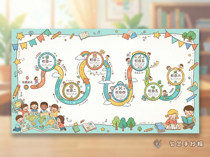
Small patterns work well along the inner edge of the border, under the title, or between columns. Common choices include a row of dots, a row of triangles, a row of clouds, or a row of stars. A decorative band along the bottom can act like a path that links several columns together.
To check whether you have added too much, step back and look. Hold the paper at arm's length. If the decoration draws more attention than the text, it is too heavy — remove a few elements.
A quick checklist before you start drawing
- Is the border fully closed, or does it have one deliberate gap?
- Do the four corners echo each other in shape and size?
- Have you used three divider styles or fewer?
- Does any decoration cover the text?
- Do the title, columns, illustrations, and border share the same theme elements?
If you want an easier way to plan the border, corner flowers, and dividers, open the WeChat mini program and search for 智慧手抄报. Choose a layout template, swap in your own title and text, then draw your own details on top.