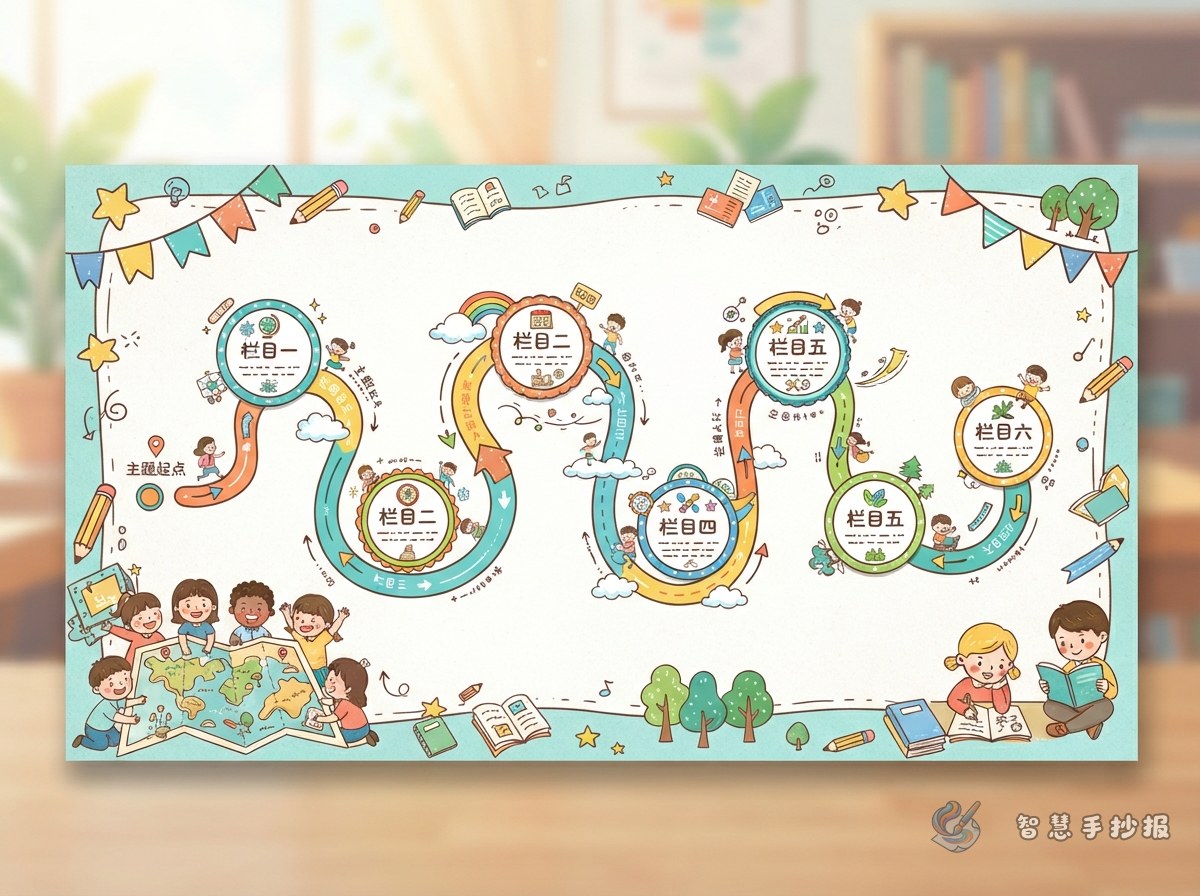
Turn the Page into a Visual Journey
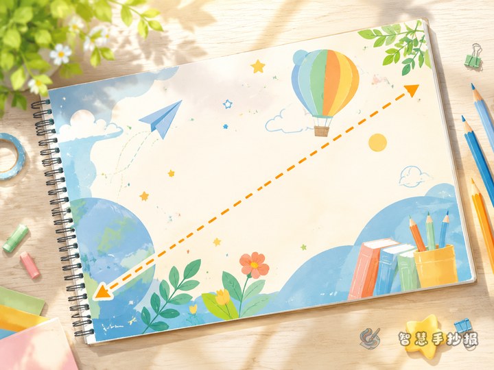
A route-map layout should guide the reader rather than connect boxes at random. Start near the lower-left corner, travel through the center, and finish near the upper-right corner. A gentle S-shaped path also works well. Place the title and introduction at the starting point, two or three key sections along the middle, and a conclusion or action message at the destination.
Keep the route simple. Three to five stops are usually enough for one handwritten poster. Each stop should represent one content section, and the path should guide the eye without crossing through body text.
Choose a Theme with a Sense of Progress
This design is especially effective for topics involving steps, exploration, habits, or growth. Suitable ideas include a reading journey, personal growth, school kindness, safety challenges, saving resources, and discovering traditional culture.
- Reading journey: Begin with the value of reading, continue to book recommendations and reading tips, and finish with a personal reading plan.
- Better school habits: Use stops such as spotting kindness, daily good habits, behaviors to avoid, and what I can do.
- Safety challenge: Arrange the sections as recognizing danger, making a judgment, responding correctly, and remembering key rules.
Write Short, Focused Text at Every Stop
Give each stop one clear purpose and keep its main paragraph to three to five handwritten lines. An opening sentence might invite readers to follow the route and discover useful ideas. Information sections can explain one point and add one example, while action sections can begin with phrases such as “I can,” “Remember to,” or “If this happens.”
If a section contains several details, emphasize the key term and turn the supporting information into short list items. At the final stop, add a brief takeaway or pledge instead of repeating earlier content.
Coordinate the Path, Frames, and Illustrations
- Sketch a loose curved path in pencil before placing section frames on both sides.
- Use one repeated stop symbol, such as signposts, footprints, flags, or circular markers.
- Make the main section larger and supporting sections smaller to create a clear hierarchy.
- Choose one main color for the route and lighter shades from the same palette for the frames.
- Add illustrations mainly at bends or in unused corners, then outline and color after all text is complete.
Test the Reading Route Before Finishing
Trace the path with a finger from the starting point and check whether every section appears in a natural order. If the eye has to jump backward, adjust the position of the stops. If the route overpowers the title, use a thinner line or a softer color. Also check that every text box has breathing room and that no illustration blocks a heading.
Once the topic and route are planned, open the Smart Handwritten Poster WeChat Mini Program to refine the sections, select a suitable layout, and continue making the poster for your page size.