Choose the First Thing Readers Should Notice
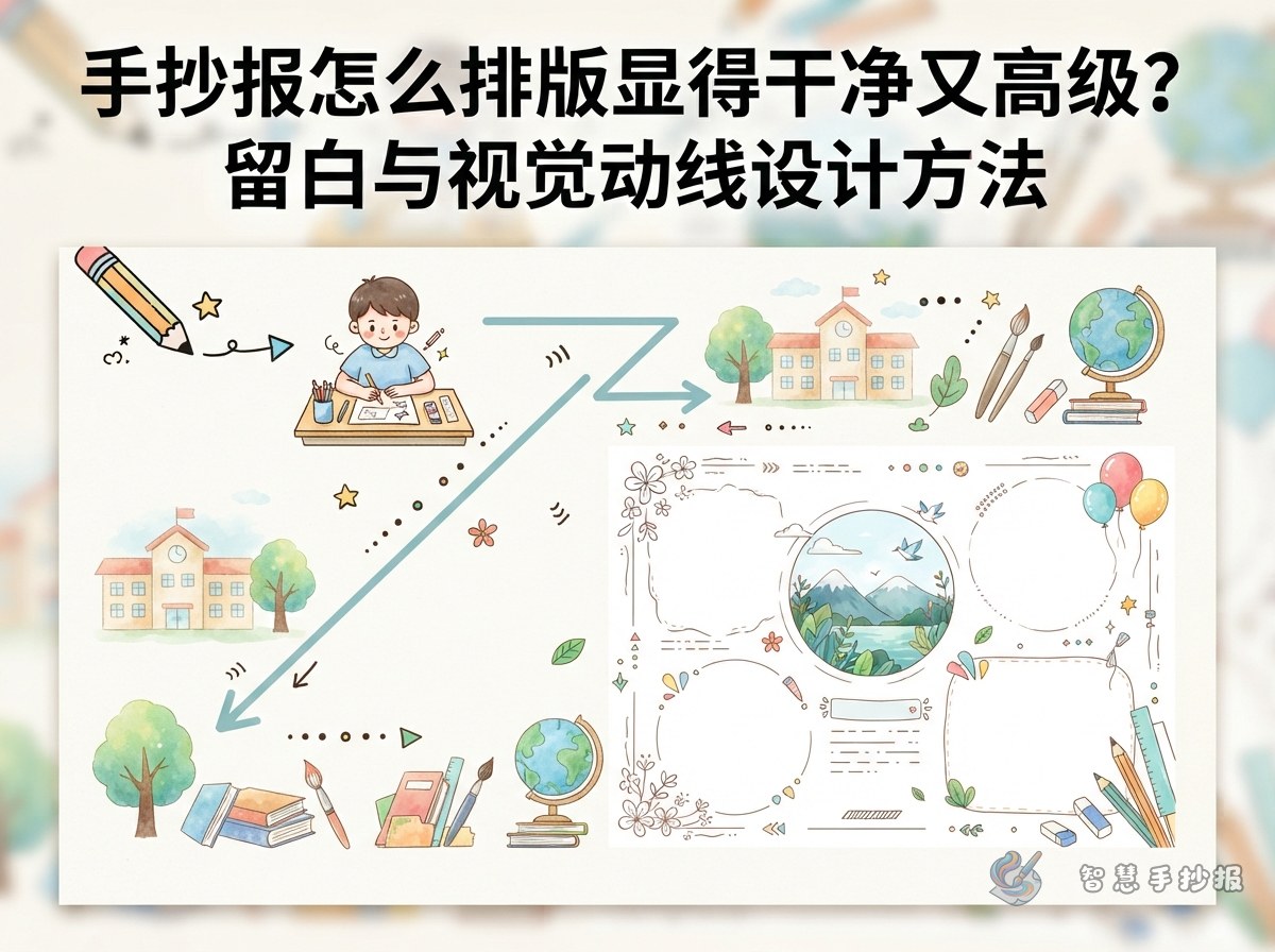
An attractive handwritten poster does not need decoration everywhere. Before drawing, choose one strong focal point. This could be a large centered heading or a heading paired with an illustration near the upper-left area. Every other section should support that focal point rather than compete with it.
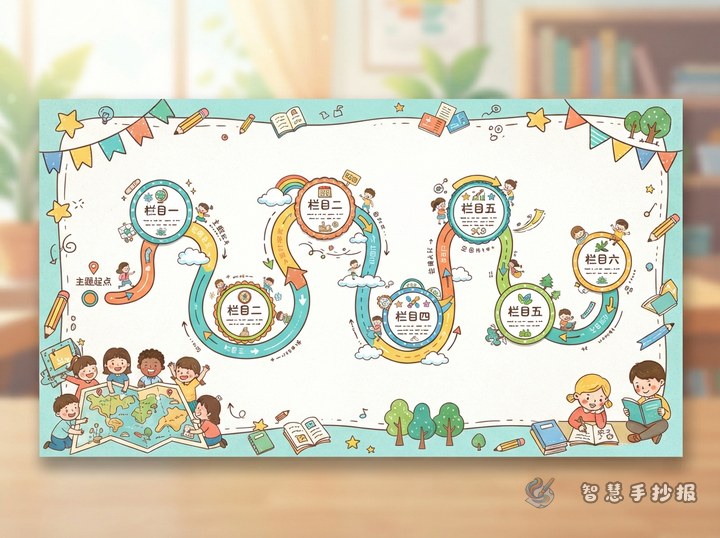
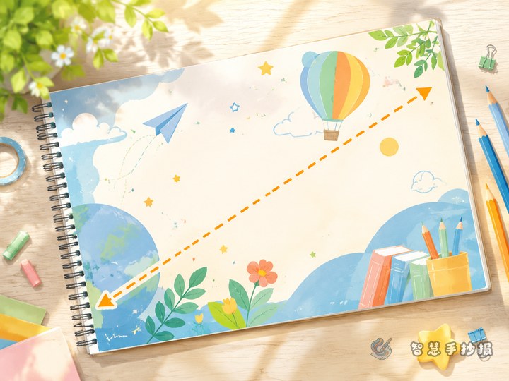
Try a central-focus composition by placing the heading at the top, a main illustration near the center, and three or four text sections around it. For a livelier result, use a diagonal-flow composition: put the heading at the upper left, the main illustration at the lower right, and arrange the sections along the path between them.
Turn Empty Areas into Useful Whitespace
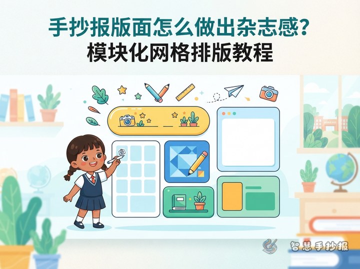
Leave a margin around the paper, then lightly mark the title, text, and illustration zones in pencil. Keep a visible gap between columns and prevent writing from touching the borders. The blank areas do not have to be perfectly symmetrical, but the page should feel balanced. If one side contains a large illustration, use two smaller text blocks on the other side.
- Title zone: Use roughly one-fifth of the page height and keep the letters easy to read.
- Text zone: Create three or four sections, each focused on one idea.
- Illustration zone: Add one main picture and only a few small supporting motifs.
- Whitespace zone: Preserve space around sections, pictures, and page edges to highlight key information.
Build Clear Sections with Adaptable Text
For holiday, safety, reading, science, or cultural topics, divide the information into four useful categories: a short introduction, key facts, an action list, and a personal reflection. Short labels such as “Topic Snapshot,” “Fact Finder,” “What We Can Do,” and “My Takeaway” create a neater rhythm than long section titles.
An Opening You Can Adapt
“Today, let us explore your topic, discover the ideas behind it, and find small actions we can take in everyday life.” Replace the topic phrase and place this introduction below the main heading or in the first section.
A Short Closing Message
“Learning something new is a beginning, and taking action creates real change. Let us remember what we have discovered and practice it in daily life.” Keep the ending brief and pair it with one small book, leaf, or star motif.
Simplify Colors, Borders, and Decorations
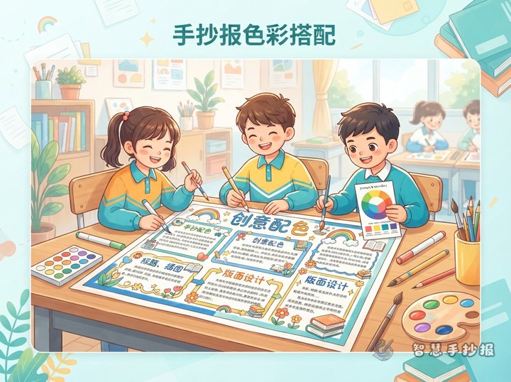
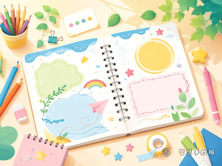
Choose two main colors and one pale supporting shade. Use a dark color for body text and outlines, an accent color for the title and keywords, and the pale shade behind small labels. Repeat one border treatment, such as rounded boxes or dotted lines, rather than giving every section a different frame.
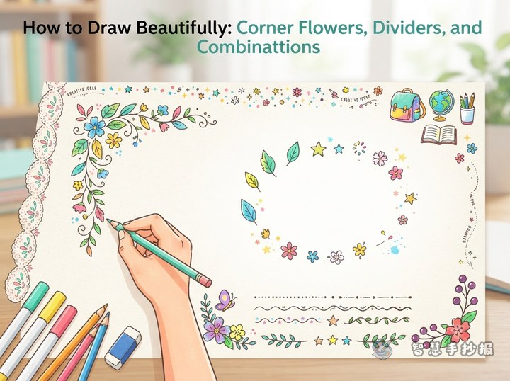
Decorations should match the subject and repeat with small variations. Leaves suit environmental themes, books and pencils suit reading themes, and planets suit space themes. Repetition creates unity and looks cleaner than mixing many unrelated images.
Complete the Page in a Reliable Order
- Write the heading and three or four section names on scrap paper, then remove repeated ideas.
- Sketch the margins, title, columns, and main illustration lightly in pencil.
- Write the body text before outlining and coloring so that each section has enough room.
- Add only the necessary decorations, then view the page from a distance to check its focal point and reading order.
If you are unsure how large each section should be, open the 智慧手抄报 WeChat Mini Program, select a topic, and continue refining the layout and content before creating your final handwritten poster.