
Decide Who the Poster Is Trying to Persuade
Energy Saving Week posters often turn into lists of facts that readers forget immediately. Before drawing, ask a simple question: whose small habit do I want to change? If the poster is for classmates, keep the content close to school life. If it will be shown to parents at the classroom door, focus on home electricity use and daily travel. Once the audience is clear, the content and layout will naturally have a sense of priority.
A useful trick is to write the whole theme as one sentence, such as “This week we turn off lights we do not need,” and let every section support that sentence. This keeps the title, drawings, and small sections from saying different things.
Four Sections Are Enough
Energy Saving Week covers many topics, but a handwritten poster has limited space. Keep the number of sections to four or fewer and make the hierarchy obvious.
- Main section: a one-week action list. Number seven simple actions, such as switching off unused lights, using both sides of paper, and walking to school. This section takes the largest area.
- Supporting section: one small number. Use a sentence or two to explain what a small habit adds up to over time, written in your own words rather than copied statistics.
- Interactive section: a promise wall. Leave a blank area with small boxes where classmates can write their own promises, which makes the poster feel participatory.
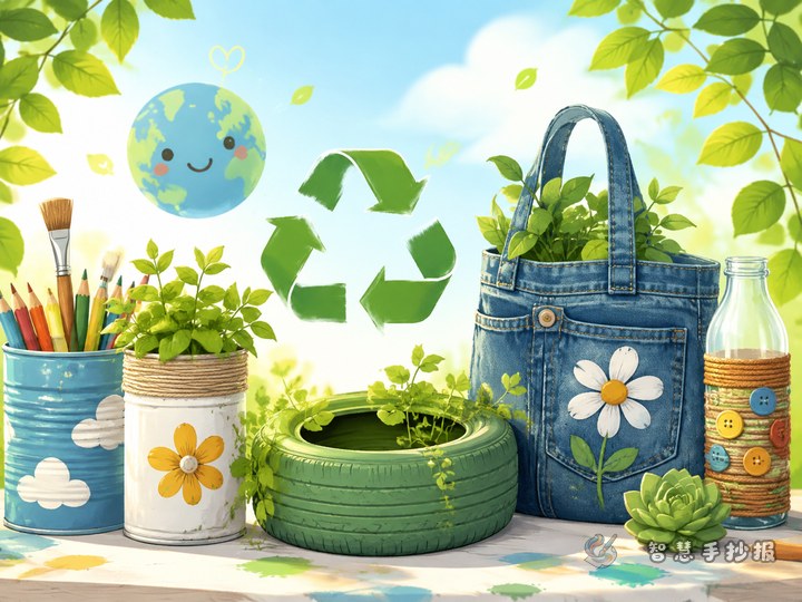
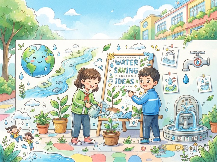
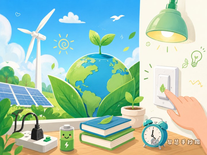
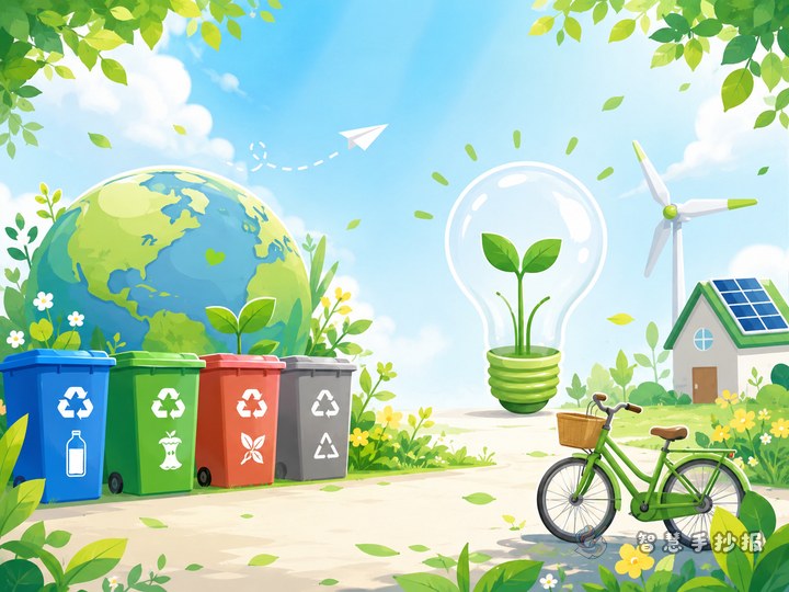
- Decorative corner: energy icons. Draw a light bulb, plug, tap, or bus with a short caption to fill empty corners.
Write Text That Sounds Like a Child Speaking
Many posters read like instruction manuals because the sentences are long and the verbs are few. Compress each item into an action plus a result. Instead of “attention should be paid to saving electricity,” write “the last person to leave the classroom turns off the lights.” Such sentences create a picture and are easy to copy neatly.
Add one personal observation, such as “I noticed two rows of lights stay on at noon in our classroom.” Real details move readers more than slogans. Three to five short lines per section are enough, and white space makes the poster look cleaner.
Layout and Color: Give Green Some Depth
The common problem with energy posters is a single flat green across the whole page. Try this approach:
- Write the main title in dark green or deep teal with a bold outline to create a visual center.
- Use light green, pale yellow, and sky blue for section frames, avoiding the same color side by side.
- Place illustrations in the four corners and along the bottom, leaving the middle for text.
- Write body text in black or dark gray so it stays readable from a distance.
If time is short, sketch a simple zoning plan on scrap paper first to fix the positions of the title, sections, and drawings before starting the final copy. For more layout and text references, open the WeChat mini program “智慧手抄报” and continue building your poster from a suitable template.
Three Checks Before You Hand It In
Before submitting, step back and check: can the title be read at a glance? Does every section have a clear border? Is there an awkward empty patch? Then read the text again, remove repeated sentences, and split the longest paragraph into two shorter lines. After this tidy-up, the poster will look complete and carefully prepared.