Build the Layout Around an Invisible Arch
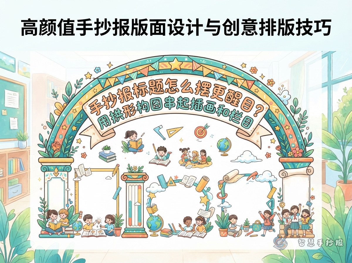
An arched composition is more than writing the title on a curve. The title, central illustration, and side sections should work together to suggest the outline of an arch. Lightly sketch a curved guide near the top, place the title along it, add one main illustration underneath, and reserve the space on both sides for text.
Choose a central image with a clear silhouette that is easy to draw. A spring reading poster might feature an open book, new leaves, and birds flying from the pages. An environmental poster could use the Earth, leaves, and water drops, while a festival poster could feature lanterns, the moon, or rice dumplings.
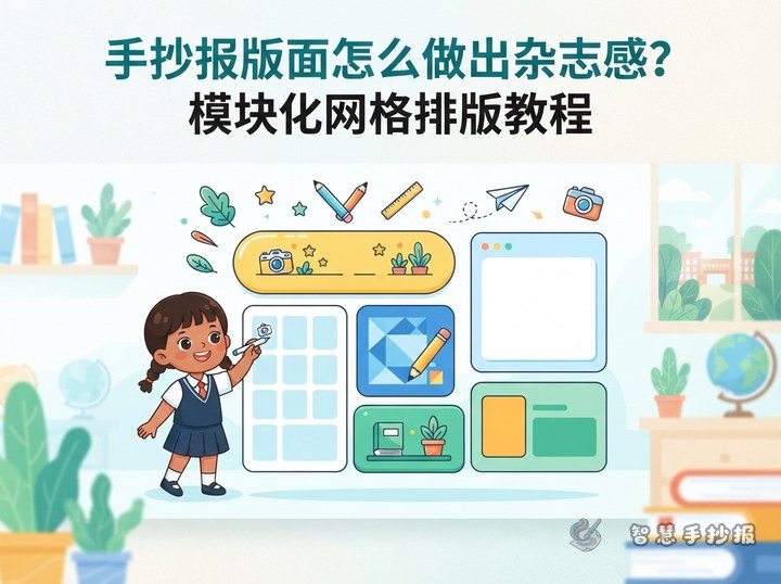
Divide the Page into Crown, Center, and Base
- Arch crown: Add the main title and one short subtitle.
- Arch center: Place the key illustration, a slogan, or the most important fact.
- Arch base: Arrange two to four text sections, keeping longer passages near the bottom.
The two sides do not have to match exactly. Two small sections on one side can balance one larger section on the other. Similar color weight and spacing will keep the page lively without making it look disorganized.
Useful Sections and Ready-to-Use Text
For a Spring Reading theme, try four sections: Book of the Day, Better Reading Habits, My Reading Plan, and A Reading Message. Sample lines include: Reading opens a window onto a wider world. Set aside a quiet time each day, read a few pages, and record your favorite sentence. Reading with a question in mind makes key ideas easier to find. Let books accompany your growth and ideas begin to bloom in spring.
The same content pattern can be adapted to other topics: a short introduction, practical tips, an action checklist, and a closing message. An environmental poster can include water-saving ideas and green habits; a festival poster can explain customs and greetings; a safety poster can present precautions and response steps.
A Five-Step Drawing Order
- Mark the centerline and reserve roughly the top quarter of the page for the curved title.
- Plot the highest point and both endpoints, then connect them with a light curve.
- Write the middle letters or words first and continue outward to avoid running out of space.
- Add the central illustration and section borders before copying the final text.
- Outline, color, erase guide marks, and check that the title remains the first focal point.
Let Color Support the Shape
Use one main color and two supporting colors. Give the title a light shadow, then place small flowers, stars, leaves, or books only around key turns of the arch. Avoid filling the entire curve with decoration. For a long title, enlarge the keywords and reduce the size of less important words so the lettering follows the curve naturally.
If you are unsure about the curve or section sizes, open the Smart Handwritten Poster WeChat Mini Program to explore a suitable theme and layout idea. You can then adjust the sections, text, and colors to match your paper before drawing the final poster.