Turn the Topic into a Small Set of Content Cards
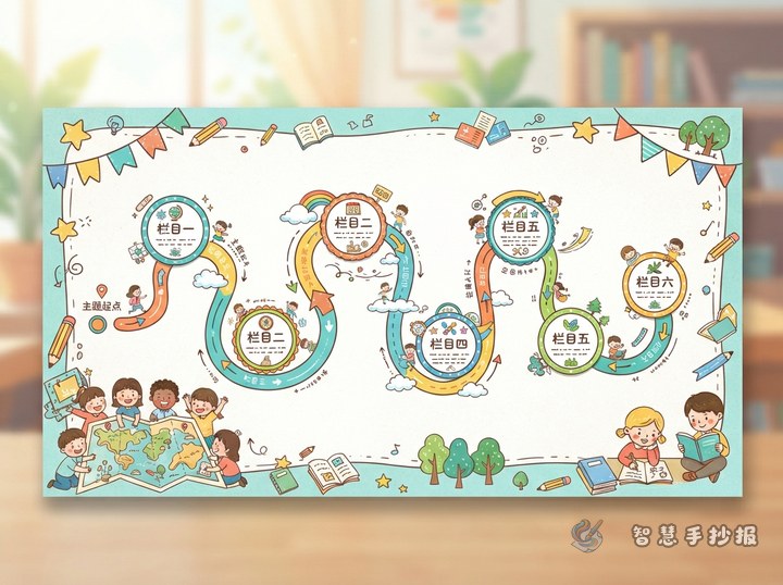
A staggered layout is not a collection of randomly placed boxes. Begin by ranking the information. The main title attracts attention, the largest card explains the central idea, and the smaller cards hold facts, examples, questions, or action tips.
This approach suits posters about books, festivals, science, recycling, traffic safety, and positive school behavior. Before drawing, prepare four kinds of material:
- Short introduction: Two or three sentences explaining the poster topic.
- Main section: The most important facts or story for the largest card.
- Supporting sections: Quotations, quick facts, questions, or reminders for smaller cards.
- Action message: A short statement showing what students can do.
Build the Composition with One Large Card and Two Small Ones
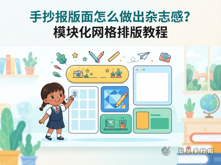
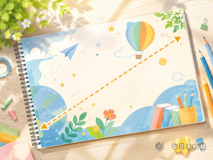
A beginner-friendly arrangement uses one large card, two smaller cards, and one tiny accent box. Place the large card slightly to the left or right of the center. Put one small card above it and another on the opposite lower side, creating a gentle diagonal reading path.
- Mark the title area lightly in pencil near the top of the sheet.
- Draw the largest card for the key information.
- Add two smaller sections at different heights around the main card.
- Use a remaining corner for a slogan, question, or one-sentence fact.
One or two small cards may be tilted slightly, but the angle should remain subtle. Keeping the main card level gives the entire page visual stability.
Match the Amount of Writing to Each Card
The largest card can contain six to ten handwritten lines, while a smaller card should usually contain three to five. An accent box works best with a single memorable sentence. Mini headings such as “Why It Matters,” “Fact Corner,” “Safety Reminder,” or “My Action” help readers scan the page.
For an environmental poster, place the importance of waste sorting in the largest card. Use the smaller cards for sorting methods and everyday conservation habits, then add a short message such as “A cleaner school begins with sorting one item correctly.” For a reading poster, feature the book introduction in the large card and use smaller cards for a character note and a personal response.
Connect the Cards with Color and Repeated Details
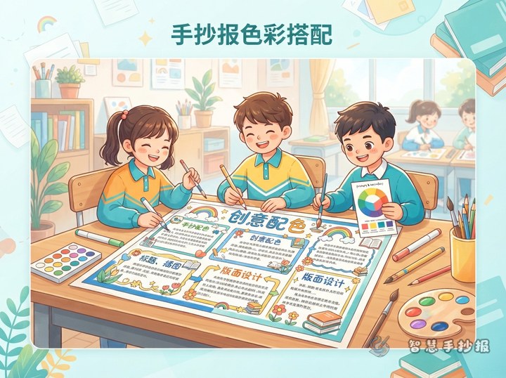
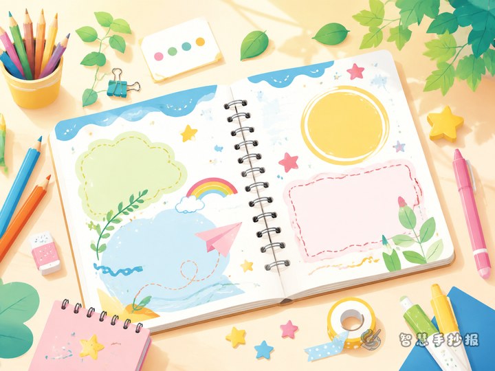
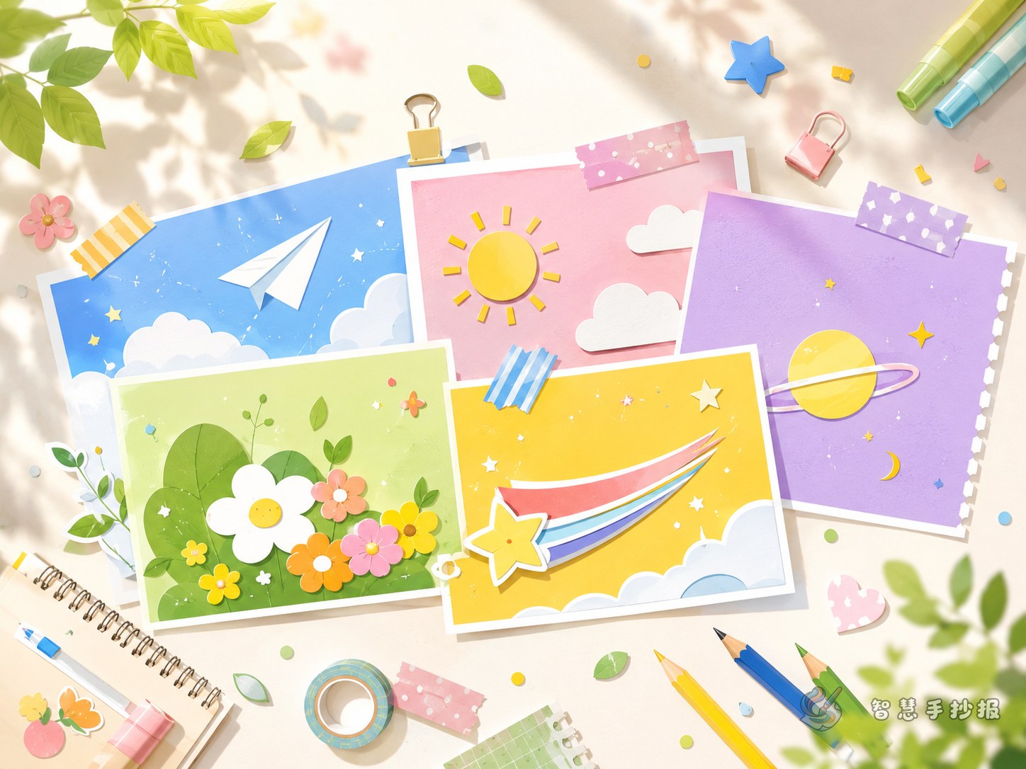
The card shapes can vary, but they need a shared feature. They might all use rounded corners, short dashed borders, or the same small shadow. Choose two main colors and one accent color. Pale tones can fill headings or shadows, darker tones can define borders, and the accent color should highlight only a few keywords.
- Use the same heading size for sections of equal importance.
- Leave visible space between cards instead of pressing them together.
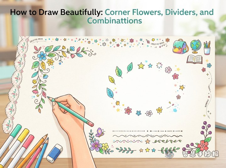
- Place simple decorations at card corners, such as tape, pins, stars, or leaves.
- Write body text in a dark color and reserve bright colors for emphasis.
Test the Reading Path Before Adding Ink
After finishing the pencil sketch, look from the main title to the largest card and then to the smaller cards. The order should feel natural. Shorten repeated sentences if a section looks crowded. If an area feels empty, add a small illustration or fact box rather than another long paragraph.
Once the layout is balanced, trace the borders, add color, and copy the final text neatly. To explore more card combinations, readers can scan the code on the Smart Handwritten Poster page to enter the WeChat Mini Program, choose a topic, and continue adjusting the sections before drawing the final poster on paper.