Turn One Week of Water Use into Data
This handwritten newspaper project can begin with a simple question: how does my family use water during one week? Do not copy numbers from the internet. Instead, choose a few things to observe, such as handwashing, brushing teeth, washing vegetables, bathing, or flushing the toilet. Record the number of times, an estimated amount, or the number of water-saving actions from Monday to Sunday. If exact measurement is difficult, use a clear level system and write the unit beside the chart.
Make a Small Record Table First
- Days: Monday through Sunday.
- Items: Number of uses, water-use levels, or water-saving actions.
- Questions: Which day has the highest record? Which habit could be improved?
Keep the same standard throughout the week. A chart is only useful when the recorded items can be compared fairly.
Choose the Chart That Tells the Story Best
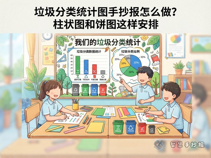
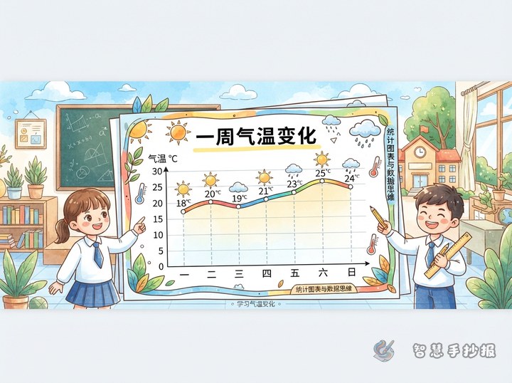
A bar chart is the easiest choice when the goal is to compare each day. Draw one bar for each day and let its height match the recorded result. A line chart works better when you want to show how the data rises, falls, or changes across the week. A pie chart can show the share of different water-use activities, but it requires a complete set of category data and may be too difficult for younger pupils.
Write the chart title, observation period, and unit below or beside the chart, such as “One-Week Family Water-Use Record,” “Observation period: one week,” and “Unit: number of times.” One main chart is enough. Add a small table or a few icons instead of filling the page with too many graphs.
Design the Page as a Data Adventure
- Top: Place a clear title with small drawings of water drops, a measuring cup, Earth, or a faucet.
- Left side: Draw a large bar or line chart with visible scales and labels.
- Right side: Add a “My Record” section explaining the method, unit, and main observation.
- Bottom: Create two boxes called “What the Data Tells Me” and “Small Water-Saving Actions.”
Use a pencil to mark the axes before drawing them with a ruler. Choose two or three related colors rather than coloring every bar differently. The title, chart, and conclusion should have different visual sizes so that the topic is clear from a distance.
Text You Can Add to the Handwritten Newspaper
Observation note: “I observed my family’s water use for one week and organized the records into a chart. I hope the data can help us find better ways to save water.”
Chart conclusion: “First compare the heights or points for each day, then think about why they changed. Data is not used to fill empty space; it helps us notice our everyday habits.”
Water-saving message: “Turn off the faucet while brushing your teeth, collect vegetable-washing water for plants, and remind family members when a leak is found.” Adjust these sentences to match your own observations rather than writing conclusions that you did not record.
Four Final Checks
- Every bar or data point matches the correct day.
- The scale intervals are even, and the numbers and units are readable.
- The conclusion comes from your own records instead of unsupported claims.
- There is enough blank space, so decorations do not cover the chart or text.
Once the observation items and chart type are decided, you can continue organizing the sections and completing the project in the “智慧手抄报” WeChat mini-program. Fill in the real data first and decorate afterward; the finished work will be both attractive and convincing.